MacKuba

🍎 Kuba Suder's blog on Mac & iOS development

New stuff from WWDC 2019

Categories: Cocoa, Mac, SwiftUI, WWDC, iPhone Comments: 3 comments

WWDC 2019

As I’m writing these words, it’s the last day of November and the temperature has just dropped to close to 0°C here in Poland. But let’s move back to a better time for a moment, to the first days of June - the long days of warm sunny weather, inviting you to spend some time outside… and the huge pile of new stuff that Apple had just dropped on us on the WWDC keynote day, inviting you to try to frantically read and watch everything at once, and don’t leave the computer until you’ve read it all.

For the past 4 years I’ve been trying to cope with this crazy period by collecting notes from the WWDC talks, release notes, saving tweets, links to blog posts and so on, and organizing it all in a single ordered blog post. Writing things down this way is how I learn best, it helps me put together all loose pieces of information into a single picture, and gives me the peace of mind that I haven’t missed or forgotten anything important.

I usually finish this by July, but this year was different - first I got really hooked on SwiftUI and spent some time doing some experiments with it, and then I was busy working on and releasing my iOS content blocker app and doing some travelling. It didn’t help that the sheer amount of new APIs added this year was simply overwhelming.

So I finally got back to this in November, and I’m posting the list here on the half-anniversary of the 2019 keynote (yes, it’s really been 6 months already!) - hopefully it will still be of use to you.
Read more »

SwiftUI on AppKit: Building a Dark Mode switcher

Categories: Cocoa, Mac, SwiftUI Comments: 2 comments

I spent a large part of last week learning and playing with SwiftUI. So far it’s been pretty frustrating at times since I kind of feel like I forgot everything I knew, but I’m also very excited about where this will lead us. I’ve summed up my first impressions in the “Thoughts on SwiftUI” post last week.

At the moment most of the available examples show how to use SwiftUI in iOS apps, but I wanted to see how it would work on the Mac (in AppKit), since it’s kind of closer to my heart (hint: look at the domain name :).

And I had an idea: last year, when I was playing with the new Dark Mode in macOS Mojave I had a plan to build a simple app that would let you override the appearance in specific apps using the NSRequiresAquaSystemAppearance setting. I started working on it, but I got stuck while figuring out the complex NSTableView API which I had no experience with, and I gave up.

So, how about I give it another try now, but with SwiftUI? I don’t really need such app myself (I only use light mode), and I’m pretty sure I’ve seen other similar apps last year, but this seems like a perfect way to try out SwiftUI on the Mac - and to see if it will be easier to get the table view to work…

Update 15.08.2020: I’ve updated all code to work with the latest (stable) version of SwiftUI, adapting it to all the changes that were made to the API in last year’s later betas.

Read more »

Thoughts on SwiftUI

Categories: Cocoa, Mac, SwiftUI, iOS Comments: 0 comments

Like everyone, I was shocked by Apple’s surprise reveal of SwiftUI at WWDC last week. We’ve heard rumors of some kind of declarative, multi-platform framework coming sometime in the future, but I don’t think anyone expected we’d see it so soon. This seems like a huge change, a beginning of a completely new chapter for app developers on Apple platforms. I’ve watched most of the session videos about SwiftUI and I’m incredibly excited and eager to start using it in practice.

Here are some first impressions and thoughts about SwiftUI after reading about it and playing with it for a few days:

Read more »

WatchKit Adventure #2: Minimum Viable Complication

Categories: Cocoa, WatchKit, iPhone Comments: 12 comments

< Previously on WatchKit Adventure…

This post is the second (or technically third) part of my series about building a WatchKit app that shows current air pollution level on the watch face. If you haven’t seen the previous parts, you might want to at least take a look at the intro.

Last time we’ve talked mostly about the general architecture of a WatchKit app. So logically it would now make the most sense to start with the main part of a watch app, the main app UI. After all, this is the only part of the app that’s required – both notifications and complications are optional if you don’t need them. This is what people normally think of when they talk about “an app”.

However… the whole thing started with me wanting to see the level of air pollution right there on the watch face, as quickly as possible. One of the three main rules of watchOS design is that apps should be glanceable, which means that you should be able to glance at the watch and see the information you need in as short time as possible, ideally within a couple of seconds at most – and a complication lets you see this information much much faster than the main app UI accessible from the app launcher.

It was also mentioned during at least one presentation that unlike on iOS, here the main UI does not need to be the most commonly used part of your app, if notifications or a complication make more sense for your use case. It can very well be something that users only fall back to sometimes when they need to see more detailed information or perform some actions.

So, why don’t we skip the view controllers for now and just build a complication?

Read more »

WatchKit Adventure #1: The Big Picture

Categories: Cocoa, WatchKit, iPhone Comments: 3 comments

Update 03.07.2019: watchOS 6 has changed a lot of things that I’ve written about here, so I went through the post again and updated all parts that got out of date.


< Previously on WatchKit Adventure…

For some reason, after watching WWDC talks mentioning watchOS in the last few years, I had this image in my mind that almost every version changed everything in how apps are built. I remembered something about native and non-native apps, two different types of app schemes in Xcode, and some diagrams of pieces moving from one box to another, on more than one occasion. This all sounded confusing, and I think that’s one reason why I was discouraged from starting, because I imagined it would make it hard for me to catch up with all of that.

As it turned out, this wasn’t really true. Well, not until watchOS 6 at least 😉

Read more »

WatchKit Adventure #0: Intro

Categories: Cocoa, WatchKit, iPhone Comments: 0 comments

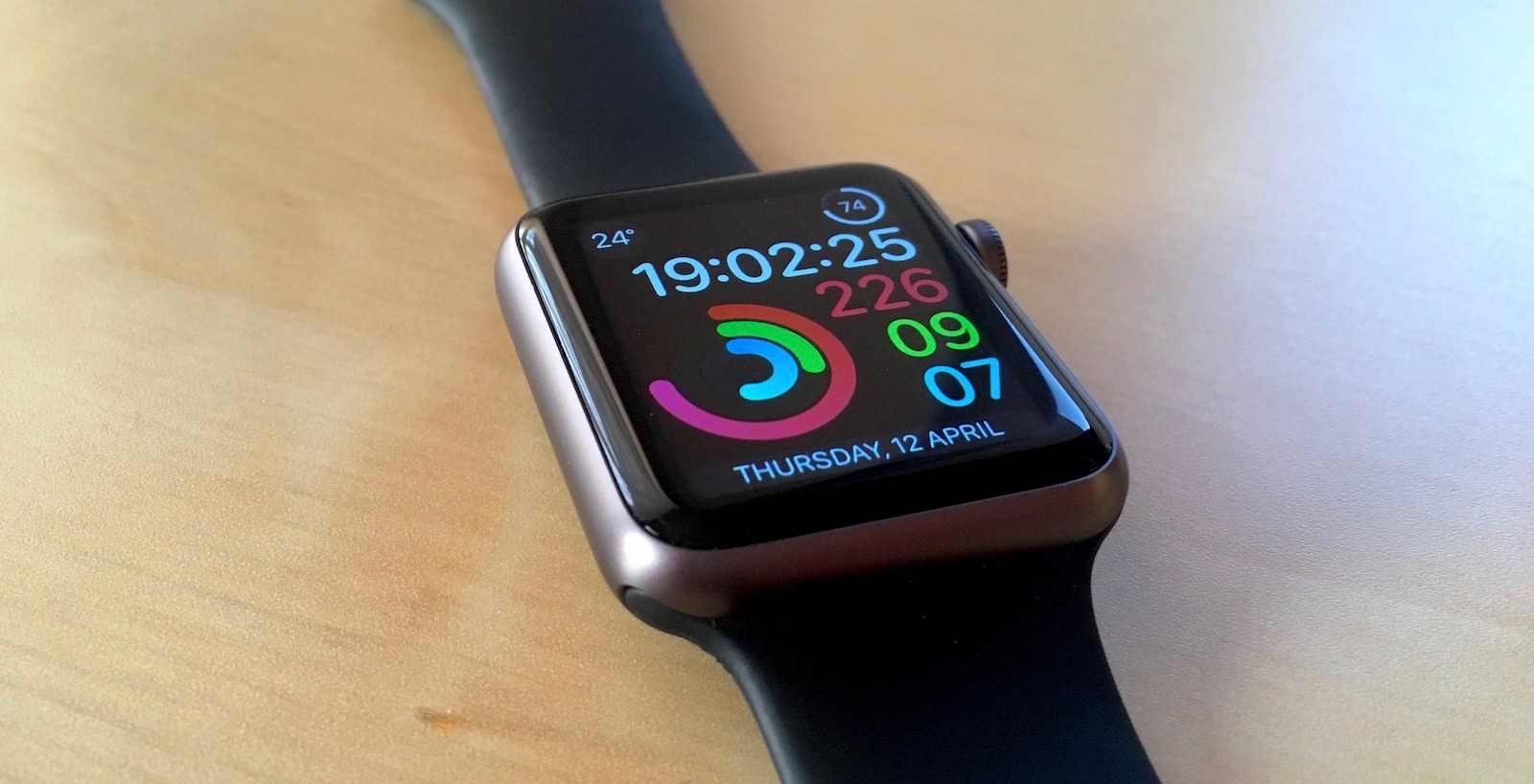
Apple Watch

Ever since I saw the first Apple Watch announced on stage, I wanted to learn to write apps for it. I bought my first Watch half a year later, when they finally appeared in Europe, with that thought in mind. You can probably guess how that went…

I now have on my wrist my second Apple Watch (Series 1), bought two years ago after I smashed the screen in the first one. And to this day I haven’t written a single line of code for watchOS… This is actually one of many things that have been on my ToDo lists for literally years, that I often think about, but never actually find time to do. Procrastination is a terrible thing.

Read more »

New stuff from WWDC 2018

Categories: Cocoa, Mac, WWDC, iPhone Comments: 0 comments

WWDC 2018

For the last 3 WWDC’s I’ve been collecting ordered lists of all new features and APIs added in the new releases of Apple’s OSes, either announced in the keynote or one of the talks, or in release notes, or just discovered by some API diff spelunkers :) I’m pretty late with that this year, because I spent some time instead on a couple of longer posts about notifications and Dark Mode, but here it is, just in time for the final launch and the September event.

In general, there seems to be noticeably less changes this year, which is good in a way - it should be easier for us to learn the new things and update our apps. For a moment it even looked like the “macOS SDK” section could be longer than the “iOS SDK” this time with all the Dark Mode changes, but iOS got a boost from the notification APIs and finally finished 3 lines ahead of macOS :)

If you want to learn more about any given topic, the best way is probably either to look it up in the shiny new Apple Developer Documentation (redesigned last year), or watch the recorded WWDC talk videos - either on Apple’s site, or using the great unofficial WWDC Mac app.

Previous editions are available here:

Read more »

Dark Side of the Mac: Updating Your App

Categories: Cocoa, Mac Comments: 6 comments

(Part 1 is available here.)

Last week I posted an article here about how the “Dark Mode” in macOS 10.14 works behind the scenes and how such features as appearances, materials and vibrancy, which were present in macOS since at least 10.10, have been extended to work with the new visual style. This is the second part of that article – now that we have the theory behind us, let’s see how you can make your own app work with dark mode.

The first thing to remember is that dark mode is automatically enabled in apps built with the 10.14 SDK (which will be in beta until September, so it can’t be used for Mac App Store app releases yet). This means that:

  1. Even if you use all the right APIs, your app will display as completely light on a dark Mojave desktop unless it’s recompiled on the new SDK – which makes sense, since otherwise most third party apps would look pretty ugly.
  2. When you switch to the new SDK, the app will use dark mode on a dark desktop whether you like it or not, which might not be good if you haven’t updated it at all.

Read more »