Dark Side of the Mac: Updating Your App
Last week I posted an article here about how the “Dark Mode” in macOS 10.14 works behind the scenes and how such features as appearances, materials and vibrancy, which were present in macOS since at least 10.10, have been extended to work with the new visual style. This is the second part of that article - now that we have the theory behind us, let’s see how you can make your own app work with dark mode.
The first thing to remember is that dark mode is automatically enabled in apps built with the 10.14 SDK (which will be in beta until September, so it can’t be used for Mac App Store app releases yet). This means that:
- Even if you use all the right APIs, your app will display as completely light on a dark Mojave desktop unless it’s recompiled on the new SDK - which makes sense, since otherwise most third party apps would look pretty ugly.
- When you switch to the new SDK, the app will use dark mode on a dark desktop whether you like it or not, which might not be good if you haven’t updated it at all.
Apple has solved both of these problems with an Info.plist key named NSRequiresAquaSystemAppearance:
- if it’s set to
true, it disables the dark mode when the app is built on the new SDK, so you can buy some time this way to tweak everything in the app until it looks great on a dark desktop; Apple has emphasized that this should only be used temporarily :] - if it’s set to
false, it enables the dark mode when the app is built on the current SDK - you can use this if you can’t or don’t want to switch to the new SDK yet, but want your app to not look out of place on a dark desktop
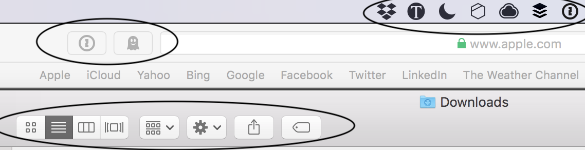
Interestingly, it seems you can also override this property through the NSUserDefaults system as a user, for any 1st or 3rd party app (at least if it doesn’t set it itself in its Info.plist?). This means you can make a system app “forget” how to use the dark mode:
And you can also force a third party app to try to work with the dark mode:

The former should usually work, the latter will depend on how much the app was following various good practices, which we’ll talk about later in this post. Be aware though that some apps might even crash when this user default is set!
If you’d like to instead force an app (that already supports dark mode) to always use it, even in light mode, there was a NSWindowDarkChocolate property before which did just that, but apparently it was removed in Beta 2. I’ve tried the alternative _NSSystemAppearanceOverride mentioned in that tweet and it seems to work for now - both with DarkAppearance, and to force a light appearance you can use a value of NSAppearanceNameAqua.
Note that everything about user defaults (not Info.plists) described above is an undocumented behavior and it can all stop working at any moment.
Debugging Dark Mode
There are also two new features in the Xcode 10 UI that can help you during testing:
- when you open a Mac storyboard (or XIB, if you’re old school 😛), there is a new “View as” switcher available at the bottom, similar to the one on iOS storyboards where you pick the iPhone screen size, that lets you see the storyboard in light or dark mode:
- when you run a Mac app in Xcode, there is a new button in the debugging toolbar (and Touch Bar too?) that lets you switch appearance at any moment in a running app (it’s the black/white square):

The View Hierarchy debugger has also been updated to show color names (for both system colors and ones defined in the asset catalog) and overridden/effective appearance.
Oh, and by the way, I would strongly recommend only making dark mode related updates on a Mac with Mojave beta installed. For starters, it’s not really possible to test your changes on High Sierra - neither of the switches mentioned above shows up in Xcode 10 beta when you launch it on 10.13. But it’s more than that - even various view properties in IB like appearance or color will show different lists of options on 10.13, so you might just not be able to make the necessary updates on a storyboard.
Colors
The majority of work needed to update your app for dark mode will probably be with tweaking the colors. If you’re lucky or really good (or just have a very small app), you might not have to change anything, but most likely at least a couple of things won’t look just right on the first run.
There are two main rules when it comes to colors:
- Remove overrides and use defaults
- Prefer system colors when possible
When you start selecting views on your storyboard - especially container views like NSTableView, NSCollectionView, NSScrollView, table cells etc., it’s likely you will find that some of them have some explicit color set as the background, for whatever reason (usually white). So if you have a table view cell like the one below where the background is set explicitly to white, then it’s also going to be white in the dark mode, which is obviously wrong:
Can you read the text in the top label?
You will need to go through all such elements and check if they aren’t overriding the default background color to something that only made sense in the light UI, but doesn’t in the dark one. In that case, you can probably just remove the override and use whatever the default is. Views like table and collection views all have their default background colors set to some appropriate system color that should make sense in most cases and in any appearance.
The same goes for labels - you may find some that have their text color set explicitly to black or some dark gray, which looked good on a light background, but is now unreadable on a dark one:

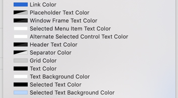
Again, remove the override and use the default label color, very creatively named “Label Color” (or one of the other Label Color variants available in the picker).
System colors
Now, while you’re changing the colors for everything, keep in mind the second rule. If you’ve ever used NSColor before, you probably remember that it can be used in two different ways:
- by passing specific RGB(A) values to one of the initializers
- by taking a preset color from one of the class properties of
NSColor, either a semantically named one likeselectedTextBackgroundColor, or one named after a specific color likeyellow
From the dark mode perspective, there are now good and bad ways to use NSColor. The bad ways include building a color from RGB(A) values, because obviously the color will be the same in both modes, unless you explicitly make two branches of code; but also the specific color properties like blue or red, because these are also set to some specific RGB values that are used regardless of the context.
It’s pretty obvious why something like NSColor.white or NSColor.black is suspicious; but why is NSColor.red or green like the ones above? They should usually be ok to use on both light and dark backgrounds, right?
Well, the thing is, most of the named colors have also matching class properties in NSColor whose names start with “system”: systemRed, systemYellow, systemBlue and so on. They were introduced in 10.10, but back then you might have thought like I did: “What’s the difference?”. You have the answer now: a systemRed color is a color that uses slightly different shades of red in every appearance, and that way it looks great on both light and dark backgrounds.
So for base colors like red or green use the systemRed variants for best effect. And for more neutral colors that normally fill most of the app UI - white, black and all the different shades of gray - you have a whole list of semantic colors in NSColor and in Interface Builder. Whenever you need a color like the blue of the focus ring, or the white background of a text field, or a link color, resist the temptation of picking a specific color manually (or using white, blue) and just find a matching one on this list. (Note: some colors were added and removed in the 10.14 SDK, but it seems that Xcode 10 is only showing the updated list if you’re running it on Mojave, but not on High Sierra.)
These colors will all automatically adapt to every appearance - and “every appearance” means not only light and dark mode, but also the translucent light and dark backgrounds, which both have slightly different color schemes - are you sure you want to pick 4 variants of each color manually (or 8, including the high contrast ones)? Not to mention the “desktop tinting” effect mentioned in the first part, which would be practically impossible to replicate in apps.
What’s more, they not only adapt to the system appearance - some of them will also follow user’s selected accent color. Remember, in Mojave you can now choose not only a blue or graphite tint, but one of 8 different colors in total, so what you may intuitively expect to always be a shade of blue might now need to be rendered as green!

It might be a good idea to switch the accent color to something other than blue while updating your app, even if you normally want to continue using a blue accent, because it will make it easier to catch when some part of the app continues to use blue regardless of system settings.
In case you want to get the actual accent color directly (e.g. for some custom drawing), you can get it from NSColor.controlAccent property (there is also an old property named currentControlTint - do not use this one, it returned an enum value that could only be set to blue or graphite, so it’s deprecated now).
Two AppKit view classes - NSButton and NSImageView - have also gained an iOS-style tint property, named contentTintColor. Currently there isn’t even any documentation for those, but they were mentioned in “What’s New in Cocoa for macOS” - they act more or less like on iOS, letting you colorize a textual button’s label or an image view’s image contents (for template images). You will most likely want to set these either to the controlAccent color mentioned above, or some brand color that you use throughout the app. (Unlike on iOS, they don’t have any tint by default if you don’t explicitly assign it.)
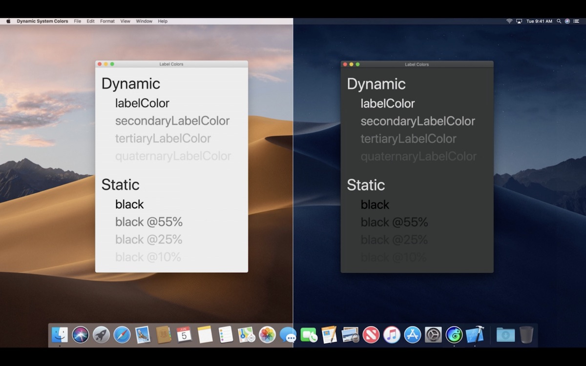
As for plain, unclickable text labels, you have the “Label Color” that you should use instead of black - but what if you want to have some lighter and some darker labels, and you’ve used different shades of gray before? The grays are likely to be much less readable if not invisible in dark mode. You could use Label Color with decreasing amount of opacity, but that’s not guaranteed to work well - a much better way is to use one of four different levels of label colors defined in the color set mentioned above:
Custom colors
It’s quite possible (and perfectly fine) that you will have some places in your UI where you still want to use a custom foreground or background color that doesn’t match any of the predefined semantic system colors or the base colors available. What to do then?
Well, of course you can always put an if/else or switch in your code and return different color variants depending on the appearance. But there’s a much better way: color assets. Since Xcode 9, we’ve been able to define the app’s various custom colors inside the asset catalog and then use them across the app without repeating the code everywhere.
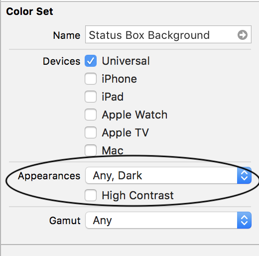
This has now been extended to allow you to define different variants of the same color asset for different appearances:
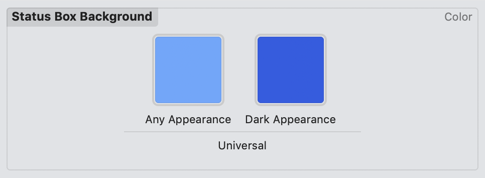
To add more appearance options in the central panel, use the “Appearances” property in the color properties panel. You can customize only dark, both light and dark, or also the high contrast ones separately (if you don’t customize the high contrast appearances, they by default inherit everything from their standard counterparts):
You can then use such asset in any place in Interface Builder where you select a color, and that color will automatically use the right variant in any appearance you support:
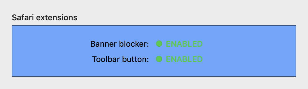
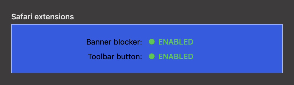
You can also use color assets from code using the init(named:) initializer:
extensionStatusBox.fillColor = NSColor(named: "Status Box Background")!
Isn’t it beautiful? 😃
One word of warning: apparently this initializer is configured to return an optional value, but even if you make a typo in the color name, it still returns a non-nil object, it just doesn’t do anything… 🤨 Unfortunately, there doesn’t seem to be any way (that I know of) to use the Swift color literals #colorLiteral with color assets like you can do with image assets.
Color assets are only available on macOS 10.13+. If you want to support older systems (or just want to do it more manually, e.g. adding some additional effects only in some appearances), you can use the effectiveAppearance property in NSView and NSWindow mentioned earlier. However, if you take that path, it’s recommended to use the new bestMatch method in combination with effectiveAppearance:
switch effectiveAppearance.bestMatch(from: [.aqua, .darkAqua]) {
  case .aqua:
    extensionStatusBox.fillColor = StatusBoxColorLight
  case .darkAqua:
    extensionStatusBox.fillColor = StatusBoxColorDark
  default:
    extensionStatusBox.fillColor = StatusBoxColorLight
}
This allows you to handle all similar appearances (system dark, translucent dark, high contrast dark etc.) with one case. You need to also provide a default, which is for “potential appearances Apple might come out with in the future” :)
If you use custom colors in your app, there’s one more great new API you can use: NSColor.withSystemEffect. This method allows you to take one base color and automatically create appropriate variants for pressed or disabled state and so on (for any appearance):
var backgroundColor: NSColor {
  if self.disabled {
    return baseColor.withSystemEffect(.disabled)
  } else if self.pressed {
    return baseColor.withSystemEffect(.pressed)
  } else if self.deepPressed {
    return baseColor.withSystemEffect(.deepPressed)
  } else if self.hover {
    return baseColor.withSystemEffect(.rollover)
  } else {
    return baseColor
  }
}
I remember building custom UIButton subclasses at my last job and trying to pick good looking shades of the dark blue and cyan-green that were the app’s brand colors for each state of the button - I’d love to have this on iOS too!
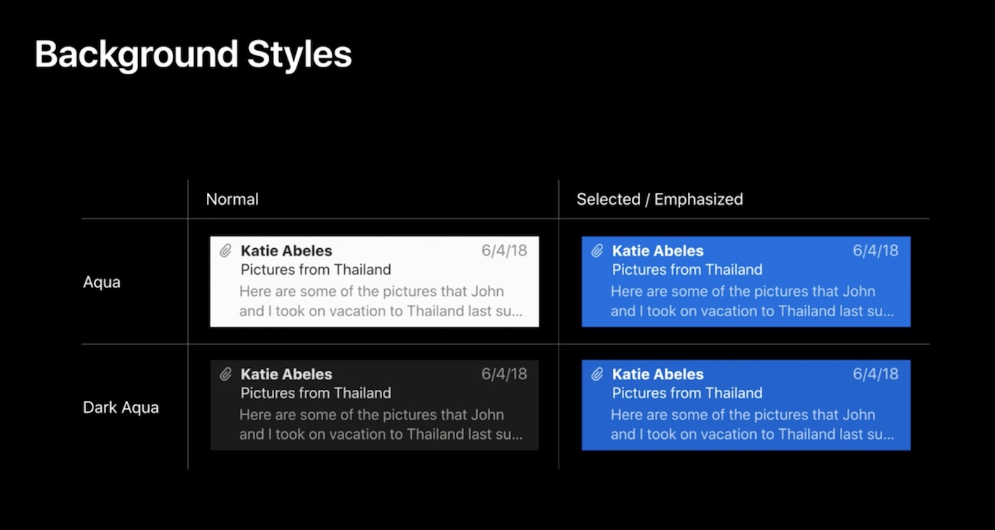
Table selection
One special case is NSTableView row selection. Previously (as I understand it - I’m not sure if I’ve ever implemented this myself) the way it was handled was that there was an NSView.BackgroundStyle enum (aka NSBackgroundStyle) with light and dark options. light basically meant white background, i.e. unselected content, and dark meant blue background for selected content, on which the text should be white instead of black. Table row and cell views had a backgroundStyle property that was automatically set by the table view, and you could override it and manually update the text color of labels in the cell to white or black.
This old system doesn’t make sense with dark mode anymore - on a dark desktop, the background will always be “dark” (whether it’s gray, blue, or some other accent color) and the foreground color should be white / light gray:
The process was also needlessly manual; the row/cell view would pass the selection status to their subviews (all system controls like labels have the backgroundStyle property too), but only direct ones, not to ones contained further in the tree in some other container views. The labels also didn’t know how to handle the color change themselves - NSTableCellView knew how to switch the color of its one default label, but if you added some others, you had to handle them yourself.
So a few things were changed here:
- The
lightanddarkenum values have been renamed tonormalandemphasizedrespectively. Normal means the row/cell looks as usual, i.e. usually white or dark gray, emphasized means it’s colored with some special color, preferably the user’s chosen accent color. This change should be backwards compatible. NSTableViewwill now set thebackgroundStyleon all views in the row recursively, even if they’re nested inside some NSBoxes or NSViews.- Labels with standard label colors (
labelColor,secondaryLabelColor) etc. now automatically handle switching between selection modes, so when theirbackgroundStyleis set, whether automatically by the table view or manually by your code, they will switch the text color appropriately for current selection and appearance. (I hope you see a pattern here - you should use these label colors as much as possible.)
Images
Images are another area that might require some tweaking for the dark mode - and here’s where it gets a bit more tricky…
The good news is that in a lot of cases you might get away with using template images, which should support any appearance automatically. In case you haven’t used them, template images are monochrome/grayscale images which are rendered in a special way by the system: from the image file only the alpha channel is taken, and the color data is ignored. The OS then basically draws the same shape you’ve prepared, but using whatever colors are appropriate for a given context.
You can turn any image into a template image by setting “Render As: Template Image” in the asset catalog, or by setting the template property to true on NSImage in code. Template images are commonly used in all apps e.g. for the standard toolbar button symbols or the menu bar icons (I’ve written before about using template images as menu bar icons when Yosemite added the dark menu bar and some app icons were not visible on it):
(Probably) all template images
Since macOS always picks the right colors itself when drawing template images, they should look just fine in the dark mode without any changes if you’ve been using them correctly. If you didn’t, any you catch any toolbar button that renders as a black shape on a dark background in dark mode, just convert it to a template image.
A nice bonus is that the OS also takes care of figuring out any selected/disabled state icon variants for you:
Now in macOS 10.14 you can even use template images to draw colored images - as long as they use a single color. Remember that contentTintColor property added to NSImageView? You can use it to apply one specific color to a template image, and it will be rendered with this color - while still applying some effects like disabled/pushed state automatically. In the WWDC talk this was used to build the “moodometer” with red, yellow and green icons - the icons were assigned systemRed, systemYellow and systemGreen tint colors respectively, and will now automatically render correctly in any appearance or state:

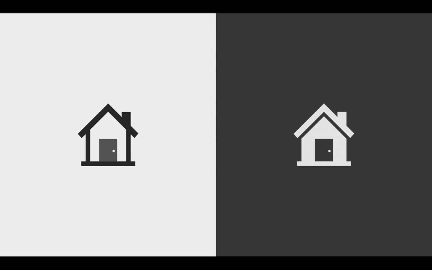
However, with full color images it won’t go as easy. You’ll need to check each one if it looks ok in dark mode or not, but probably at least for some of them you’re going to need your designer’s help (of course ideally they would be involved in the whole process from the beginning).
And even for some monochrome images you might decide to draw different versions for dark backgrounds anyway. The issue here is that, as was explained in the “Introducing Dark Mode” talk, in a lot of cases a simple color inversion or otherwise swapping or changing just the colors won’t be enough. A lot of icons look good as dark lines with light solid spaces between them, but when you turn them into light lines and dark spaces in between, they look completely different in a way that might not make sense. So a lot of icons will just need to be designed again in a completely separate dark variant; in the examples from the talk, Apple usually turned these bordered shapes into solid light shapes with no borders:
Here’s an example of a success icon in Banner Hunter’s Safari toolbar popup. I’ve used a black image rendered as is, which looked good in light mode, but worse (sometimes almost invisible) in dark mode:
It looks better when rendered in template mode:
However, a better approach is to add a separate icon for dark mode which is a filled shape:
As with colors, you can now put these different variants of the same image into the asset catalog and macOS will pick the right one automatically:

Unfortunately, it doesn’t seem like you can do that with your main app icon - which is kind of surprising, given that Apple even bragged in the talk about having a dark variant of the trash can icon. If you’d love to be able to do that in your app, you know what to do.
Custom drawing
This part just collects some random tips from the talks around dark mode that you normally won’t need in simple apps. I have to admit I haven’t used most of these APIs myself, so it’s possible some things here won’t be correct or even won’t make sense, but I’m just putting everything here for completeness' sake:
NSViewhas a new lifecycle callback method namedviewDidChangeEffectiveAppearancecalled when the appearance changes. You can implement it in your custom views if you need to do something non-standard depending on the appearance (note that the view is also repainted automatically at that point).- There is a thread-local shared variable
NSAppearance.currentwhich stores the current appearance that you can access in various drawing methods. - Custom sublayers don’t inherit appearance automatically from your views. You can either replace them with subviews, or you can implement
viewDidChangeEffectiveAppearanceand update the custom layers manually, changingNSAppearance.currentwhile doing the drawing. NSVisualEffectViewhas amaskImageproperty (since the beginning) which allows you to cut out a non-standard shape like a rounded rect or a speech bubble that will be filled with the selected material, and the area outside of it won’t.- Remember that
NSColorcontains a lot of “magic” inside that knows how to render a given color in any appearance.CGColorhowever doesn’t… so avoid storing theCGColorextracted from anNSColor- e.g. if you assign it to a layer’sbackgroundColor, it won’t automatically switch to a dark variant when needed, even if the originalNSColorwould. - For the same reason, if you take some of the “magic” colors like
controlBackgroundColororwindowBackgroundColorand draw using them in your drawing method e.g. by callingsetFillon a color (or read their RGB values and use them directly in some way), you will not get some of the extra effects like desktop tinting in dark mode. Instead, just use a system container view likeNSBoxwith a given background color or anNSVisualEffectViewwith an appropriate material (possibly also with amaskImage). - For offscreen drawing of NSImages, avoid the
NSImage.lockFocusAPI. Instead, use theNSImage(size:flipped:drawingHandler:)initializer, which lets you provide a drawing block that will be rerun when needed. - When drawing
NSAttributedStrings manually (outside ofNSTextViewetc.), if you have a set of attribute keys that do not contain aforegroundColor, for background compatibility it will default to black text instead of what’s appropriate for the current appearance. So in this case, you might need to explicitly add aforegroundColorkey set to e.g.NSColor.labelColor.
Summary & tips
To sum up, here’s what you need to remember about or update in your app to make it work well with dark mode:
- Update & test your app in Xcode 10 on macOS 10.14. If you need to keep the old SDK for releases, use
NSRequiresAquaSystemAppearance. - Watch out for elements on the storyboard that override the default “Inherited” appearance to an explicit “Aqua”, which was easy to miss before, since they usually meant the same thing in practice. This includes NSVisualEffectViews, which previously usually used an explicit “Vibrant Light” or “Vibrant Dark” appearance - they should also use “Inherited” now, which makes them automatically pick the right vibrant appearance.
- Don’t use visual effect views configured to use materials named “light”, “dark” etc. - switch to semantically named materials.
- If you branch out code into different paths depending on appearance, use the
bestMatchmethod. - When configuring container views and system controls, think hard if you really want to override their default foreground & background colors - in a lot of cases you can just leave them in their default state. If necessary, use semantic system colors, materials provided by
NSVisualEffectView, or system colors from thesystemXXXset. If you find any labels or backgrounds that override the default to e.g. white, gray or black for no good reason, just clear the override. Find and check every use ofNSColorin code. - For labels, use colors from the
*LabelColorset whenever possible. They provide several automatic behaviors that manually specified colors don’t:- they adapt to any appearance whether it’s light/dark, vibrant/non-vibrant, high or normal contrast
- they use vibrancy on translucent backgrounds
- they automatically switch color depending on table cell selection status
- If there are any custom colors you need to use in the app, move them to asset catalogs; add an
if #availablefallback if needed for macOS older than 10.13. - If you use some shade of blue as a highlight color somewhere, remember that there are many different accent colors available now. Consider switching to
NSColor.controlAccentor one of the other system colors. - If you’ve previously defined sets of related colors for drawing a control in a normal/pressed/hovered state etc., you can now use
withSystemEffectfor that. - Check any code that handles updating foreground colors in selected table view cells, it will most likely look wrong in dark mode - removing overrides and using standard label colors should fix the problem.
- Look for any black icons (e.g. on buttons) that don’t switch to white in dark mode and make sure they’re rendered as template images.
- For non-template images, create dark mode variants and add them to the asset catalog. Consider doing that also for some template images, if the icon doesn’t look right when inverted (e.g. you might want to draw a filled shape instead of an empty one).
- For any areas with scrolling, try scrolling beyond the end to trigger the “rubberband” effect and check for any incorrect backgrounds hiding there.
Links to relevant WWDC videos:
- WWDC 2018:
- WWDC 2014:
Copyright note: all pictures of slides from WWDC talks are © Apple Inc.
6 comments:
Nebula
Hi there,
is there a way to use something _NSSystemAppearanceOverride in the App preferences to force single apps to use a specific mode? Eg. a light Mail in a dark Mojave?
Cheerz,
Nebula
Kuba
@Nebula: I've tried _NSSystemAppearanceOverride now and it doesn't seem to work anymore... some people say it was removed in beta 4: https://twitter.com/zenangst/status/1018983811491794944.
You can still use NSRequiresAquaSystemAppearance on some apps to force them to stay light on a dark desktop, like this:
defaults write com.apple.iCal NSRequiresAquaSystemAppearance -bool true
And to reset:
defaults delete com.apple.iCal NSRequiresAquaSystemAppearance
But not the other way around (dark apps on a light desktop). And for some reason it doesn't seem to work with Mail (com.apple.mail)...
Kuba
There seems to be an app here that kind of automates this (but since it uses the setting I mentioned above, it only works by forcing some apps to stay light, so the menu bar / dock etc. have to be dark): https://github.com/zenangst/Gray
Nikk
Hi, I've used NSRequiresAquaSystemAppearance setting on two laptops with latest MacOS Mojave with different results. I can't figure out what can cause the difference in behavior.
One is old MBP 2012 other is MBP 2017. Both have same version of macOS and same versions of system apps. Yet on old one I can set any system app (at least ones I tried) to use light mode when dark mode enabled system wide but on new one Mail and Safari just do not react to this setting.
HOWEVER if I use `defaults write -g NSRequiresAquaSystemAppearance -bool Yes` all apps including Mail and Safari start in light mode. So they do react to global setting but not to local one and only on the new MBP.
I initially tried this on my old system to see if it works and doesn't break anything. All worked fine, but when I tried it on the new MBP these two apps refused to change. The only thing that is different is that my new system uses APFS with encryption enabled. can't think of any other differences.
Kuba
@Nikk: Huh, interesting... I don't think we can really figure out how this all works exactly, since we don't have the source code (unless someone can find something with a decompiler?), so we can only do experiments and see what happens. And we probably shouldn't rely on anything we find anyway, since it can all change at any moment...
Personally, I'm just using light mode for everything, so I don't have that problem myself ;)
Steve
Such an excellent, thorough write-up. I have learned a great amount of new things. Thank you very much!