Dark Side of the Mac: Appearance & Materials
One of the most exciting announcements at this WWDC was the introduction of a long-awaited “dark mode” in macOS 10.14 Mojave, which lets you use a whole desktop with all the apps on it in a dark theme, instead of just the dock and the menu bar as before.
While I’m not nearly as excited about it from the user’s perspective as some others are 🙂 - I’m totally a “light side” Mac user, I’ve always used a light theme in TextMate, light theme in Xcode, white background in iTerm, and I sometimes have to use reader mode on websites with a dark background - I’m actually very curious about it as a developer. The reason is that it seems to require a lot of changes across apps to adapt them to the new appearance, or at least a lot of checking and testing, but it does so in a way that feels like “making things right” - not so much introducing complexity just for this reason, but rather enforcing some order and good practices that were earlier easy to forget about. As you’ll see, a lot of work might actually be about removing things.
As with the changes in notifications, I’ve set out to collect everything related to dark mode from the WWDC videos this year and organize all the information in a way which makes more sense to me (since in the talks these things are often mentioned in a slightly random order and topics are scattered through multiple sessions). This eventually grew into the longest article on this blog, so instead of deleting some sections, I’ve decided to split it into two parts. This first part will be a bit more theoretical about some underlying features and APIs that make the dark mode work or that are especially relevant now, and the second part will be about the things you need to think about while updating the app (and in the future).
I’ve learned a lot about AppKit while writing this, and I’ve managed to clear up a lot of things which I didn’t fully understand before, so I hope this will help someone else too.
NSAppearance
The funny thing is that a large part of what makes Dark Mode work and what was explained in the WWDC talks this year was available since… 2014, when OSX Yosemite (10.10) was introduced. A lot of it sounded kind of familiar as I was listening to it, so I started digging in ASCIIwwdc, and I’ve found three videos from WWDC 2014 that were talking about the exact same things (links at the end if you’re interested). Interestingly, there was barely any mention of all that between then and now, so you have to go all the way back to WWDC 2014.
As with a lot of things before - like AutoLayout or size classes - Apple has introduced some APIs back then that were at first ignored by a lot of people, which have later turned out to be really important after some hardware or software updates made years later. And again, looking back now at the 2014 talks, it seems kind of obvious in retrospect that these APIs would eventually lead to a full dark mode.
The base class for the appearance system is the NSAppearance class, available since OSX 10.9, so even a year before Yosemite. From outside it’s a very simple class - it basically lets you create an appearance object using several predefined appearance name constants and compare appearances by their name property, and that’s pretty much it.
Inside however, it (or its related classes) hides the whole complexity of determining how things should look when each appearance is used. It determines things like:
- how various system colors from
NSColorshould look like in each mode - how system controls like buttons or checkboxes should be rendered, what foreground and background colors to use in which state, what special effects to apply
- how images should be rendered
- how system-provided images should look
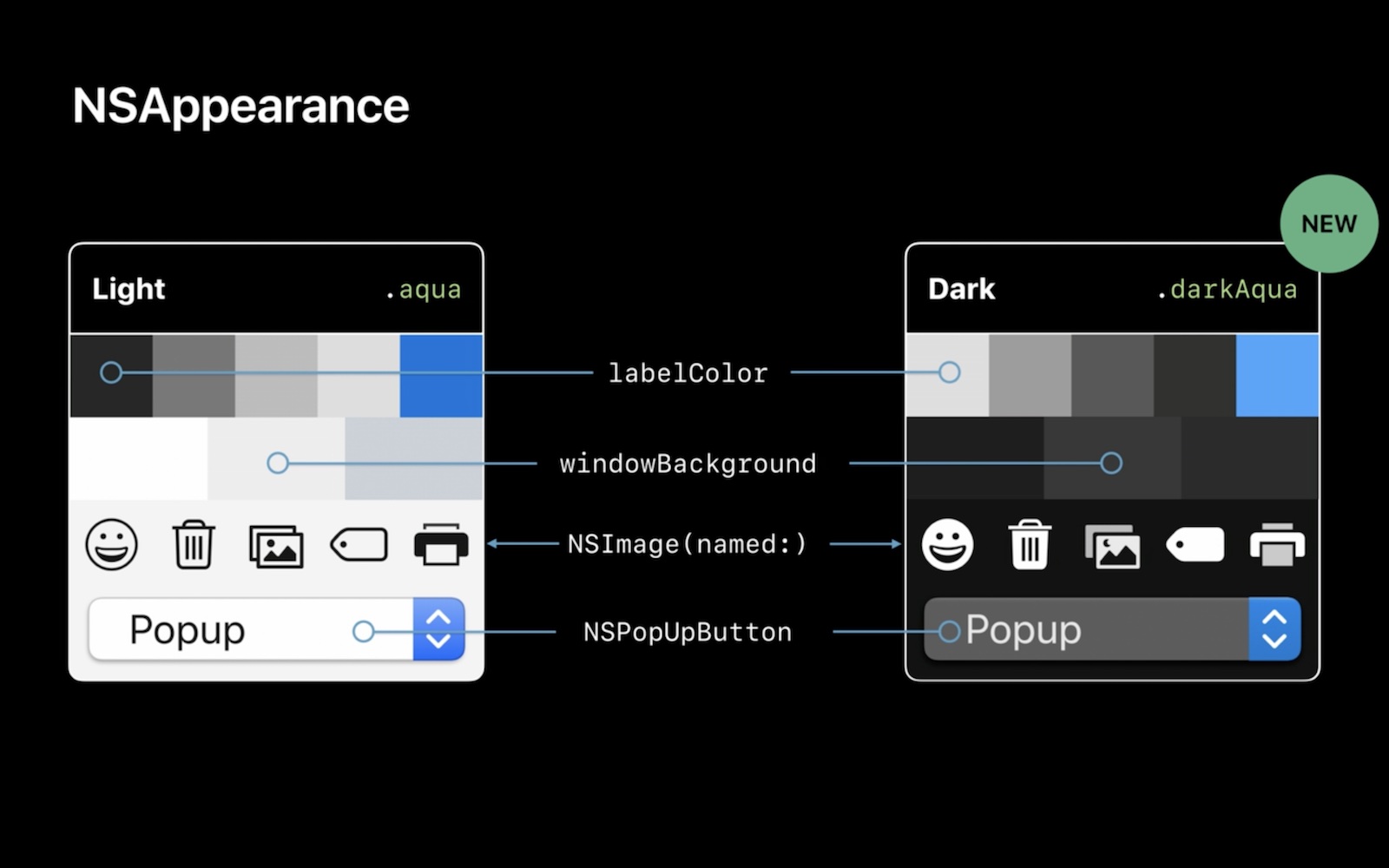
And again, all of this has been there since at least 10.10, and was presented in the WWDC 2014 videos. It had to be there, because - if you remember - Yosemite introduced all those translucent sidebars, which were mostly light (Finder, Mail etc.), but some were dark (the notification center panel sliding in from the right edge of the desktop, at least in Yosemite). And for those sidebars, a “Vibrant Light” and a “Vibrant Dark” appearances were added, which made sure that system colors, images and controls rendered differently on a blurred light and a blurred dark background.
The pictures showing that “Vibrant Dark” appearance look suspiciously similar to the “Dark Aqua” appearance now (yes, this is from 4 years ago):
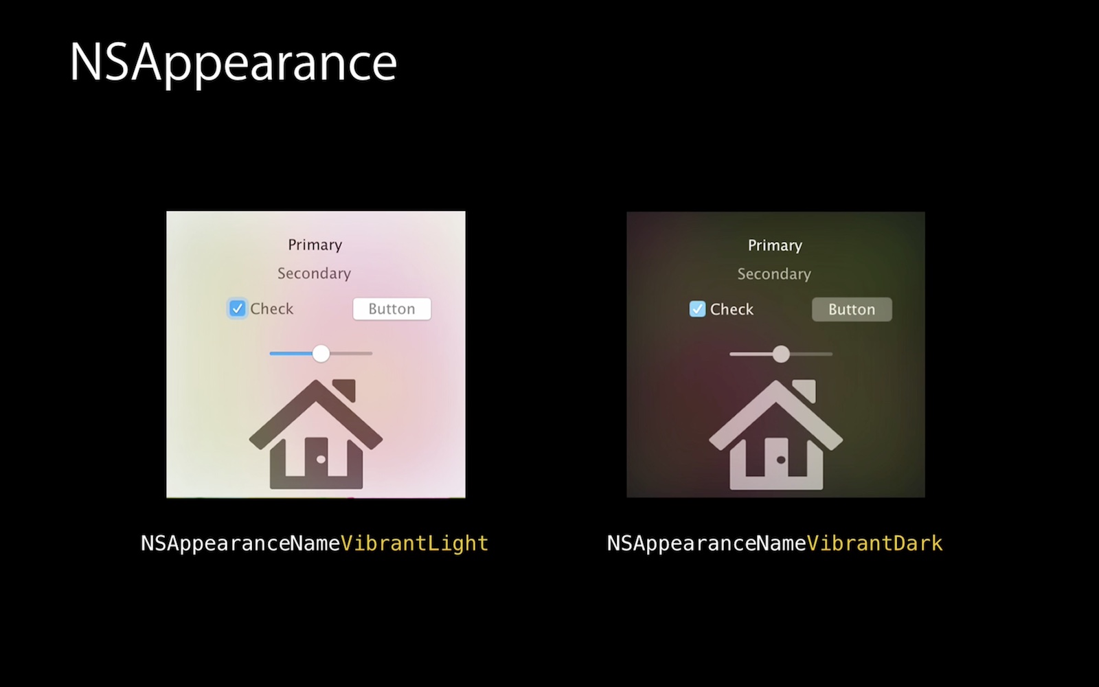
From “Adopting Advanced Features of the New UI of OS X Yosemite”
What was changed now was mostly that a new fully dark appearance has been added to the list, and it was made available for use in the whole system globally, instead of being restricted only to dark translucent sidebars.
Appearance types
Previously (since 10.9/10.10), NSAppearance existed in such variants:
aqua, the default light appearancevibrantLight, the appearance for light translucent panelsvibrantDark, the appearance for dark translucent panels
There was a lightContent appearance earlier in 10.9 meant for use on light backgrounds (lighter than the standard window background - e.g. completely white spaces or in popovers), but it was deprecated a year later, mostly replaced by the “vibrant light” appearance.
The 10.14 SDK adds:
darkAqua, the new system-wide dark appearance (I really love this name BTW :)- four combinations of
accessibilityHighContrast*appearances for variants of the above when the “high contrast mode” is enabled in the accessibility settings (it’s not a new feature, so I imagine they’ve been available before internally)
In one of the talks it was also mentioned that some version of NSAppearance is also used to provide the look of elements in the Touch Bar in new MacBook Pros.
If you need to explicitly create an NSAppearance object with a chosen style, you do it using the named: initializer (only for the standard 4 types):
self.appearance = NSAppearance(named: .vibrantLight)
Using appearance in practice
Most of the time, you won’t really be changing the appearance in your code, but rather using what is set in the system. And in most cases, the system controls should just do the right thing automatically too, as long as you build the UI in a recommended way and aren’t doing anything custom. The main exception is when you have some custom-drawn views or controls.
To determine which appearance to use, the NSAppearanceCustomization protocol is used (also available since 10.9). This protocol is adopted by:
NSApplication(since 10.14)NSWindowNSPopoverNSView
So basically by pretty much everything in the UI.
The protocol has just two simple methods:
appearancereturns the appearance explicitly set for this object and its descendants (in most casesnil)effectiveAppearancereturns the appearance that will actually be used in this object - you can think of it asself.appearance ?? parent.effectiveAppearance
This means that all elements of your app, from the whole app down to a single button, will by default use the global system appearance, but that you can also override appearance in any specific part of your app (or the whole app) to use something different explicitly.
So if you insist on making your app always look dark regardless of the system appearance, you can do:
NSApp.appearance = NSAppearance(named: .darkAqua)
Note: Apple has emphasized that you should not force dark appearance on users just because you like it more or you think it looks cool, unless it really makes sense for your app (e.g. some creative/pro apps that work with media like photos, videos, 3D graphics, where it’s important that the focus is on the user’s content and the UI gets out of the way).
And if you want to make a single window or a part of a window always light or always dark, you can do:
window.appearance = NSAppearance(named: .aqua)
view.appearance = NSAppearance(named: .darkAqua)
One trick you might need in some rare cases is that while views inherit the appearance from their superviews up to a window, and windows inherit it from the app, related windows will not automatically inherit overridden appearance from each other. So if you have some small floating accessory window that should take the appearance from a larger window within which it appears, which has a custom appearance, you can manually set who the “parent” is using a new NSWindow.appearanceSource property:
panel.appearanceSource = self.window
Materials
There are two terms that are repeated over and over in these talks from 2018 and 2014, which are kind of hard to define, but I will try to do my best to explain how I understand them.
The first one is materials. A material is one of the several system-provided types of backgrounds that should be used in a specific context like the standard background of a window, popover, context menu, toolbar, top menu and so on.
An important thing about materials is that these are often not just solid colors, but some combination of a pattern or gradient, blur/translucency and some additional visual effects appropriate for a given part of the UI - some of which might not even be applied by code running within your process, but by the window server. So there isn’t really such concept as “the r/g/b values of the standard window background color”, because the specific color of a pixel will really depend on what the OS decides to draw in a given context. So instead of specific colors, you should think in terms of semantically defined material types such as “window background” or “popup background” and let the system do its thing.
This is especially important in the dark mode, where the specific RGB color of the window background can literally change as you move the window around the screen. The dark mode uses something called desktop tinting, which means that the dark gray color of the window background is very slightly tinted with the average color of the desktop area behind the window (uniformly across the whole window, not like on the picture below). This tinting effect is also used in other materials like “under page background”, and even when drawing some of the system controls placed on top of such backgrounds.
So if you use e.g. the classic Windows XP wallpaper, the shade will be slightly more blue with the window at the top of the screen and slightly more green when it’s at the bottom. Apple has added this because a tinted gray just looks better on a colorful desktop, and a completely desaturated gray may look a bit out of place; however, if you really hate colors, you can use the “Graphite” tint color in the System Preferences, which, apart from removing the tint from controls, also removes it from the window and content backgrounds.
“The dark side of the Mac is a pathway to many abilities some consider to be… unnatural.”
- From a random internet comment
Materials are automatically provided by the SDK in a lot of places when you use system controls and containers - e.g. context menus, popovers, toolbars etc. automatically use their materials in the background, and you can add a sidebar with the familiar translucent background by using an NSTableView or NSOutlineView in the “Source list” mode.
But there is also a special view called NSVisualEffectView (available since - you’ve guessed it - 10.10) which lets you create an area in your window filled with any selected material and then put any controls you want on top of such background.
In earlier versions of macOS, the materials available in NSVisualEffectView belonged to two very different categories:
- one was materials defined by their color or rather brightness, like
light,dark, and later alsomediumLightandultraDark- all variants of the blurry translucent background used in app sidebars, differening only in what shade of gray they used - the other was materials defined by where they should be used:
titlebar,selection,menu,popover,sidebar
Confusingly, the NSVisualEffectView also had a material named appearanceBased which followed the appearance it was assigned (“Vibrant Light”, “Vibrant Dark” or the default “Aqua”), so you could use the appearanceBased material with a light or dark appearance, but also a light or dark material with any appearance, which would have more or less the same end result.
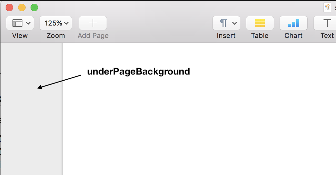
The 10.14 SDK cleans this all up. All the color-named materials are deprecated, and you should only use the semantically named materials. A whole bunch of new ones were also added to this set: the list includes headerView, sheet, windowBackground, hudWindow, fullScreenUI, toolTip, contentBackground, underWindowBackground, and underPageBackground.
So if you’ve used a “Light” or “Dark” material before - go through the list and try to find one that most closely matches the context in your app where you want to put it, e.g. if you need a background for a table view header, use a headerView material. The docs for NSVisualEffectView even explicitly say:
“Don’t select materials based on the apparent colors they impart on your interface.”
Materials are kind of important in the context of dark mode, because looking at that list of new materials added this year, it’s pretty clear that Apple wants us to use them a lot more than before, and the reason is that it makes it easier for apps to follow the system look whatever it changes to.
For example:
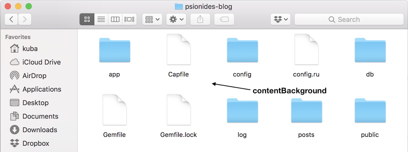
- If you have a view like in Finder, with a white window filled with some items on a grid, you might have used an explicitly set white background before, but now the background should be white in light mode and dark gray in dark mode. You could manually assign what color to use in which mode, but you can instead use a
contentBackgroundmaterial which is designed for such places, and it will automatically pick the right color for you (NSTableViewandNSCollectionViewshould use it by default, unless you’ve overridden their default background color on the storyboard).
- If you have a document window like in Pages, where some user-designed document with a white page background is put inside a larger container with some light-grey background around it, again, you could manually pick a darker shade of grey to use in dark mode; or you could instead use an
underPageBackgroundmaterial designed for this use and let the SDK handle this for you.
Some of the materials also have matching colors in NSColor which you can just use as a background color of e.g. an NSScrollView or NSBox, for example instead of adding an NSVisualEffectView with underPageBackground material you can just use an NSColor.underPageBackgroundColor fill, which should have the same effect.
Regarding the backgrounds of content areas, Apple mentioned that there are three possible approaches you can choose depending on what kind of app you have:
- in an app like Finder you can use the
contentBackgroundmaterial mentioned above to always follow the system appearance - in an app like Pages that shows user-designed content you probably want the background of the document itself to always stay white, since that’s how it would look when printed
- in an app like Mail you might want to let the user choose in the app preferences whether they prefer to see the content (the email body) always on a white background or follow the system appearance
Vibrancy
The other strange word is vibrancy. It’s something that’s very often mentioned in talks together with materials, and what it means is basically a way of drawing foreground content (text, images, controls) on top of various translucent backgrounds that improves the contrast between the foreground and background and makes this content more visible and more readable. It doesn’t really matter what exact effects this involves (and the effect might be different for different materials). What matters is that when you have some items on top of such background, they will look better if they use a vibrant appearance - with one exception: colorful images like photos or colored icons should be displayed unmodified. (If you want more details about how the vibrancy algorithm specifically works, watch “Introducing Dark Mode” starting from around 17:00 and “Advanced Dark Mode” from around 29:00.)
For system views and controls this effect is mostly applied automatically: the NSVisualEffectView picks an appropriate “Vibrant Light/Dark” appearance for itself and its descendants, and system controls know how to render themselves in these vibrant appearances. As a test, I’ve put some labels - both with the default label color - inside visual effect views, one with a vibrant appearance and the other with appearance explicitly set to a non-vibrant “Aqua”. I then checked their pixel colors with Digital Color Meter - it’s kind of hard to see through the antialiasing, but in one of them at least some darkest parts use a perfect gray, and in the other those parts are always slightly tinted towards the green, which is the color visible in the background (because something green was behind that part of the window):
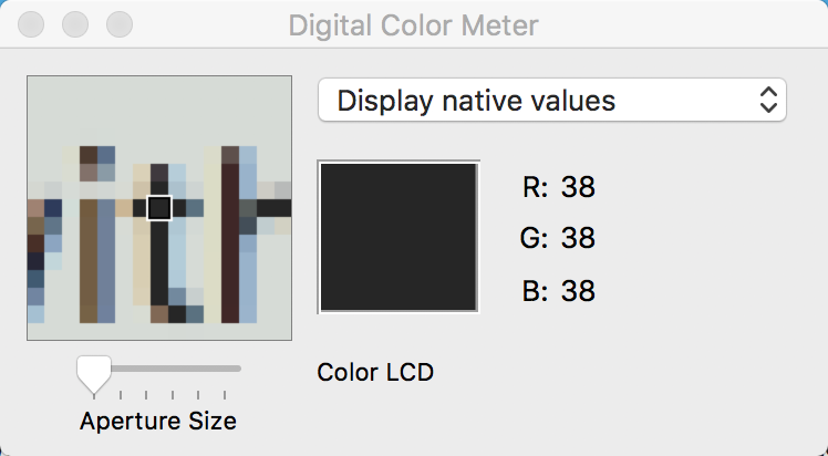
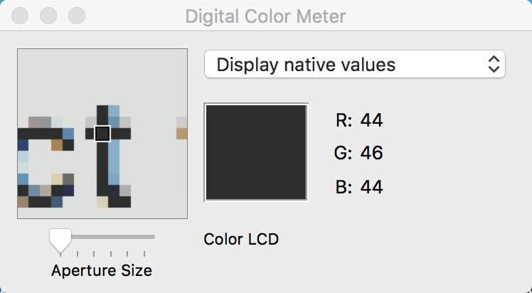
Aqua on the left, Vibrant Light on the right
This only works if the label uses one of the standard label colors - if you set an explicit color with custom RGB values, it will always use that color as is; labels with other system colors like controlTextColor will also not draw vibrantly (unless something changed since 10.10). NSImageView will automatically use a vibrant appearance when rendering an image in template mode, and will disable vibrancy when rendering a normal colored image (since applying these effects could mess up the colors on the image).
If for some reason you’d like to disable this automatic behavior like I did - which is not recommended - you can always put the relevant controls inside another container view like NSView or NSBox which has its appearance in IB set explicitly to “Aqua” instead of the default “Inherited”. IB doesn’t let you set this on an NSVisualEffectView (you can only set it to “Vibrant Light”, “Vibrant Dark” or “Inherited”), but you can do the same thing in code. Note though that if you do that, it will use an Aqua appearance even with the app running in dark mode.
Also, the behavior of NSVisualEffectView has slightly changed in 10.14 (this was mentioned near the end of “Advanced Dark Mode”): in 10.13, if a visual effect view has the appearance set to “Inherited”, it uses that appearance directly. So since the app is running in Aqua appearance (the only one available), the visual effect view will also use the Aqua appearance, which means the controls drawn on it will not be vibrant. They are only drawn vibrantly if the visual effect view uses a “Vibrant Light” appearance.
On 10.14 however, NSVisualEffectView automatically picks a right vibrant appearance matching the system appearance if you keep the default “Inherited” option - so if the app is running Aqua, the visual effect view will use “Vibrant Light” for its controls, and in Dark Aqua it will use “Vibrant Dark”.
Vibrancy in custom views
As I explained above, vibrancy should mostly work automatically - you might however need to think a bit more about it if you have custom views, especially views that contain system controls inside. To enable vibrancy in your view, override this property, which returns false by default (do not override this in subclasses of system controls, e.g. custom NSButtons):
var allowsVibrancy: Bool {
  return true
}
This means that your custom view or control will get the same effects that system controls get. Then, if you do some drawing in a draw(_:) method, you just draw things there as usual - it’s recommended though to only use shades of gray, ideally system label colors like NSColor.labelColor and its friends (it’s totally fine to use them for things other than text). Non-grayscale colors might be affected by vibrancy in a way that won’t look good.
Be careful however if you’re overriding this property on a container view that contains a hierarchy of subviews inside - in that case, vibrancy will be switched on for all of them even if they would normally ignore it (e.g. NSImageViews showing some photos) and can’t be turned off. So it might be safer to only override it in “leaf” views that don’t have any further subviews.
Note that a view will only actually use vibrancy if all of these conditions are true:
- the view’s effective appearance allows vibrancy (
NSAppearancehas a read-only propertyallowsVibrancy- all the “Vibrant” appearances have it set to true) - the view itself (or its ancestor) allows vibrancy by returning true from the above property
- the view is inside a visual effect view
So you can safely make your view always return true and it will only use vibrancy if it’s inside a visual effect view, and will render normally outside one. If you’d like to do something differently depending on whether vibrancy will or won’t be applied, check the allowsVibrancy property of the effectiveAppearance.
That’s all in this part - the second part will be about how you should update the colors and images in your app to make it look good in dark mode.
Links to relevant WWDC videos:
- WWDC 2018:
- WWDC 2014:
Copyright note: all pictures of slides from WWDC talks are © Apple Inc.
4 comments:
orta therox • orta.io
Great write up!
Peter Nikolow • www.mobiliodevelopment.com
Amazing!
Eduardo C. Cuansing
I am not convinced.
Jorge Leandro Perez • www.lantean.co
Loved this article. I'm dealing with... Dark Mode annoyances, and you might have just saved me up several hours!