WatchKit Adventure #1: The Big Picture
Update 03.07.2019: watchOS 6 has changed a lot of things that I’ve written about here, so I went through the post again and updated all parts that got out of date.
For some reason, after watching WWDC talks mentioning watchOS in the last few years, I had this image in my mind that almost every version changed everything in how apps are built. I remembered something about native and non-native apps, two different types of app schemes in Xcode, and some diagrams of pieces moving from one box to another, on more than one occasion. This all sounded confusing, and I think that’s one reason why I was discouraged from starting, because I imagined it would make it hard for me to catch up with all of that.
As it turned out, this wasn’t really true. Well, not until watchOS 6 at least 😉
In this first episode, I want to start with a bit of an overview of what pieces a watchOS app consists of, how they fit together and how it all changed since the first version. Like with my Dark Mode articles, what I’m trying to do here is collect the information I’ve found in docs like the App Programming Guide for watchOS, the official documentation site and in the WWDC videos I’ve watched, and organize it in a way that makes sense to me (and hopefully to others). I’ve found that very often related pieces of information are scattered through several talks, and it only starts making sense to me once I collect some notes while watching them and then rearrange everything, grouping things by topic, so that I see all information in the right context.
This got a bit long, but bear with me, I expect next episodes to be shorter and much more practical :) (*)
(*) Spoiler: they’re longer ¯\_(ツ)_/¯
The watchOS application
The first thing to note is that unlike macOS, iOS and tvOS, watchOS is (still) not a completely independent platform: the Watch relies to a larger or smaller degree on the paired iPhone. It can work independently for some periods of time without the phone, especially if it’s an LTE variant, but it cannot completely exist without one. You need an iPhone to set it up, to update the OS, or to change some of the settings through the “Watch” app on your iPhone.
Over the years, this relationship got more and more loose, as you’ll see in a moment - but the connection is still there, and it probably won’t disappear completely soon.
One important aspect of this, which as far as I know hasn’t changed so far, is that Watch app’s storage isn’t backed up at all to iCloud or local iTunes backup when you sync your phone. This means that you should not let it keep any precious information that can’t be recreated and isn’t synced anywhere. Anything that’s created on the Watch should be quickly synced at least to the companion iOS app (if there is any), and ideally straight to the cloud.
This close relationship between the Watch and the iPhone means that in a lot of cases your users might want to perform the same activity simultaneously on both devices. The Watch then acts as a kind of external controller for the iPhone - for example, when the user starts a podcast on the phone and controls it on the watch, or is tracking a workout on the watch but also checks the position on the map on the phone, or uses the Watch Camera app to take a photo of themselves from an iPhone a few steps away. Because of this, it’s often important to sync not only the created data, but also the state of where the user is in the app. This greatly depends on the kind of app though - for some apps it will be obvious to also have an iOS app and use them together, and for some others you might not even want to build an iOS app at all.
The Watch app and the extension
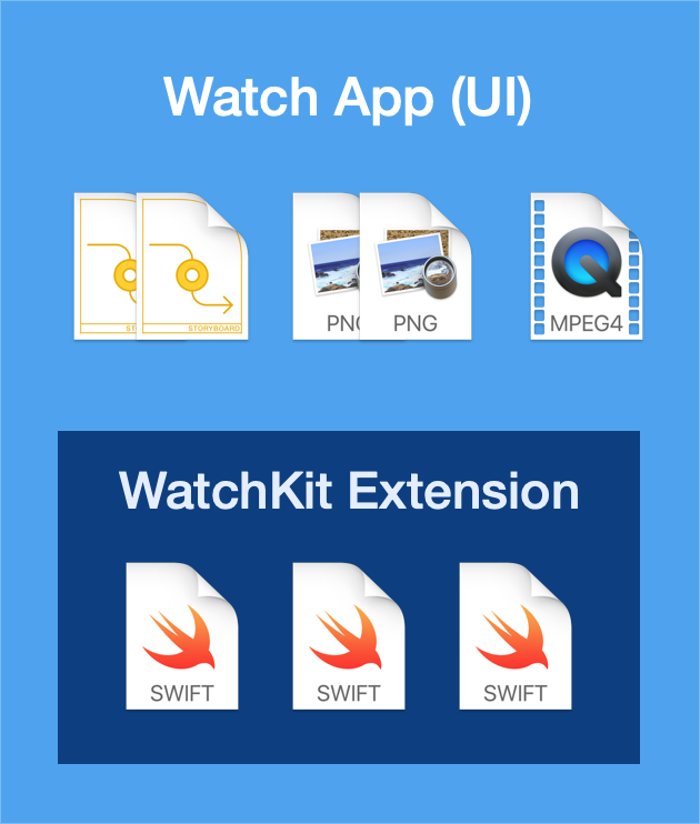
The most striking difference between how iOS and watchOS apps are built is that WatchKit apps are strictly divided into two very different parts. These two parts are packed into two different bundles and can’t directly communicate with each other at runtime.
The first part is called by Apple the Watch app - kind of confusingly, since what we normally understand as “app” is really both those parts taken together (they sometimes literally say that the watch app is a part of the watch app). I will often call it instead more explicitly “the app UI” or “the UI”.
This part handles the on-screen parts of your app, and it consists only of your app’s storyboards and the assets you put in the bundle with them to be used in the UI. It does not include any code files. The UI is managed by the system at runtime and you only have limited access to it.
The second part is called the WatchKit extension. This includes all of your watchOS code, your view controllers and models, everything your app does. It does not include any storyboards or XIBs, and in fact cannot create any WatchKit UI elements itself. Building your view hierarchies in code, as some people do in iOS apps - by creating instances of UIViews inside view controllers and putting them together using layout anchors - is completely out of the question. Your code cannot actually add or remove a single thing from the UI, it can only change properties of existing UI elements - but the list of views present in the view hierarchy and how they are arranged has to be decided up front and defined on the storyboard, and is set in stone when the app launches.
This splitting of the app into two parts is the single strangest thing in watchOS for me, and I expect this to be one of the biggest challenges, at least for non-SwiftUI apps. It doesn’t mean you can’t modify anything in the UI apart from contents - you can actually achieve quite a lot by changing the alpha and hidden properties of views or their exact positioning within groups (watch the “Layout and Animation Techniques for WatchKit” talk for some great examples), and you can even switch out whole screens inside container controllers. But it definitely limits the range of things that are possible at all.
(This gets kind of complicated with SwiftUI introduced in watchOS 6, since in SwiftUI your UI is code… From what I’ve seen, newly created WatchKit apps with SwiftUI include a storyboard with just a hosting view in the “Watch app” bundle, and SwiftUI view code in the extension bundle. It’s not clear to me yet how much this division still exists in practice in SwiftUI apps and how much it still limits your movement.)
On disk, the WatchKit extension bundle is packaged inside the UI bundle. This is kind of important, because it means that the UI can access any resources shipped both inside itself and the extension bundle, but the extension cannot access resources shipped inside the UI bundle. You need to keep that in mind when adding e.g. image assets, videos and other resources to the app.
The two parts also use separate data containers, so if the extension downloads some files or data from the Internet or the iPhone, by default it puts them inside its own container, to which the UI has no access. In order to share files between the UI and the extension, you need to use App Groups and put the files in a shared data container.
What’s changed over the years
What I’ve described above - about watchOS apps being strictly divided into two separate parts - has worked more or less like this since watchOS 1.0 and it still works like this in watchOS 6. What’s changed between OS versions is where these parts are running:
In watchOS 1, the app UI was running on the Watch, but the extension was running on the iPhone. The extension could communicate very easily with the iOS app on the same device, but every communication between the extension (i.e. all of your code) and the UI had to go between devices, which made apps extremely slow.
In watchOS 2, the WatchKit extension has been moved to the Watch. Apple called the new-style apps “native Watch apps” - somewhat confusingly, since both kinds of apps are native in the usual sense, in that they’re written using ObjC and Swift, and not web technologies or some other kind of emulation.
This made apps run much faster, but it also meant that the way of communicating between the iOS app, the WatchKit extension and the UI and how the data is stored and moved has changed significantly, and that was probably the biggest problem during the migration. In order to make it easier to communicate between the iOS and watchOS apps, Apple introduced the WatchConnectivity framework that lets you send data back and forth between the phone and the watch. (Another problem was that the extension now had access to a more limited set of SDKs on watchOS instead of all iOS ones, although most of the missing ones have been added to watchOS in later versions.)
In watchOS 4, the extension and the UI have been made to run inside a single process in memory. The slide from the WWDC talk with the moving boxes looked like the one during 1.0 → 2.0 migration, but in fact very little has changed this time from the developer’s perspective, and apps didn’t even need to be recompiled. The only effect is that apps now run even faster, but the two parts are still strictly isolated, so it didn’t make the development any easier than before or enable any new functionality.
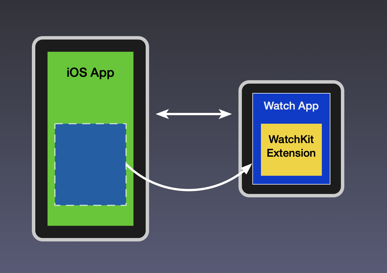
Independence from iOS
The most recent major change was in the relationship between the iOS and the watchOS app. Up to watchOS 5, a WatchKit app always required a companion iOS app and was bundled inside it:
Older version of that app structure picture (watchOS 1.0 to 5.0).
The Watch app was downloaded to the iPhone when you installed the iOS app - even if you didn’t own an Apple Watch! - and then from there it was automatically or manually copied over to the Watch. This meant that if you had an idea for a watchOS app, you also needed to build an iOS app with at least some minimal UI to contain it, even if that wasn’t your focus - there was just no other way to ship a Watch app to the App Store.
WatchKit apps also initially relied on a connection to the iPhone for most communication. A Watch could only connect by itself to “known Wi-Fi networks”, i.e. those to which you had connected before using your iPhone, in practice - mostly your home/office networks.
With watchOS 4 came the Series 3 LTE Watch, which allowed people (those who were willing to pay extra and used the right cell carrier) to leave their phone at home and connect to the Internet using just their watch, from anywhere - well, at least within their own country. And watchOS 5 added an ability to connect to any new WiFi network you found, typing in the password on the watch.
However, since the iOS app was always guaranteed to exist and be installed and available, it was still treated as a kind of “source of truth” that could be relied on most of the time. Even if the watch was away for some periods of time, and could even connect to the Internet by itself, it always came back in range with the phone sooner or later and the apps could sync the changes. In early WWDC talks it was even explicitly recommended to prefer copying data that the iPhone has already downloaded from the Internet to the Watch through WatchConnectivity instead of downloading it second time on the Watch.
Finally, in watchOS 6.0 WatchKit apps have finally “declared independence”. You can still have a Watch app that requires an iOS counterpart and closely cooperates with it when possible (“dependent app”), but you can also allow your app to be installed by itself, without the iOS version (“independent app”). And you can even build Watch apps that do not have an iOS version at all (“watch-only app”) - if you’re only interested in the Watch app, there’s no point wasting time on some useless iOS walkthrough or settings UI just so the App Store review doesn’t reject it.
Watch apps also aren’t bundled inside iOS apps anymore (and this includes all existing apps, even if they aren’t rebuilt on the watchOS 6 SDK yet). They are separated by the App Store service, so the iPhone only installs the iPhone part, and the Watch only installs the Watch part (and trimmed of any binary and asset versions not needed for this specific device). They are still however (as far as I know) shipped together, packaged into one, when you make an App Store release - I don’t think it’s possible to have both an iOS and a watchOS app and only release an update to one of them at a time (though I don’t know for sure).
Since the Watch apps are getting more and more independent - they can connect to the Internet through LTE or WiFi without iPhone’s help, and the iPhone app might not even be there on the phone - the latest recommendation is now to download all data straight from the network using URLSession, CloudKit and so on, and only use WatchConnectivity when you really need it (the slide literally says “Migrate all WatchConnectivity usage to URLSession”).
However, remember about those cases mentioned earlier where the user uses both apps together (workout, camera etc.) - in those cases you will definitely still want to use WatchConnectivity (and/or NSUserActivity) to make sure that things like current position in the podcast or distance moved during a workout stay in sync between the two apps.
More than one UI
iOS apps usually have one main point of entry. When people talk about an iOS app, they usually think of the icon that they see on their home screen and the full screen view that appears when they select it. There are of course various extensions that can let you access the app from different parts of the system - like share extensions or “today” widgets - but they’re generally considered only accessories to the main app, in which you spend most of the time.
With watchOS apps, things are very different. There is a main UI, but depending on your use case it might not be the most commonly used one.
The difference is that Apple Watch apps have completely different interaction patterns than iOS apps. On iOS, we open an app and then spend many minutes, possibly hours, scrolling the content (to the point that Apple had to add the Screen Time feature in iOS 12 to help us control ourselves).
On watchOS, the key word repeated by Apple over and over is glances or glanceable. The expected way of interacting with an app is: raise your wrist, look at the watch, make one or two taps (or even none at all), maybe scroll the crown a little bit, lower the wrist, and go on with your life. The average time spent on such action will be measured in seconds - in fact, it’s recommended that you try to target 2 seconds as the time in which the user can find the information they want (“glanceable”) or perform the action they need (“actionable”). No one will be holding their arm up for 15 minutes browsing Twitter on a 1.5" screen, because it’s just not comfortable.
And if you’ve ever used any watchOS app, you probably know that it can be tricky to find the information you want there. First, you have to find the app on the home screen, which can take forever on the hexagonal grid (the list view is much better IMHO). Then you have to wait for it to load, and the screen sometimes goes dark before that happens. And then search through the different screens in the app to find what you need.
Because of this, depending on the kind of app you build, it’s very much possible that your main UI will only be used occasionally. WatchKit apps can have a few other entry points which can be just as or even more important, which I’ll talk about below.
Notifications
Notifications were present on iOS since basically forever, and watchOS doesn’t really provide anything beyond what we already know - it simply forwards all incoming notifications to the watch and shows them there (as long as it’s unlocked and you aren’t using the iPhone at the same time). It does that for all iOS apps - even those which don’t include a Watch app at all (which is the vast majority of them).
However, because of the ease of access - you literally need less than half a second to look at your watch, compared to pulling your iPhone out of your pocket or purse - a lot of people will tell you that notifications are the main thing they use their Watch for (apart from just checking the time).
This will depend greatly on the kind of app you’re building, because for a lot of apps it makes no sense to have notifications (and it could even make the experience worse if they insisted on adding them). But if your app’s purpose is to notify users of some things that happen at irregular intervals, notifications could be the single most important piece of your app. One example could be the Reminders app - you can set reminders through Siri and get notified through notifications, and you might rarely need to open the actual app at all.
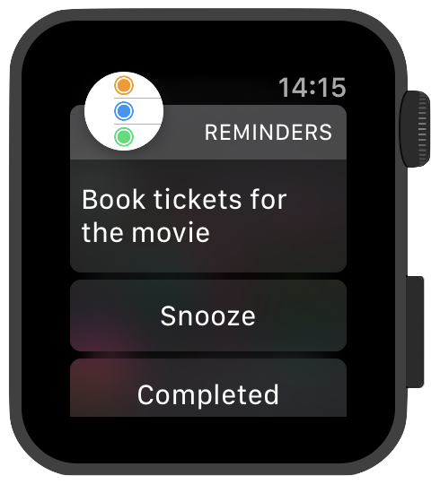
If notifications are important in your app, you can provide a special notification interface for watchOS, which can show any custom UI as the notification content and some action buttons below. The UI has 3 variants:
- static with only preset info, used as a fallback
- dynamic which presents some non-interactive dynamic content
- and dynamic interactive, available since watchOS 5, which allows user-interactive controls
watchOS 6 also lets you send remote push notifications specifically to the Watch, bypassing the phone.
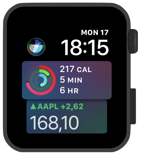
Glances / Dock
Since version 1, watchOS has included an interface kind of similar to the iOS app switcher, accessible by swiping up from the bottom edge. It showed a set of app “cards” side by side, scrolled horizontally. These cards were called “glances”, and they were meant to present some selected, most important pieces of information from the app in a way that lets you quickly scroll through the list, look at the card, read the information you need and leave. If you wanted to learn more or perform some actions, then you could tap a card and get redirected to the main app UI, but that shouldn’t be a requirement.
Glances were built from a completely separate scene on your storyboard and were set up separately from the main UI, using one of predefined templates. However, in watchOS 3 they were deprecated and replaced with a “dock”, accessed by pressing the long button on the side of the watch.
The dock works in a very similar way as glances, but the cards shown there are based on the actual UI of the main app (like on iOS). The way it’s done is that at various points in the app lifecycle the OS saves a “snapshot” of what can be seen on the currently visible view controller, and that snapshot is shown initially as a static image in the dock. When you stop scrolling the dock and settle on a selected app, the system starts waking up the app and a moment later the actual live view of the real app replaces the image (you can see that e.g. if you start a timer in the Timer app - it shows a static time at first, which starts animating once you scroll the app into view and wait a short moment).
(It was mentioned that the dock snapshot view does not have to be identical to what’s displayed in the app, and it could show some special, simplified view if it makes more sense, but it’s not clear to me how this should be done. The API doesn’t receive a reference to a screen or an image, it simply saves the current screen after you tell it you’ve finished updating it.)
In watchOS 4 the dock UI was replaced with a vertically-scrolling one. This made it more similar to the iOS version, since the cards overlap one another a bit, but at the same time it has arguably made it less “glanceable”. You can say it traded the ability to easily see all information on the cards for the ability to quickly find the app you want to switch to. Apple however still emphasizes how important it is that the information on the dock snapshots be kept up to date at all times.
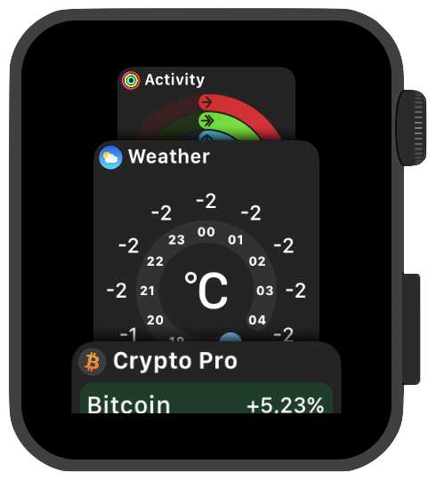
Complications
“Complications” are a funny name Apple uses for all the widgets you can see on the watch face:
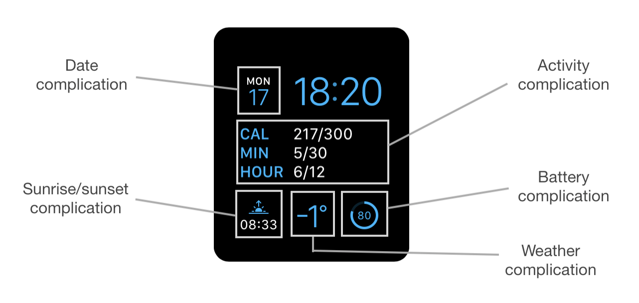
There are several different “families” of complications, built for different watch faces - circular or rectangular, small and large, and the Series 4 Watch even adds some curved ones that fit in the corners of the crazy new Infograph watch face. On the picture above, you can see complications from the “Modular Small” and “Modular Large” families.
What they (almost) all have in common is that they have an extremely small amount of space to present their information. They are also visible all the time (those that are active) and need to be always up to date.
As you can imagine, this couldn’t have been implemented by just letting apps run in the background whole day and giving them full access to their piece of the watch face, because this would have drained the battery too fast.
The way Apple has solved this is that you periodically provide a timeline of values to be shown on the complication in given time ranges, and you do this in advance. The system stores this data and then automatically switches to the correct state at a right moment. You also can’t show any arbitrary content on your complication - you have to choose one of the predefined templates for a given complication family, and then fill it with some data prepared in a way that potentially lets the system simplify it if necessary to fit it in the available space. Most complications are also monochrome - they are drawn with the same color selected by the user as everything else on the watch face.
This all makes it incredibly challenging to figure out how to do something useful with this tiny space with all those restrictions - but in a way constraints can also simplify your work, because you only have a limited number of options to choose from.
Apple has initially said that complications only make sense for some subset of apps, which is of course true - not every app will have some crucial piece of information it can show as a single number or one line of text. However, since watchOS 3 they started recommending that all apps actually implement a complication, even if it’s just a static launcher that gets you into the main app (a lot of built-in apps have followed this approach).
The reason is that if you have some app that you use often, a complication on the watch face really is the fastest way to open it - a single tap and you’re there. And it’s even more important since in watchOS 3 Apple has made it so that all apps that have an complication on the current watch face (and also all apps in the dock) are kept suspended in memory if possible the whole time, so they open much faster. So consider adding a complication as a launcher for your app, even if it doesn’t actually do anything else.
(You can read more about complications in Episode #2.)
Siri
The last point of entry is Siri. I haven’t really looked into this part so far so I can’t tell you much, but as I understand, SiriKit has been available on watchOS since 3.2 and it has allowed voice access for some specific subset of apps like messaging, todo lists or taxi apps for a while. With Siri Shortcuts in iOS 12 and watchOS 5, this has now been expanded to a lot more possible use cases.
watchOS 5 also gives you access to the Siri watch face, where you can provide entries for the list visible on the watch face that either show some piece of information from your app, or act as shortcuts to quickly perform some kind of action:
Again, depending on the kind of app you’re building, this might be something you can completely ignore, or potentially the most often used view into your app. You decide.
With the overview part behind us, let’s start building something now :)
I’ve created a repo for the app on GitHub - for now it’s just an empty app from the template, but watch it if you’re interested. In the next episode, we’ll try to build some minimal viable version that shows some actual data.
3 comments:
Valeriy Van
>“Complications” are a funny name Apple uses for all the widgets you can see on the watch face.
Yes, complication is a funny name, but it used by watch industry. It wasn't invented by Apple.
Jan Z
This is really useful content. Apple's docs really don't touch on this level of context, and I'm finding this invaluable. Many thanks for taking the time to write this!
(Captcha is great too!)
Kuba • mackuba.eu
Thanks Jan, I'm glad you like it! From what I've heard, it looks like I will need to rewrite some parts of this post again soon… (there are some rumors of Watch apps moving to a new architecture now, not in the form of a "WatchKit extension" anymore).