WatchKit Adventure #3: Building the App UI
This is the third part of my series about building a WatchKit app that shows current air pollution level on the watch face (it started here). In this episode, we’re going to build the app’s main UI. I will be building on top of some data handling & networking code written in the previous episode about complications, so if you haven’t seen that one, you might want to at least skim through it to get some idea about what this is about. Browse through the WatchKit category to see the whole list.
We’re venturing into a somewhat uncharted territory now… The WWDC talks about WatchKit are an amazing source of information and they’re great to get started (I definitely recommend watching them, especially the earlier ones, from 2015 & 2016), but once you actually start building things and run into a problem, there’s surprisingly little help available. Even StackOverflow isn’t of much use. There aren’t many books out there either that are up to date - I got one from raywenderlich.com, but it doesn’t really answer the hard questions, and it wasn’t updated since watchOS 4; Paul Hudson has another, and that’s pretty much it.
I’ve tried to figure out some things myself, but some questions are left unanswered. If you know how to solve anything better than I did, please let me know in the comments.
The two frameworks
watchOS SDK launched first in 2015 with a new UI framework called WatchKit. It was a very different framework than what we knew from macOS and iOS, a framework specifically designed for the Watch and all its inherent and temporary limitations - and also limited in what it could do and what you could do with it. It got people excited, but also very quickly frustrated, once they’ve run into these limitations. It didn’t help that Apple’s own apps were very obviously doing some things in the UI that weren’t possible to external developers, clearly using some internal APIs Apple needed to build more powerful apps, but which they didn’t want to share with us.
So of course the hearts of Watch developers started beating faster when we heard the brief mention “… and a new native UI framework” during the 2019 keynote - said almost as if we were supposed to miss it. Of course about two hours later we’ve learned that this new framework was SwiftUI, built not only for watchOS (although that’s how the whole thing started, apparently!), but for all Apple platforms. A thing that would completely change Apple platform development.
However, as people who have rushed to try out this new framework quickly discovered, SwiftUI as released in the iOS 13 SDK was “a pretty solid version 0.7” - a massive step forward of course, especially on watchOS, but still more of a beta. The “version 2.0” released this June seems like a very decent update, but it’s not stable yet and at this point it’s still unclear if it solves most of the issues that people had with the first release.
So here we are, with two frameworks, an old one that’s very limited, and a new one that’s still kind of unfinished. Which one should I use to build an app right now? Which one should I learn?
Well… ¿Por qué no los dos? 😎
Seriously speaking, my intuition tells me that if you’re starting to build a new Watch app right now, it probably makes more sense to go with SwiftUI. Since the platform was much more limited previously, the gain from using SwiftUI compared to the old way is probably much bigger than on iOS, and while on iOS you’re likely to often run into things you can’t do with SwiftUI that you could with UIKit, it’s probably more of the opposite on watchOS.
But since I haven’t really built anything with the plain old WatchKit before, I still want to have this experience, if only just to have a broader knowledge of the platform. So let’s build the app in the classic WatchKit now, and then we’ll do the same thing again in SwiftUI and compare.
Design
Before you start writing code, it’s good to spend some time first designing and thinking about what you’re actually planning to build, how it should look and work and why. Perhaps even away from the computer, with a pen and a piece of paper. This is true for any kind of app, but especially for Apple Watch apps. Watch apps are designed for extremely quick interactions, on the order of a few seconds - the user should be able to open your app, find the information they need and leave, without spending too long trying to understand your app’s layout and navigation. So it’s worth spending some time to make sure that your app really works this way.
I started by listing the things the user might want to see and do in this app:
- see the current pollution level
- view a history chart with earlier values
- select the monitoring station
- select the specific parameter
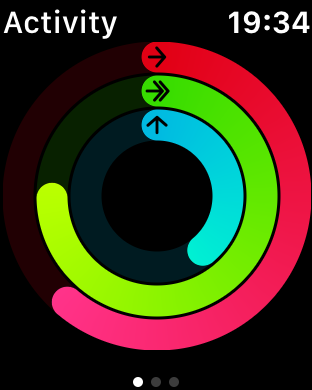
Next, I looked through the apps I have installed on my Watch (mostly first-party ones) to get some idea and inspiration about what layout and navigation they use and find something somewhat similar to what I want to build. In the end, I think the Activity app looked closest to what I imagined: a big circle with the 3 colored arcs, showing you the most important information at a glance, and then by scrolling down you can access some additional information like per-hour charts, steps count and so on.
I got a piece of paper and did some planning and drawing, and ended up with something like this :)
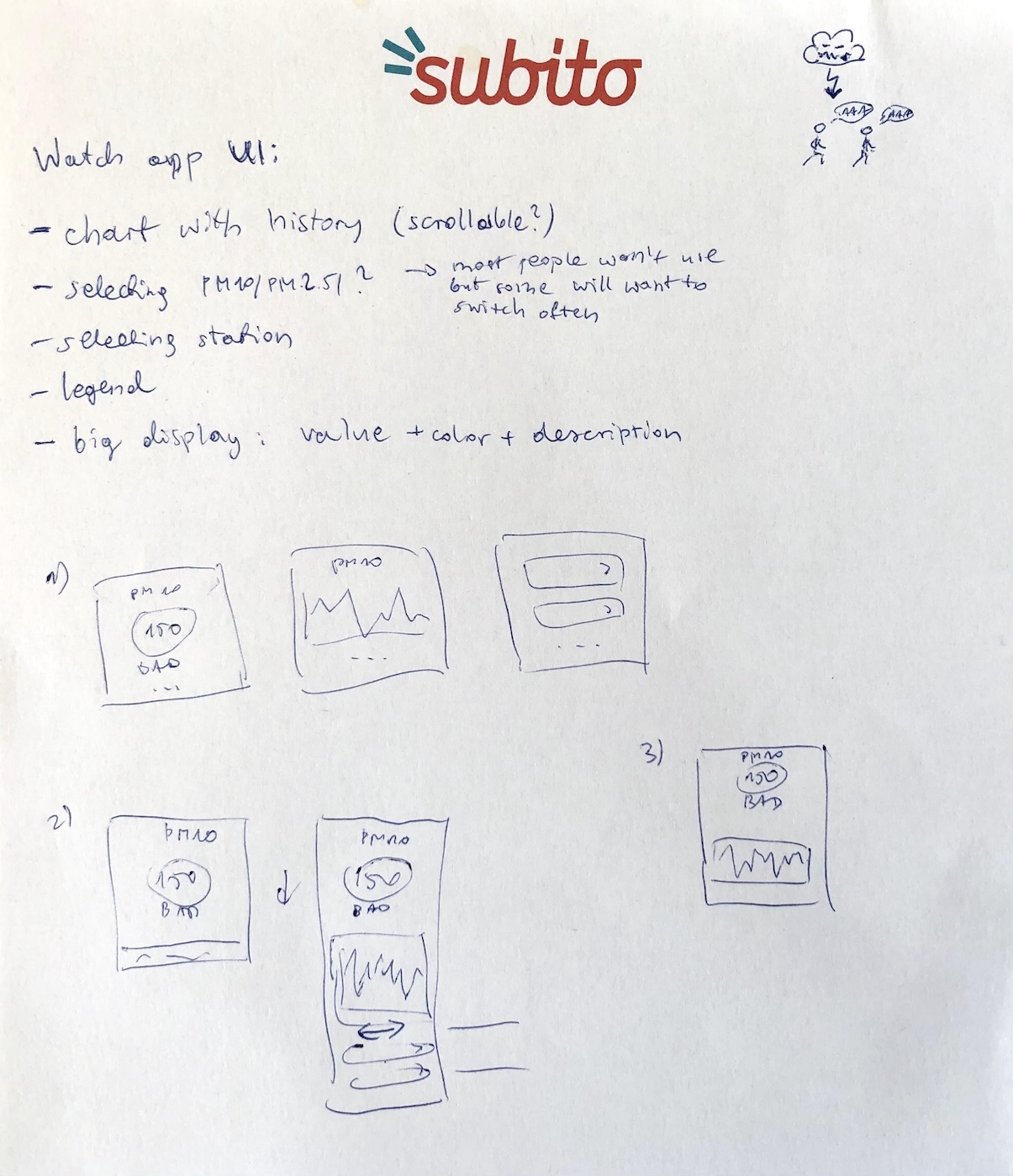
The option 2 is what I went with - I figured that having a big colored circle with the PM value on the first screen would fit the idea of making the app “glanceable” by providing the most important information first, same as in the Activity app.
I managed to build the complete app in about 4-5 days. I want to describe the whole process here, but this got a bit long so I broke it into two parts: the main screen and the list that lets you select the measuring station.
The status screen
Like from the beginning, I’m doing anything in the open, in a repo on GitHub - licensed under WTFPL, so you’re free to reuse any piece of code for anything you want. If you want to follow with me in Xcode, here is the commit from which we start, and here’s the complete version (after this first part of the tutorial).
Open our Interface.storyboard. Let’s remove the notification scenes added by the template for now to clear up some space.
Let’s start with something I completely missed until the moment I had the app finished and this blog post ready to ship - you can learn from my mistakes 😅 Here it is: a Watch app needs to have a title label!
Look at some of the system apps - they all show their name in the top bar next to the clock:
This is not CFBundleDisplayName or something else that happens automatically - you need to set it as the title of your main interface controller. Set it either in the Attributes inspector (the “Title” field), or by double-clicking the top bar area on the storyboard (the title won’t be displayed there, only when the app runs).
If you have some kind of brand color that you use in your icon and logo that the users associate with your app or service, you should also set it on the storyboard as the “Global Tint” (in the File inspector - first tab), then it will be used to color that title label. I’m going to keep the default gray tint color.
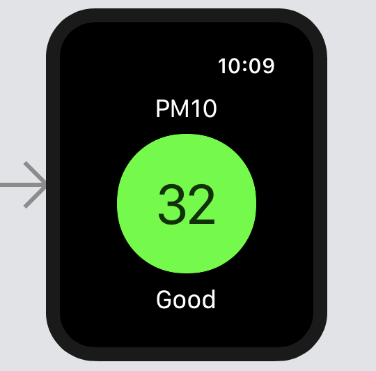
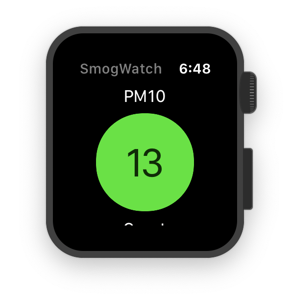
The value circle
Now, we’re going to work on the thing that the user will see when they first open the app - the big circle showing the measured value.
Drag the first item from the Library to the view - a label. Make it say “PM10” and use the Title 3 font style. In general, you should try to use one of the 10 standard semantic font styles if possible, to take advantage of Dynamic Type and have all fonts adapt to user’s chosen text size.
Notice that you can’t really position the label wherever you want in the view by dragging - the way you position things in WatchKit is by using the “Alignment” and “Size” properties in the Inspector, and by wrapping items in Groups which act like stack views on macOS/iOS. Position this label to Center horizontally. (In this case, you could achieve the same effect by setting its size to 100% of the container width and then setting its internal text alignment - the one in the “Label” section - to centered.)
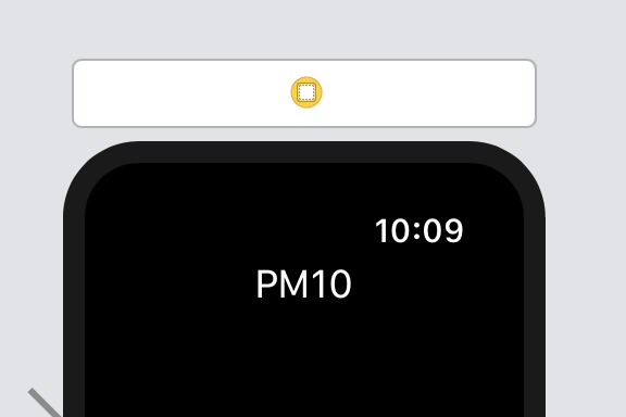
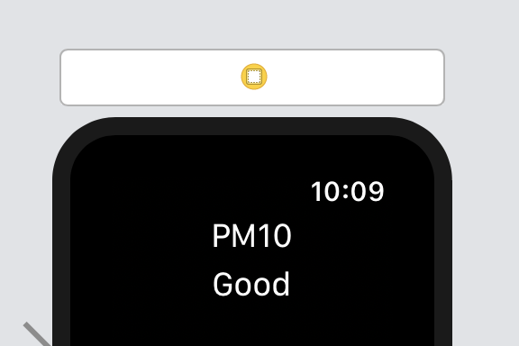
Add another label (or you can make a copy of the first one), make it say “Good”, use the same Title 3 font and also position it to Center horizontally.
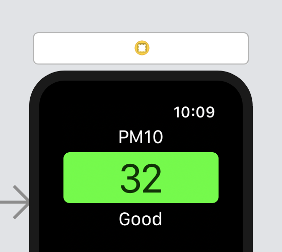
Next, we need the main circle. We could use an image, but we can also use a group and set its background and corner radius so that the four corners form a circle.
Drag a group into the view between the two labels, and a label inside it. Set the group’s Color to e.g. light gray or green, and the label’s text to some number like “32”, its font to System 42 (we won’t be using Dynamic Type for this one since it should be large enough for everyone), its Text Color to black with 80% alpha, and position it to Center/Center inside the group.
Now, we run into two problems:
- first, I’d like to position the top & bottom labels and the circle so that they always take whole height of the screen: the two labels take as much as they need, and the circle takes whatever is left
- second, I’d like to have the circle always keep a 1:1 aspect ratio, so that its width is equal to whatever height it’s allowed to have
Unfortunately, this doesn’t seem to be possible in WatchKit. You can position something at the top and bottom, but there isn’t really such width or height setting as “take whatever is left”. There is also no aspect ratio constraint (since there are no constraints in general). You can only size a thing to fit its content (not helpful here, since we want to make the circle big, with plenty of space around the number), size it relatively to the container - but ignoring whatever else is inside it, or use a fixed size.
So I think the best we can do here is to use a fixed size. Make the circle group 100×100 in size and give it a Corner Radius of 48. Also center the group horizontally in the view.

Notice that it would probably be nice to have some more spacing between the labels and the circle. We can add spacing using groups. The top level view is actually a group itself - if you select the Interface Controller, you can set e.g. its background, insets and spacing - but you can only set one consistent spacing per group, and we might want to use different spacings further down.
So instead lets wrap the three elements in a new vertical group - you can do that by selecting them and using the “embed” button in the bottom toolbar:
Now give the group a Spacing of 7. Also, override the default Insets and set Top to 8 in order to add some margin from the title in the title bar - which you don’t see now, but you will once you run the app.
Looks good! Because of the limitations I’ve mentioned it won’t always look perfect depending on the watch and selected text size, but it seems to work well enough in most cases. The difference between the smallest and largest text sizes isn’t as drastic here as on iOS.
Interface controller
Now, let’s write some code to show the right values. We’ll be adding it in our InterfaceController, which is WatchKit’s equivalent of a view controller. First, add these 3 outlets:
@IBOutlet var valueCircle: WKInterfaceGroup!
@IBOutlet var valueLabel: WKInterfaceLabel!
@IBOutlet var gradeLabel: WKInterfaceLabel!
Connect them on the storyboard to the elements we’ve added: the circle, the label inside it, and the bottom label, respectively. We’ll also need a reference to the DataStore that we’ll load values from (see Episode 2).
let dataStore = DataStore()
Now we need to have some logic for how to interpret the raw numbers we get from the web service - how much is good enough, and how much is not? Let’s add an enum SmogLevel which will cover this.
⚠️ Note: the ranges configured below are my personal subjective interpretation of how I feel about the given pollution levels. They are somewhat skewed by the fact that the smog levels in southern Poland during winter are more often above the safety limits than within them (although it got much better in the last year or two, fortunately). In theory, anything above 50 µg/m3 should be considered bad.
enum SmogLevel: Int, CaseIterable {
    case great = 30,
        good = 50,
        poor = 75,
        prettyBad = 100,
        reallyBad = 150,
        horrible = 200,
        extremelyBad = 10000,
        unknown = -1

    static func levelForValue(_ value: Double) -> SmogLevel {
        let levels = SmogLevel.allCases
        return levels.first(where: { Double($0.rawValue) >= value }) ?? .unknown
    }

    var title: String {
        switch self {
        case .great: return "Great"
        case .good: return "Good"
        case .poor: return "Poor"
        case .prettyBad: return "Pretty Bad"
        case .reallyBad: return "Really Bad"
        case .horrible: return "Horrible"
        case .extremelyBad: return "Extremely Bad"
        case .unknown: return "Unknown"
        }
    }
}
We’ll also use different colors for each range - for simplicity, we’ll use the HSB system and use colors of the same saturation and brightness, differing only in the hue.
var color: UIColor {
    let hue: CGFloat

    switch self {
    case .great: hue = 120
    case .good: hue = 80
    case .poor: hue = 55
    case .prettyBad: hue = 35
    case .reallyBad: hue = 10
    case .horrible: hue = 0
    case .extremelyBad: hue = 280
    case .unknown: hue = 0
    }

    if self == .unknown {
        return UIColor.lightGray
    } else {
        return UIColor(hue: hue/360, saturation: 0.95, brightness: 0.9, alpha: 1.0)
    }
}
Finally, let’s add a method that reloads the values in the UI, and call this method from awake(withContext:):
func updateDisplayedData() {
    let smogLevel: SmogLevel

    if let amount = dataStore.currentLevel {
        let displayedValue = Int(amount.rounded())
        valueLabel.setText(String(displayedValue))
        smogLevel = SmogLevel.levelForValue(amount)
    } else {
        valueLabel.setText("?")
        smogLevel = .unknown
    }

    valueCircle.setBackgroundColor(smogLevel.color)
    gradeLabel.setText(smogLevel.title)
}
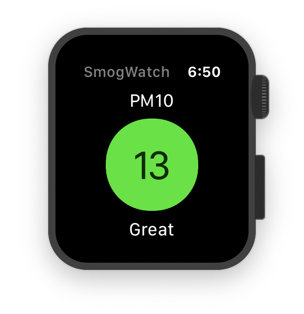
Looks pretty nice already, doesn’t it? (This is a real live value from a nearby air monitoring station.)

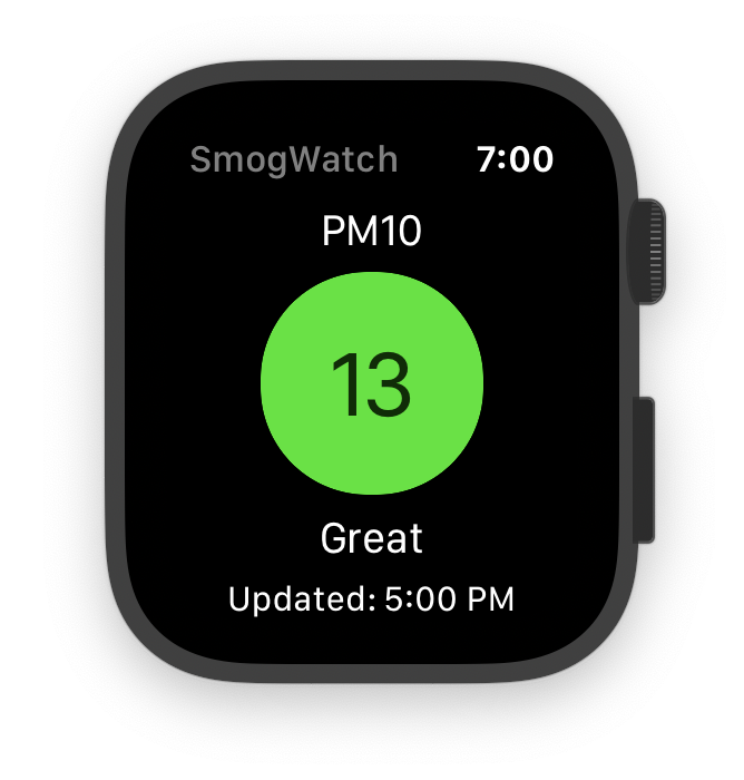
Last update time
We could also add a label showing last update time, so that you can easily see if the value is up to date.
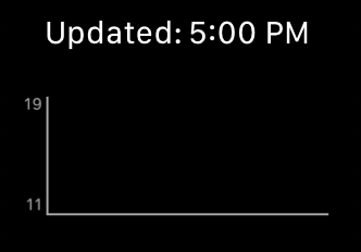
Add another group below the previous one (it’s sometimes hard to position a new thing in the right place, so that it’s added at the root level and not into an exising group - you need to have some patience), make sure that its Layout is Horizontal. Add two labels inside, which will be arranged left to right. Give them a font style of Caption 1 and make them say “Updated:” and e.g. “15:00” (we’ll use a formatter to print time in the right format).
Change the group’s Width to Size to fit content and its Horizontal Alignment to Center. Note, that’s something different than horizontal layout: layout means how the group arranges its child elements, and alignment means how the group positions itself inside the parent, which is the root container here. (For extra confusion, labels also have an additional text alignment property…)
Override also the group’s insets and set the Top and Bottom to 2 to keep some spacing from the “Good” label and from what we’ll add below.

You might notice a WKInterfaceDate item in the library that seems to be a customized label for showing date:
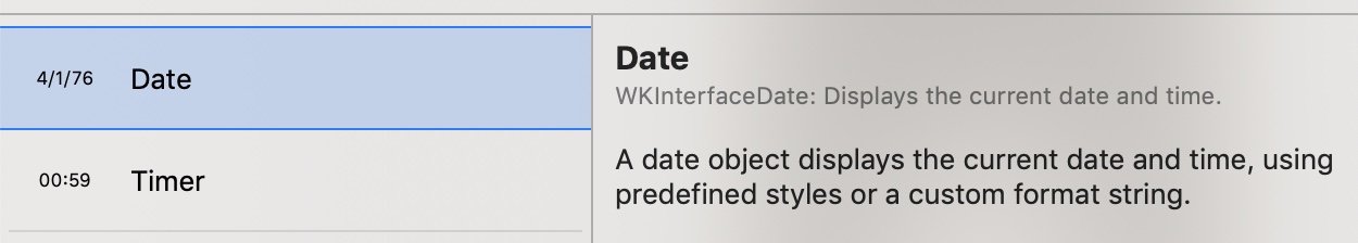
Why not use that one, sounds like a perfect place to use it? I’ve actually tried to do that at first, but I couldn’t find a way to set its date… Turns out, if you read the description carefully, you can see it says that it’s only meant for showing current date 😉 It’s a way to avoid using an NSTimer to keep the date label updated if it’s meant to show the current time which constantly changes - but in our case, we’re showing a past time that will only change when the data is refreshed. So we can just use a plain label and manually format the time once using a DateFormatter - which also gives us more options for customizing the format than the date label would.
In the interface controller, add two more outlets and connect them on the storyboard to the right label and the whole group:
@IBOutlet var updatedAtLabel: WKInterfaceLabel!
@IBOutlet var updatedAtRow: WKInterfaceGroup!
We’ll also need the date formatter. I’ve been thinking what would be the best way to show the time: should I include just the hour, day, or full date? But then I realized: if the data is more than a few hours old, it’s useless anyway! What does it matter if the pollution was high or low a week ago?
So there are really two cases: either the data was updated at most a few hours ago today, or it’s e.g. 2am and it was updated shortly before midnight yesterday. If it’s more than a few hours old, we’re going to treat it as if we had no data at all, because doing otherwise could just be misleading.
So we’re going to use two different time formats: when the data was updated earlier today, we’ll only show the time, and if it was yesterday, we’ll add the short day name for clarity. We’re using the DateFormatter.dateFormat method here which generates an appropriate specific format string that includes the listed fields for your current locale - so depending on your settings the hour might be in the 24- or 12-hour system, 0-padded or not, and so on.
let dateFormatter = DateFormatter()

let shortTimeFormat = DateFormatter.dateFormat(
  fromTemplate: "j:m", options: 0, locale: Locale.current
)
let longTimeFormat = DateFormatter.dateFormat(
  fromTemplate: "E j:m", options: 0, locale: Locale.current
)
We’ll also hide the whole updatedAtRow if we have no data to show. The updated updateDisplayedData() method will look like this:
func updateDisplayedData() {
    var smogLevel: SmogLevel = .unknown
    var valueText = "?"

    if let updatedAt = dataStore.lastMeasurementDate {
        updatedAtRow.setHidden(false)

        dateFormatter.dateFormat = isSameDay(updatedAt) ? shortTimeFormat : longTimeFormat
        updatedAtLabel.setText(dateFormatter.string(from: updatedAt))

        if let amount = dataStore.currentLevel, Date().timeIntervalSince(updatedAt) < 6 * 3600 {
            smogLevel = SmogLevel.levelForValue(amount)
            valueText = String(Int(amount.rounded()))
        }
    } else {
        updatedAtRow.setHidden(true)
    }

    valueCircle.setBackgroundColor(smogLevel.color)
    valueLabel.setText(valueText)
    gradeLabel.setText(smogLevel.title)
}

func isSameDay(_ date: Date) -> Bool {
    let calendar = Calendar.current
    let updatedDay = calendar.component(.day, from: date)
    let currentDay = calendar.component(.day, from: Date())

    return updatedDay == currentDay
}
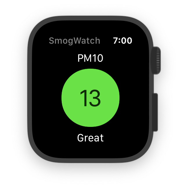
The app should now look like this:

History chart
Now we’re getting to the exciting part: we’re going to do some drawing!
At this point I took a break from coding to research the options. The main problems: there is no UIView.drawRect: in WatchKit, and there’s no UIScrollView that would let you scroll parts of the screen independently. I initially imagined some kind of chart that can be scrolled horizontally to show more points than fit on the screen. I could possibly simulate the scrolling with some horrible hacks, but I’ve realized that this would probably be both unnecessary and possibly confusing in terms of UX. I usually don’t care about the numbers from yesterday or earlier, and if I do, I can check them on the web - it would be enough to show the last few points, say, 6-8, so that you get the idea of what the trend is and if you should expect the value to rise or fall.
Like I said, there is no drawRect: - however, there is a WKInterfaceImage and it accepts dynamically generated images, and we can generate one with Core Graphics. UIGraphicsImageRenderer is not available, but you can use the older function-based API and capture an image using UIGraphicsGetImageFromCurrentImageContext().
Alternatively, I could use a WKInterfaceSKScene and draw the chart using SpriteKit - it’s a framework made mainly for games, but Apple have said explicitly in their WatchKit talks that it can be used for things like animations inside apps.
That said, I have zero experience with SpriteKit, so I would have to spend some additional time learning it from scratch - and I have a feeling that this would be an overkill for something like this. However, it’s still something to keep in mind if you need to do some more advanced drawing on watchOS, or especially animations. (Although at this point building it in SwiftUI might be a better idea - even if you just embed one tiny piece of it in a classic WatchKit interface.)
Getting the data
First, we’ll need to store some more data - right now we only store a single point (a value and a date). Luckily, we don’t need to change that much - we’re already getting all points from the given day in the response, it’s just that we’re discarding all except the last one, and now we need to keep them. In some cases we might also need to load data from the previous day, so that you don’t see an empty chart at 2am - normally we’ll simply remember old points from previous requests, but this will be needed later once we add a way to change the station we get data from.
However, this is a lot of code and it’s kind of not relevant to the topic of building a UI, so just assume that we now have an updated DataStore with an interface like this:
struct DataPoint {
    let date: Date
    let value: Double
}

class DataStore {
    var currentLevel: Double? {
        points.last?.value
    }

    var lastMeasurementDate: Date? {
        points.last?.date
    }

    var points: [DataPoint] { ... }  // keeps last 8 points
}
You can see the full (final) implementation on GitHub here:
- DataStore - stores and retrieves the data to/from
UserDefaults - KrakowPiosDataLoader loads the data from Krakow’s regional air monitoring service
- DataManager decides when to load which data, and makes sure that complications are reloaded when needed
Or alternatively, copy the version of DataStore and KrakowPiosDataLoader from this commit that adds just the changes needed for this part.
It would also be nice to be notified in the UI when the loader loads the data in the background. To achieve that, we’ll send a notification from ExtensionDelegate when the data is received:
NotificationCenter.default.post(name: DataStore.dataLoadedNotification, object: nil)
And in the InterfaceController, we’ll subscribe to this notification:
override func awake(withContext context: Any?) {
    super.awake(withContext: context)

    updateDisplayedData()

    NotificationCenter.default.addObserver(
        forName: DataStore.dataLoadedNotification,
        object: nil,
        queue: nil
    ) { _ in
        self.updateDisplayedData()
    }
}
Adding a chart container
Add another group into the view, below the update time label, and add an Image into the group. Set the group’s Insets to 15 at the top and 15 at the bottom. Leave the size settings at the default (size to fit content + the group filling whole container width) - we’ll specify the image dimensions in the code.
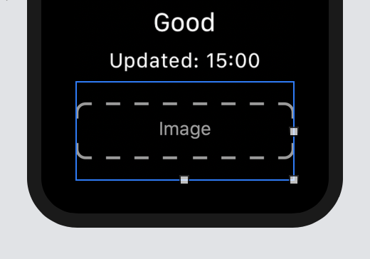
Bind the image on the storyboard to an outlet in the InterfaceController:
@IBOutlet var chartView: WKInterfaceImage!
One problem with WatchKit that I’ve run into a few times is that all the view objects only have setters and no getters. It might have something to do with the fact that the UI is technically running in another process, or rather a subprocess now since watchOS 4. So reading information from the view would involve something more than simply accessing some place in the process memory. If you look at the documentation of e.g. WKInterfaceLabel, you can see that it has methods like setText, setTextColor and other inherited from WKInterfaceObject - but they don’t have matching getters like textColor. Which means that you can’t ask any view element at runtime what its current text or color is, and specifically you can’t ask it what its current size is. So if we want to render the image in code for a specific size, this size needs to be hardcoded in the code.
The only exception is that an interface controller can call the method self.contentFrame, which returns the frame of the whole view it manages - which we will be using here to at least get the width of the rendered image, since that will depend on the size of the watch (we’ll keep the same height for all sizes).
Drawing the chart
This will be quite a lot of code, so let’s put it in a separate class to avoid the Massive View Controller pattern. However, there’s an important difference here from iOS and UIKit - you’re not really supposed to subclass view classes in WatchKit. Again, if you look at the documentation for WKInterfaceLabel, WKInterfaceImage etc., they all say: “Do not subclass or create instances of this class yourself”.
But we can always have a separate class that just handles rendering a chart to a UIImage, and that’s what we’re going to do:
class ChartRenderer {

    let chartFontAttributes: [NSAttributedString.Key: Any] = [
        .foregroundColor: UIColor.lightGray,
        .font: UIFont.systemFont(ofSize: 8.0)
    ]

    let leftMargin: CGFloat = 17
    let bottomMargin: CGFloat = 10
    let rightMargin: CGFloat = 10

    func generateChart(points: [DataPoint], size chartSize: CGSize) -> UIImage? {
        ...
    }
}
We’re going to call this class from InterfaceController, at the end of the updateDisplayedData method:
let chartRenderer = ChartRenderer()

let points = dataStore.points
let chartSize = CGSize(width: self.contentFrame.width, height: 65.0)

if points.count >= 2, let chart = chartRenderer.generateChart(points: points, size: chartSize) {
    chartView.setImage(chart)
    chartView.setHidden(false)
} else {
    chartView.setHidden(true)
}
In the generateChart method, first we need some boilerplate to get the context and then capture the image at the end:
UIGraphicsBeginImageContextWithOptions(chartSize, true, 0)
guard let context = UIGraphicsGetCurrentContext() else { return nil }

let width = chartSize.width
let height = chartSize.height

// ... drawing ...

let image = UIGraphicsGetImageFromCurrentImageContext()
UIGraphicsEndImageContext()
return image
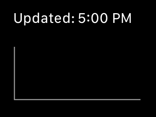
Next, let’s draw the Y axis on the left and the X at the bottom:
context.setStrokeColor(UIColor.lightGray.cgColor)
context.move(to: CGPoint(x: leftMargin, y: 0))
context.addLine(to: CGPoint(x: leftMargin, y: height - bottomMargin))
context.addLine(to: CGPoint(x: width - rightMargin + 2, y: height - bottomMargin))
context.drawPath(using: .stroke)
Next, we’ll print the min and max value on the left side of the Y axis. For that we’ll make a helper function drawText that can print text towards the left or right, or centered on the given point (in this case, these two labels will be right-aligned):
enum TextAlignment {
    case left, right, center
}

func drawText(_ text: String, x: CGFloat, y: CGFloat, alignment: TextAlignment = .left) {
    var leftPosition = x

    if alignment != .left {
        let width = text.size(withAttributes: chartFontAttributes).width
        leftPosition -= (alignment == .right) ? ceil(width) : ceil(width / 2)
    }

    text.draw(at: CGPoint(x: leftPosition, y: y), withAttributes: chartFontAttributes)
}
And we print the values like this:
let values = points.map { $0.value }
let minValue = Int(values.min()!.rounded())
let maxValue = Int(values.max()!.rounded())

drawText(String(maxValue),
         x: leftMargin - 2,
         y: -2,
         alignment: .right)
drawText(String(minValue),
         x: leftMargin - 2,
         y: height - bottomMargin - 10,
         alignment: .right)
Finally, we’ll calculate the position of each point based on the values from the DataStore and draw a line through them, and print matching hour labels exactly below the points, below the X axis. We’ll need two more helper functions for this:
func chartPosition(forPointAt index: Int, from values: [Double], chartSize: CGSize) -> CGPoint {
    let xPadding: CGFloat = 3
    let yPadding: CGFloat = 3
    let innerWidth = chartSize.width - leftMargin - 2 * xPadding - rightMargin
    let innerHeight = chartSize.height - bottomMargin - 2 * yPadding

    let minValue = values.min()!
    let maxValue = values.max()!

    let xOffset = innerWidth * CGFloat(index) / CGFloat(values.count - 1)
    let yOffset = innerHeight * CGFloat(values[index] - minValue) / CGFloat(maxValue - minValue)

    return CGPoint(
        x: leftMargin + xPadding + xOffset,
        y: chartSize.height - bottomMargin - yPadding - yOffset
    )
}

func hour(for point: DataPoint) -> Int {
    return Calendar.current.component(.hour, from: point.date)
}
Next, we set some line properties to make it look better at the joints:
context.setLineWidth(1.0)
context.setLineCap(.round)
context.setLineJoin(.bevel)
And we draw the line by starting at the first point and then jumping through the rest one by one (while also printing the hours below):
let firstPosition = chartPosition(forPointAt: 0, from: values, chartSize: chartSize)
context.move(to: firstPosition)

drawText(String(hour(for: points[0])),
         x: firstPosition.x,
         y: height - bottomMargin,
         alignment: .center)

for i in 1..<values.count {
    let position = chartPosition(forPointAt: i, from: values, chartSize: chartSize)
    context.addLine(to: position)

    drawText(String(hour(for: points[i])),
             x: position.x,
             y: height - bottomMargin,
             alignment: .center)
}

context.setStrokeColor(UIColor.white.cgColor)
context.drawPath(using: .stroke)
Voila 😄
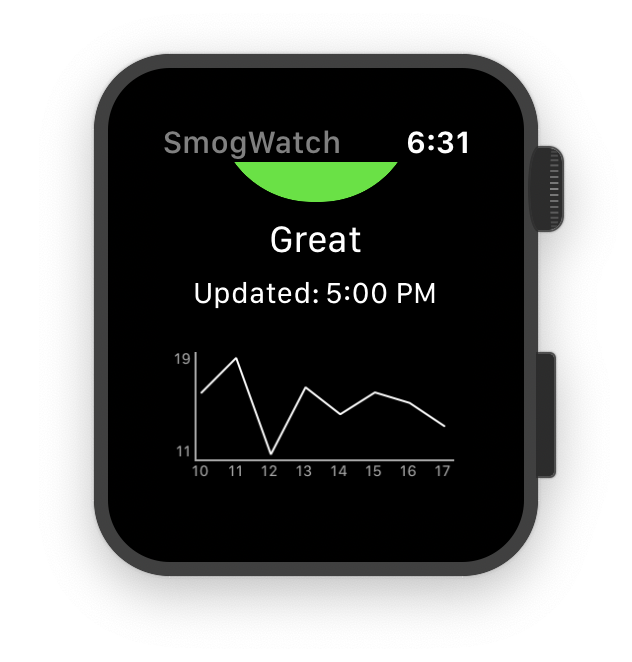
(I suppose we could use a time formatter to print the hour labels here in a 12-hour format if the device uses one… but let’s leave that as an exercise for the reader ;)
Testing on different screen sizes
There are currently 4 different Apple Watch screen sizes, and we need to make sure that our app works on each of them. Fortunately, in our case it seems to mostly work fine on any screen and also with different text sizes set in the Settings. I’ve built the storyboard and tested the app mostly on the 42mm variant, since I’m using a Series 3 42mm Watch right now, and I think that in general, just like on iOS, it’s a good strategy to design for compact/medium-sized devices first, and then scale up to larger ones and down to the smallest ones. 40mm is more or less the same, 44mm has more space but usually fills it in the right way automatically, and 38mm might require some minor tweaks.
In this case, we’ll adapt a few things on the main screen for the 38mm:
- The main circle is a bit too large there. Select the circle group, and in the inspector where you have the width & height set to 100, there is a tiny “+” on the left side - if you press it, you can add an exception for any property. Override the circle’s size to 90×90 on the 38mm (it’s good to do this when you have the storyboard set to render the scenes on this specific device, in the toolbar at the bottom, so that you see the effects immediately).
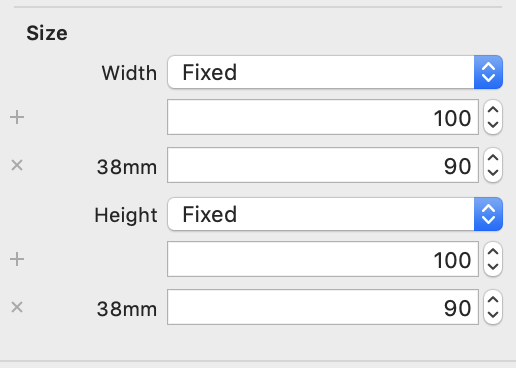
- Also, in the circle group, make the radius 43 on the 38mm watch, otherwise the circle is going to look funny.
- For the number label inside the circle, make the font slightly smaller too, 40pt let’s say.
Left: before the change, right: after the tweaks
Another tiny change I made was that on the new-style watches (40mm and 44mm) I changed the top spacing for the first group from 8 to 5 - these watches seem to automatically have some larger margin at the top, so we don’t need to add that much, and on the 44mm watch this allows us to fully see the update time label below.
The rest should look ok - 38mm watches also have a smaller default text size than the larger ones (although you can change it of course), and 44mm has a larger default text size.
We could possibly make the chart height slightly smaller or larger depending on the width (that would have to be changed in code, since that’s where we hardcoded it), but it looks ok as it is.

42mm, 40mm & 44mm
You’re going to have a bit more work if you use static images in your app. In that case, images will usually be scaled exactly as they are saved in the file, and they will not change their size automatically based on the screen size (unless you set their widths relatively to the container). So it would probably make sense to have different variants of the same image for each screen size. Since watchOS 6, App Store uses app thinning to only download assets for a given Watch size, so it doesn’t make the bundle larger for your users, and by providing smaller image variants you can save some space on smaller devices.
There are also some gotchas related to the rounded corners, safe areas and margins on the Series 4+ watches, but this should mostly be handled automatically if you’re using system controls, and you might only run into problems if you’re using SpriteKit/SceneKit views. You can learn about that from this 9-minute talk on Apple’s site.
The main app screen is complete now and we’ve reached the end of the first part of the tutorial. If you want to look at the code on GitHub, the version after this part is available here.
In the second part, we’ll build a second screen for choosing the station providing the data from a list of available stations.