Coronavirus charts
I’ve been tracking the growth of the new coronavirus ever since it first appeared in China in the last week of January, and even more since it spread to Europe around mid February. Initially I’ve been looking mostly at the popular ArcGIS dashboard made by Johns Hopkins University that everyone is probably familiar with.
However, I really wanted to see some charts showing how the numbers grow in each country separately, since just seeing “8000 in Italy” doesn’t tell me much if I don’t remember how much it was yesterday. At that point it wasn’t possible to see that kind of information on the dashboard, and I couldn’t find any other source that showed that in an accessible way.
But then I saw a mention in the footer on the dashboard that the authors have shared all their data (including past numbers) in a GitHub repository in the form of CSV files. So of course I decided to do what always comes to my mind when I have a problem to solve… build a new project :)
And that’s how the Coronavirus charts site was born.
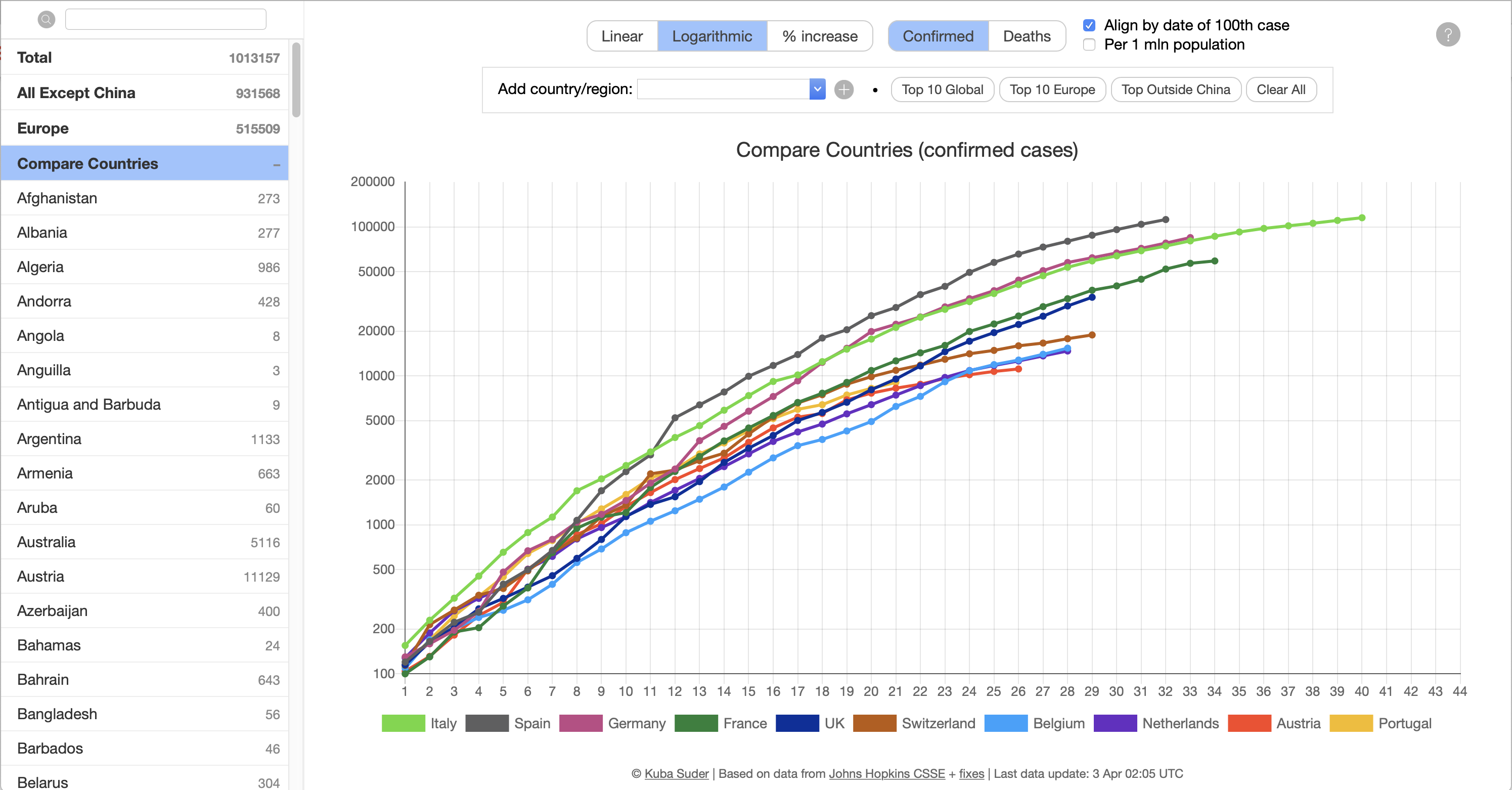
I managed to build and deploy an initial working version in one afternoon and evening - it’s amazing how fast you can build things with the right tools. I used Ruby for the server part - I wrote an import script that downloads the CSV files from GitHub every few hours (though in practice they only change daily) and processes them into a JSON file. There’s a whole bunch of things that need to be done on the data: extract the columns that list the numbers, calculate totals (global count, whole Europe, adding up Australian or Canadian provinces which are listed separately), some naming tweaks, etc. And Ruby is absolutely *perfect* for tasks like that - get this file, parse it, slice it into arrays, filter them this way, map them through that block, gsub some strings with a regexp, and so on - nothing else I know comes close. It feels almost like being Dr. Strange.
The UI part is a small amount of plain static HTML, some vanilla CSS and JS, and the Chart.js library for rendering the charts. I’ve worked with Chart.js before and it’s super easy to get started and get a nice chart once you have the arrays of numbers loaded from the JSON.
Everything else is completely plain JS, no jQuery, no NPM, no React, no nothing. I like to avoid dependencies, and it’s so nice how much more you can achieve with standard JS now than what I remember from my professional web development days, when IE 8 was still a thing. Things like arrow functions, fetch, querySelectorAll, classList, ES5 Array extensions and so on make coding in plain JS much easier than it used to be when jQuery or at least Underscore.js was a requirement.
Since the first version the code grew quite a lot - I’m adding some improvements almost every other day. You can now switch between linear and logarithmic scales, “daily increase” and “% increase” views, and there’s a pretty complex “Compare Countries” screen that lets you compare up to 20 countries or regions, with a few more options like adjusting the numbers by population size. I also regularly have issues with the source data, so I need to add some workarounds to the import code, including some code that detects places where the number of cases is lower or the same as the day before, in which case I fix the numbers manually.
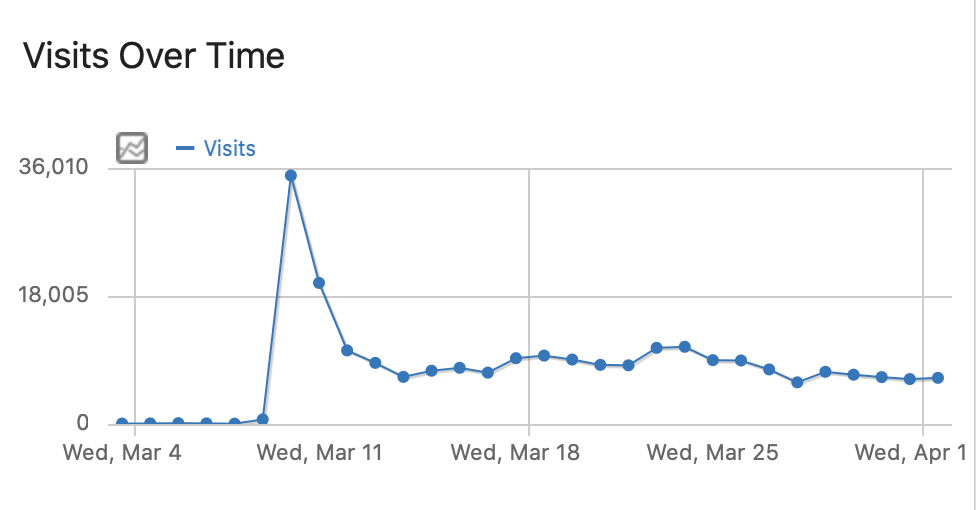
To my surprise, even though this is just one of dozens if not hundreds of similar dashboards, this seems to be my most popular project ever. I got over 200K visits in March, around 6-9K daily (over 30K on the first day when I posted it to Reddit, while normally my blog gets around 100 visits a day (!). I’m also getting quite a lot of messages from various people all over the world with feature requests.
I’m kind of having fun building this, and seeing that it’s helpful to so many people - even though these are extremely serious matters… but in a way getting busy writing code lets me take my mind off the constant worrying, and is a good way to spend these weeks stuck at home. I just hope, for all our sakes, that I won’t need to maintain this site for much longer… Stay safe out there.
(The project isn’t open source since I built it as a module of this blog to save time, but the JS should be fairly readable if you’re curious.)
20 comments:
Jan
Could you please aggregate the data from europe to one country "Europe" and "EU (without) UK", so it would be comparable to USA in the compare countries ?
Thank you
Benji
Great project. Any chance you could add saving the list of country/regions you've entered in the compare countries screen into localstorage or something? I've a set of countries I'm watching and it would be nice to not have to reenter it several times a day...
Kuba
@Jan: Interesting idea, I'll think about it!
@Benji: I'm planning to add all the state of all switches and the selected country set to the URL, so you should be able to share it or bookmark it and get exactly the same view as you had before.
Markus
Hey Kuba,
thanks for your awesome project! Without the virus it would've been highly unlikely I crossed paths with your work since I never owned an Apple device. As to your wondering about the sudden interest in a project of yours: David Kriesel (data scientist and well-known speaker at Chaos Computer Club events) linked to your dashboard as a prime example of explorable data in his blog on March 11th: http://www.dkriesel.com/blog/2020/0311_explorierbare_corona-daten
Perhaps thats one source of the sudden interest.
On the other hand - be confident. Your tool just is really damn good ;)
Greetings from Frankfurt a.M.
Zsolt Dubovanszky
Please make it possible to select the active cases in compare countries:
https://mackuba.eu/corona/#compare?pop=1&c=mt,hu,bg,us-pr
Kuba
@Zsolt I was just thinking about that last night :) Active cases weren't that interesting until recently, because they weren't much different from confirmed, but in the last week active finally started falling in some countries (e.g. Germany, New Zealand), so it would be nice to see easily which countries got into this phase.
jan
any chance of adding an adjustable moving average to the daily increase charts?
Kuba
@Jan: I've been working on this already :) You're right that it's hard to see what's going on there right now. For now it's just a checkbox, but maybe I'll make the interval configurable later.
Kuba
@Jan - I've deployed a "Show trend" setting with an editable trend length yesterday.
Markus
Hello Kuba,
just a little thing: the weekdays are two days off. April, 25th is a Saturday, in your dashboard it's a Monday.
Greetings!
Kuba
@Markus I can't believe I haven't actually verified if this is correct… 🤦🏻♂️ Damn JavaScript, counting months from 0 to 11… But I'm glad that someone is watching :)
non merci!
Top us active case seems to be broken
https://mackuba.eu/corona/#compare?val=a&c=us-ny,us-nj,us-ma,us-il,us-ca,us-pa,us-mi,us-fl,us-tx,us-ct
Kuba
The JHU data doesn't include the number of recovered for US states at all, and I calculate the active count by (confirmed - dead - recovered), so if there's no recovered, I can't show the active either. This is the case for all US states.
Robert
Hi Kuba, thank you for this great project and your periodic improvements. Your site was one of the first I found and I've been checking graphs here almost daily since the virus hit Europe.
In the beginning "All except China" was a very useful graph. Today not so much anymore. But I think there is another very useful graph to make: could you create "US except New York" or even a "US except these selected states" so we can exclude the few statistical explosions and see what goes on in the rest of the country?
Robert
Hi Kuba, I have another question: when comparing countries using Top Global, Top Europe I get a certain list of ten countries with confirmed cases.
When I then change the settings to display, say deaths per 1 mln population, I get a graph of those same ten countries. This is somewhat misleading as this grahp is missing some countries compared to the real top ten of death per capita. How can I see that real top ten?
Armin Willerding
Hi Kuba,
in the "compare countries" view, the graphs for the daily change of active cases are unfortunately cut off below the zero line since the last update from Sept 22.
I'm using your charts nearly every day to watch the pandemic!
Greetings from Germany.
Zsolt Dubovanszky
Dear Kuba
Many times I am comparing countries, the 5th country color become white, so invisible.
Example: https://mackuba.eu/corona/#compare?val=a&c=bg,hu,mt,cy,es
Es = Spain is invisible.
Please fix the issue.
Thanks, Zsolt
Kuba
@Zsolt: Hey! This is on purpose, some countries aren't shown on the chart when the "Active" mode is selected, because the Johns Hopkins data doesn't include up to date numbers of recovered for that country, so I can't calculate the number of active cases (e.g. in case of Spain the recovered dataset shows the number 150376 unchanged since the middle of May). I've added a comment below the chart that appears when such countries are included, to explain what is going on. Maybe I'll look for other data sources at some point, but for now I'm using only the JH data (+ Franch govt data for France).
Kuba
@Armin: Oh, you're right, it seems I accidentally broke it during one of the last updates… I missed your comment, because I also broke blog email notifications ;) Should be fixed now.
Matthias - DE
Hi Kuba.
Also a hughe thanks from my side. Your Corona website was quickly the only one I was watching since JHU did not offer logarithmic Y-axis in the beginning. So I was very sad to see that you removed this feature on Sept-22. Is there a way (I may missed it) to bring this back?
Also I noticed the following in the chart where you can compare countries:
- Some countries like Italy show data up to day 251 while Germany only shows until day 244. But the raw data on GIT (CSV-File) includes the data. How come?
- What date was day 1?
Bye,
Matt