A guide to NSButton styles
⭐️ This post has been rewritten in December 2021 for Xcode 13 & macOS Monterey. (old version here)
Note (Oct 2023): The names of the buttons have been changed again in the SDK in macOS Sonoma - I will update this post once I have Sonoma on one of my Macs :)
When you’re building a native Mac app and you want it to feel like a part of the system, to have a UI that users who care about design will appreciate, it’s important to use the right kind of controls in the right places. Some features could be implemented visually in a lot of different ways, but only a few of them will “feel right”. This is even more important these days - with the influx of Electron apps that don’t even pretend they’re native, and not always well written Catalyst apps that often feel like something is missing there, an AppKit app written with care and attention to detail stands out from the crowd more than ever.
The macOS SDK has quite a lot of different controls available, and while this gives you a lot of built-in functionality for free, using them in the right way might be a bit more tricky than on iOS. This is especially true in case of the base button class, NSButton, which lets you choose from as many as 15 different styles, not counting the subclasses.
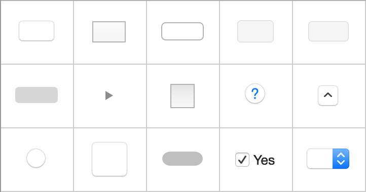
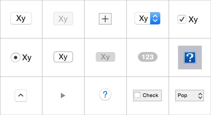
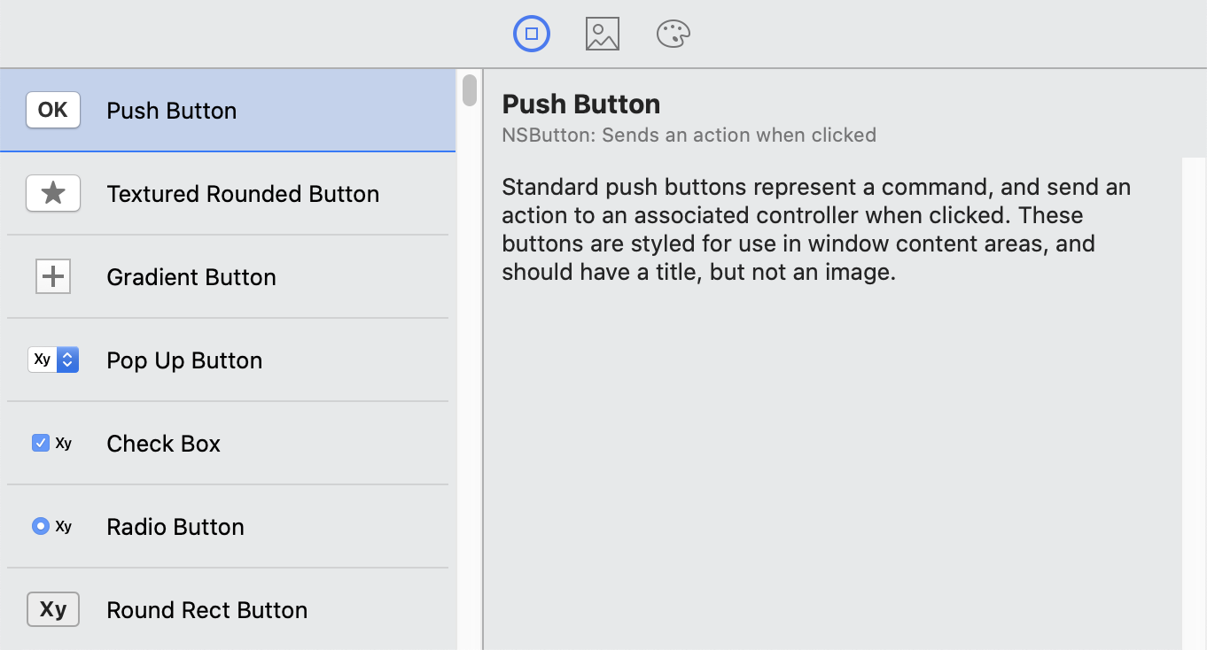
I originally wrote this post 7 years ago, shortly after OS X 10.10 Yosemite was released, changing the design significantly since the previous versions. The latest version of Xcode was 6.1, and if you were working on a Mac app interface and looked at the selection of available buttons there, you would see something like this:
All buttons were given the same generic description which basically described the NSButton class itself:
The NSButton class is a subclass of NSControl that intercepts mouse-down events and sends an action message to a target object when it’s clicked or pressed.
It was hard to figure out the purpose and intended use of each kind of button, and there were hardly any clues inside Xcode itself. So I decided to do some research to find some tips about what each button is for. I put together information I found in the old-style Apple docs and the Human Interface Guidelines, I also looked through Apple’s system apps to see which buttons are used in what contexts, and I even peeked inside some apps using Interface Inspector.
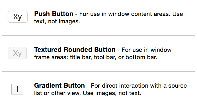
Things have changed a lot since then. In latest Xcode, the button graphics now show their characteristics better, the descriptions actually describe the purpose of each different kind of button, and some confusing old button styles were hidden and are explicitly marked as “discouraged”. You can now also find some extremely detailed information in the HIG, with whole separate pages describing each button style!
So I suppose this article might not be as useful as it was 7 years ago. However, given that this is still one of the most popular posts on this site, there’s clearly demand for this kind of information, so I decided to give it a serious update - especially since the Big Sur release has now introduced some significant design changes to macOS again, comparable to the last UI redesign in Yosemite, which inspired the original version of this post.
In this second edition, I’ve replaced all old screenshots with new ones in Retina quality (I even installed a Mavericks VM in VirtualBox to get 2x pictures from there!), and I added a new set for Big Sur and Monterey. In some cases there are even separate versions for Yosemite and Catalina, because I’ve noticed that a few things were tweaked during that macOS era. I also added new content about new kinds of buttons and features introduced in recent years, clarified and expanded a lot of descriptions, and added some additional examples. I also went through Apple’s own apps and looked inside some of them again, this time using Xcode view debugger with SIP turned off (thanks to Tim Oliver for the tip!).
Before we get to the buttons though, let’s start with a brief recap of what has changed in macOS controls and how they’re presented in Xcode over the years.
macOS & Xcode history
I started using OS X at version 10.5 (Leopard), so that’s where the Mac history starts for me; everything before I only know from stories. There is a fantastic site where you can see all previous versions though, the macOS Screenshot Library by Stephen Hackett.
It seems that most of the main controls, with the exception of the window and toolbar background which went through several redecorations, haven’t changed their designs much since the initial 10.0 release until 10.7 Lion. Back then buttons and other clickable things were generally more 3D and more colorful. Some of the now standard controls weren’t available in early OS X versions, and some buttons that are now deprecated and forgotten were heavily used.
2011: OS X 10.7 Lion
OS X 10.7 brought with it a kind of refinement of the early Aqua UI, and that design is what you may remember from Mavericks, since that style lasted until Yosemite. It’s not instantly recognizable as a new design, but several things were changed: buttons became flatter and more round-rect-shaped instead of the previous “capsule” shape, and in general things got a bit less colorful and more serious:
2014: OS X 10.10 Yosemite / Xcode 6
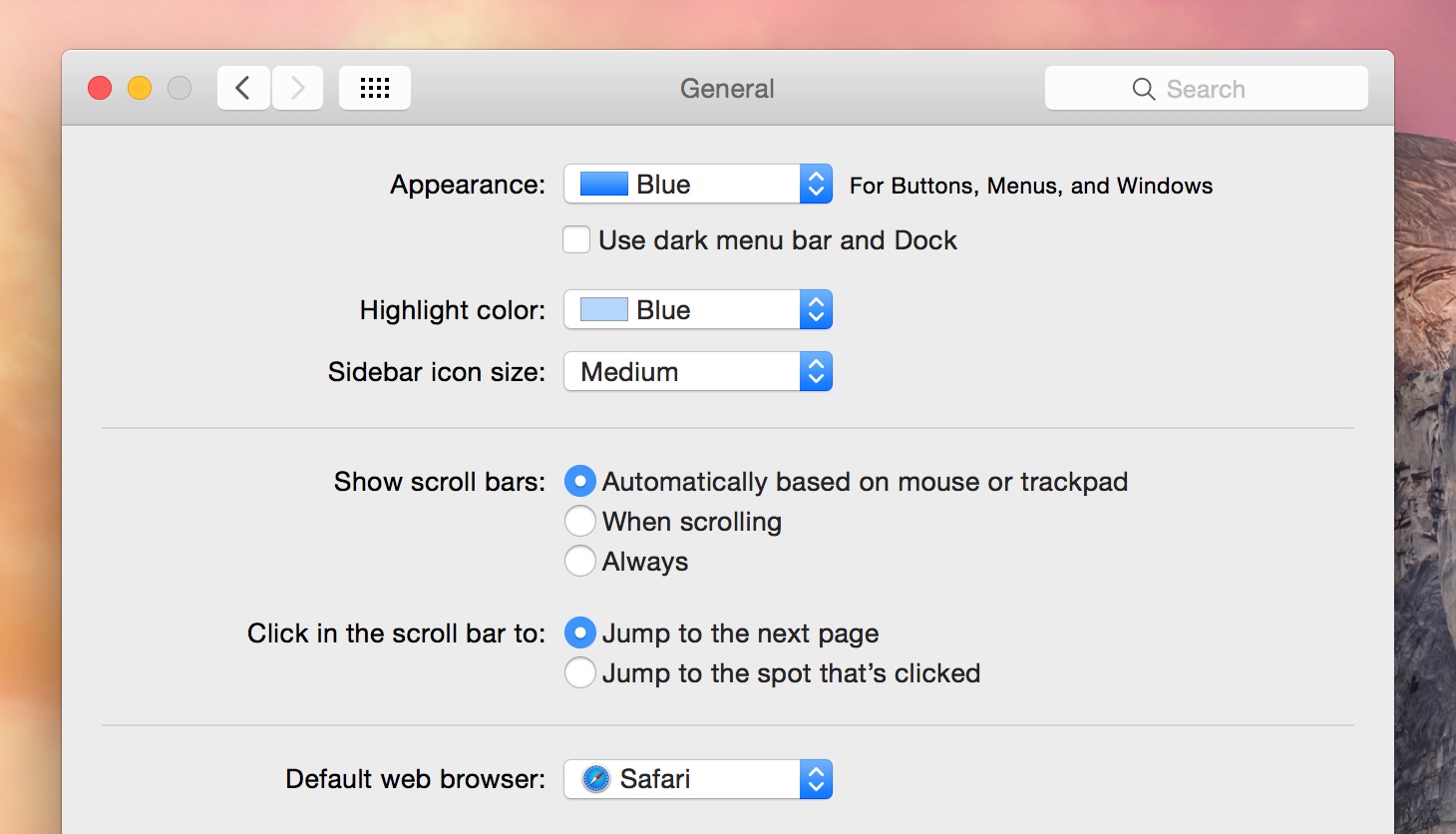
Yosemite and Xcode 6 was what I originally wrote this post with. In Yosemite the design of the OS changed significantly - the UI got even more flat and less 3D, used transparency and blur instead of skeuomorphism, and the controls that included color used a darker shade of blue. The system font was changed from Lucida Grande used in previous versions to Helvetica Neue, which can be seen in the button labels.
With a few small exceptions, this style was mostly unchanged until the Big Sur release last year.
2015: OS X 10.11 El Capitan / Xcode 7
Xcode 7 has already cleaned up the confusing button styles quite a bit. The 3 button styles that I previously had to figure out were obsolete and not recommended - Textured, Bevel and Round - were moved to a new section in the list in Attributes Inspector titled “Discouraged Styles” and were removed from the object library in IB. The fourth most confusing style, Square, has been replaced with an “Image Button”, which more closely matches what it’s intended for (it’s still listed as Square in the Attributes Inspector). The button descriptions were also changed to describe each button style more accurately:
OS X El Capitan changed the system font again, to Apple’s own San Francisco font - this is the main reason why buttons on screenshots from Yosemite looks slightly different from the following versions.
2018: macOS 10.14 Mojave
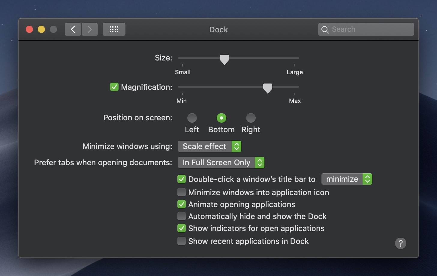
Mojave introduced dark mode and additional accent colors. Your users can now use your app with a light or dark background and with 8 different accent colors, and you need to take that into account when designing your app, because every control you add to the storyboard will be changing its colors based on that selection.
2019: macOS 10.15 Catalina / Xcode 11
macOS Catalina introduced the NSSwitch control.
Since Xcode 11 the Object Library is now located in a new floating panel, while button descriptions have been expanded and now define their intended use in more detail:
2020: macOS 11 Big Sur
Big Sur brought us the first major redesign of the system UI since Yosemite. The changes mostly affected the system-controlled areas of the desktop - the menu bar and the dock (new app icon style), and also the title bar/toolbar areas of app windows. The design became even flatter and more minimalistic, with various views and controls losing backgrounds or borders.
The buttons haven’t changed that much in comparison (although some other controls did), but some of them also became “lighter”, especially those that appear in toolbars:
Big Sur also added large control size, used mainly for large push buttons.
2021: macOS 12 Monterey
Monterey was more of a “Snow Leopard” kind of update and relatively few things were changed, but there are a few changes on the controls front too:
- bevel buttons are back in style
- bevel and push buttons can now have custom colors
- push buttons no longer highlight with color on click
List of NSButton styles
A note on styles vs. types:
If you look at the attribute list of a button in Interface Builder, you will see two properties next to each other with somewhat similar names that both let you choose something from a long list: the button style and the button type. What’s the difference, you might ask?
The button style maps to the bezelStyle property and is set to a value from the NSButton.BezelStyle enum. This property defines what kind of bezel (border) the button has - rounded, square, recessed, etc.
The button type maps to the setButtonType method (no getter) and is set to a value from the NSButton.ButtonType enum. This property defines how the button behaves when clicked - if it has an on/off state or gets back up by itself after it’s pressed, and so on.
So in short, “Style” / bezelStyle defines how the button looks, and “Type” / buttonType defines how it works. This gets slightly more complicated though when you look at checkboxes and radio buttons, which are button types but they also override how the button looks 😅
But for the most part, we will be talking about button styles here. The reason is that while you can technically try to make any combination of a button type and style, in most cases a given button style (design) should only be used with one specific button type (behavior), because many combinations either don’t work as you’d expect or don’t make sense. In most cases you should use the default button type that is assigned when you drag a button from the Object Library and don’t change it (I’ll list the preferred button types for each style below).
For most kinds of buttons - except those few that switch between different states - the “Momentary Push In” type will be the default/preferred one. If you’re curious, I also briefly describe all button types at the very end.
A note on double naming:
Another confusing thing about the button styles is that they sort of have two separate naming schemes: each button has one name that’s used in Interface Builder and in the HIG, and another that’s used in the constants that you will use in code. The constant names are naturally older since they don’t change, and sometimes they’re completely unrelated to the current “public” name. So pay attention to those “internal names” too, because buttons are occasionally referred to by those and you may also see them e.g. during debugging (for example, Xcode’s View Debugger will call the standard button “Rounded”, not “Push”).
Now, let’s look at the NSButton styles available in Xcode one by one:
1) Push Button
- bezelStyle =
.rounded/NSBezelStyleRounded(NSRoundedBezelStyle) - button type =
.momentaryPushIn, possibly.togglein special cases - fixed height
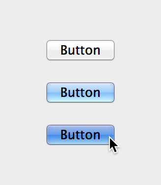
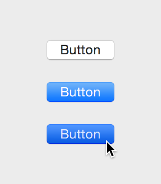
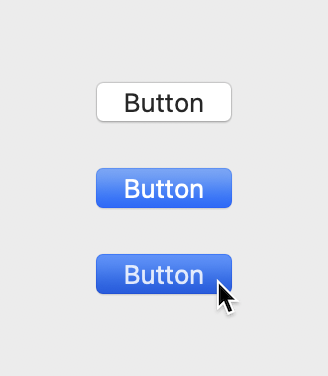
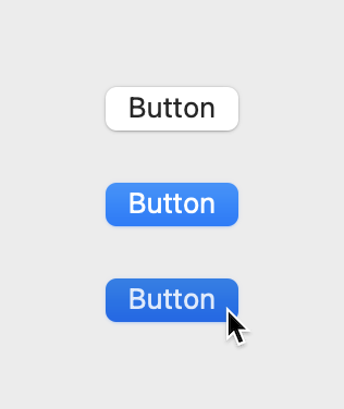
This is the most standard and most commonly used button style on macOS, the default button style in a way (although not literally, you still need to set bezelStyle if you create it in code). It’s the main button style to use within the window body area (as opposed to various toolbars and title bar), also in alerts, sheets and other panels, and in preferences windows. It shouldn’t generally be used in the title bar and toolbars, where a Textured Rounded Button is usually more appropriate.
A push button is supposed to only have a text label (no icon) and it’s meant to execute some kind of specific action when pressed.
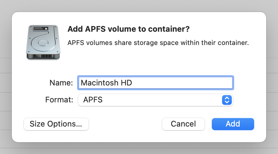
Here are some standard push buttons in the “Add Volume” dialog in Disk Utility:
Xcode:
Standard push buttons represent a command, and send an action to an associated controller when clicked. These buttons are styled for use in window content areas, and should have a title, but not an image.
Push buttons are designed for use in the window body only, not in the window-frame areas.
Users expect an immediate action to occur when they click a push button, including the opening of another window or the dismissal of a dialog.
Don’t use a push button to indicate a state, such as on or off. Instead, you can use checkboxes to indicate state (…)
Avoid associating a menu with a push button.
Use title-style capitalization for the button title and add an ellipsis if necessary. If the push button immediately opens another window, dialog, or app to perform its action, use an ellipsis in the title. An ellipsis prepares users to expect another window to open in which they complete the action the button initiates.
Push button sizes
Push buttons, like most macOS controls, have a smaller variant that can be used in some places by setting NSControl’s controlSize to small or mini. Here’s the smaller version in Safari preferences:
Small push buttons can be often found in views and windows in which there’s a potentially large number of them visible next to each other, e.g. when they’re displayed in a column of a list, with each row of the list having its own button for the same kind of action. Like here, in iCloud preferences:
macOS Big Sur has also introduced the large control size. Large push buttons are used in the new, vertically laid out alerts, and you can also use them in your app windows, e.g. for some kind of centrally located “call to action” button, or next/back buttons in various welcome screens.
The idea behind large controls is that sometimes you just need a bigger button. These are really common in onboarding flows like this one where there’s a single call to action right in the middle of the window. (“Adopt the new look of macOS”, WWDC 2020)
Default buttons
Push buttons normally have a white background; however, the default button in an alert, sheet or panel has a colorful background - blue in most cases, but keep in mind that this depends on the user’s (or app’s) selected accent color, so it could be e.g. green or orange. Non-default buttons were also drawn with the same colored background in their pressed state in systems up to Big Sur (this was changed in Monterey).
To set a button as default, set its “Key Equivalent” to the Enter key in the Interface Builder, or set keyEquivalent to \r (not \n) in code. Inside alerts (NSAlert), the first added button is the default one automatically.
Documentation:
The system draws the default button prominently using the accent color to indicate that the user can press the return key to invoke the button’s action.
Configure a push button the user is likely to select as the default. A default push button is prominent in appearance and automatically performs its action when the user presses Return. There can only be a single default button in a view.
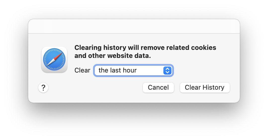
Note: the default button should only perform safe actions, i.e. clicking it should not potentially result in some kind of data loss - you don’t want the user to delete something they didn’t want to delete because they pressed Enter in the wrong window. For example, here the “Clear History” button is not a default button:
Provide a default button only when the user’s most likely action is harmless. Users sometimes press Return merely to dismiss a dialog, without reading its content, so it’s crucial that a default button initiate a harmless action. When there’s no default button, pressing Return should have no effect; the user should have to explicitly click a button to dismiss the dialog. Alternatively, when a dialog may result in a destructive action, Cancel can be set as the default button.
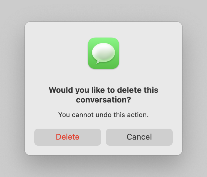
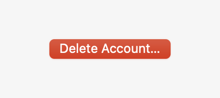
There is also a new property introduced in Big Sur named hasDestructiveAction. If you set it to true, the button will be marked with a red color as an additional warning (this only seems to work inside NSAlerts):
Setting this to true allows the system to guard a destructive-action button against accidental presses, and can give the button a special appearance in certain contexts to caution against unintentional use.
Custom button colors
Since macOS Monterey you can also manually override the background color of a push button, regardless of the global accent color and whether it’s a default button or not. The property used for that is called bezelColor (don’t be fooled by the “10.12.2+” availability, this only works in Monterey).
This is meant for special cases and lets you create e.g. a pair of green “Accept Call” & red “Reject Call” buttons, or red buttons for some kind of destructive action; so don’t use this everywhere.
The new tinting API provides a way to override the color for one specific control. This is great for controls where you’d like to apply a semantically meaningful color. For example, if your app uses a specific shade of orange to distinguish a preorder from a normal purchase, you can reinforce that design using a tinted button. Another example would be a video conferencing app, where the Start and End Call buttons perform two of the most meaningful actions in the app. Tinting them green and red adds emphasis and it makes their function instantly recognizable.
One important note is that tinted buttons always show their tint color in every active state, unlike ordinary push buttons which are white or gray. This puts your tint color front and center. However, take care in your design not to create confusion with the default button, which also uses a colorful appearance.
Finally, it’s important to convey your controls' purpose using more than just color. You want to make sure that people who have difficulty distinguishing between colors can still easily identify the purpose of a given control, so be sure to provide a clear label or icon. (“What’s new in AppKit”, WWDC 2021)
2) Textured Rounded Button
- group: Toolbar Items (window frame controls)
- bezelStyle =
.texturedRounded/NSBezelStyleTexturedRounded(NSTexturedRoundedBezelStyle) - button type =
.momentaryPushIn, possibly.togglein special cases - fixed height
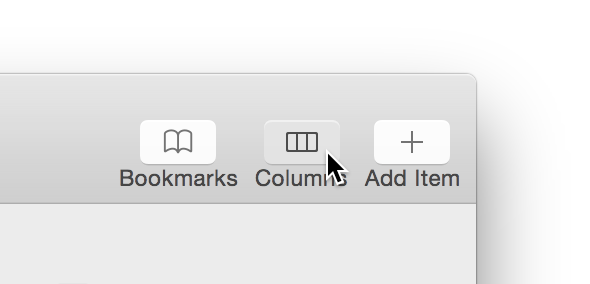
The textured button is probably one that has gone through the most drastic changes over the years. This button style is mainly used in window toolbars, and since the design of window toolbars has changed several times, the look of the buttons has changed together with it.
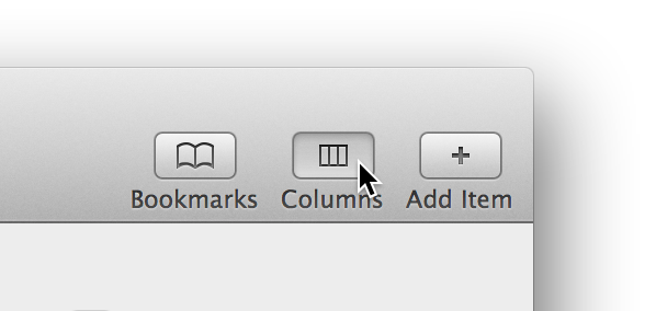
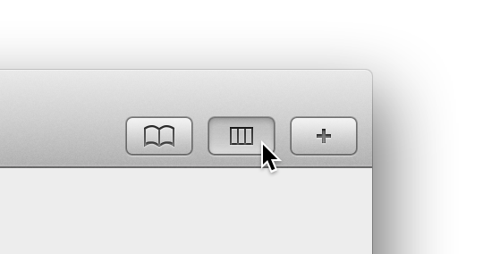
In Mavericks and before, the window toolbar and the buttons in it had a kind of 3D metallic look:
In Yosemite, everything got much flatter, and the buttons became almost flat white rounded rectangles:
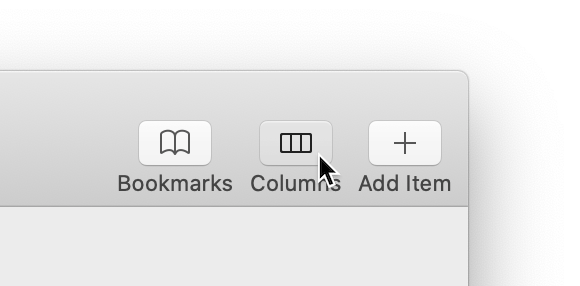
The design was slightly refined in El Capitan, and in later versions until Catalina you can see the buttons with a very thin border and shadow:
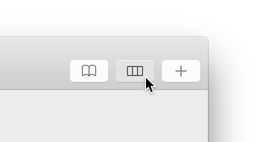
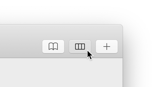
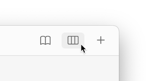
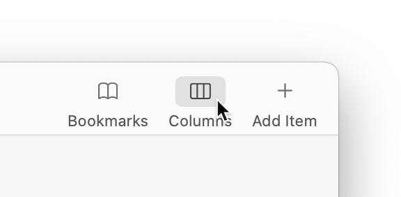
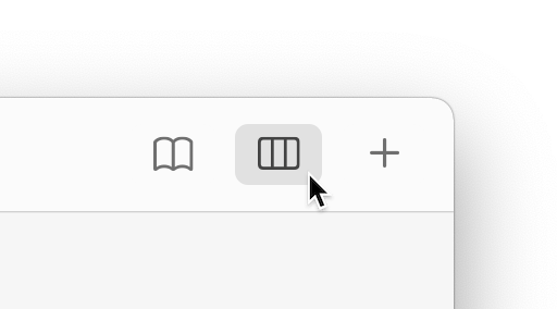
In Big Sur and Monterey, those buttons are… barely even buttons anymore. The design became extremely minimalistic, with the buttons turning into simply unbordered symbolic icons, which only show a light button shape behind them on hover. (As you might have guessed, I’m not a big fan of this change…)
The side effect of all these changes is that the button style named “textured” is now one of the most flat and minimal button styles here… This is exactly why you’re taught not to name CSS classes like .green-button 🙃
Textured buttons can technically have either an image or a title inside (or even both), and in Xcode they’re created with only a title by default, but in practice they’re always used with icons - usually monochromatic, symbolic ones (use SF Symbols on Big Sur and above).
There are two ways to create a textured button in the toolbar (both can be done in code and in IB):
- create a toolbar item with a custom view, which is a textured button (in IB you do this by dragging a button from the library to the toolbar editor panel)
- in Catalina and above, you can simply assign an icon to a toolbar icon and set its “bordered” property to true, which creates a proper button automatically (although Catalina doesn’t seem to support this when done in IB, only in code)
If you want to support older versions of macOS and use the first approach, you may need to manually override the button’s width so that it looks like the buttons in system apps; the right width seems to be 40pt, I’m not sure if this is specified somewhere. On Mojave and later this seems to work automatically. (More info on how to build toolbars here.)
Xcode:
These buttons are styled for use in window frame areas like the title bar, tool bar, or bottom bar.
Use window-frame controls in a toolbar. Standard controls look bad on the toolbar background, whether it’s translucent or opaque. Instead, use the controls that have been specifically designed for use in toolbars, such as the round textured button (…)
Don’t use the toolbar-specific control styles anywhere else in your window. The toolbar control styles are designed to look good on the toolbar; but on a window-body background, these controls can disappear or look inactive.
Avoid combining text and images within a toolbar control. A toolbar button can contain either text or an image.
If your window includes a bottom bar (which is not typical), you can use window-frame controls in the bottom bar.
Prefer system-provided glyphs in toolbar items because they’re familiar. System glyphs automatically receive appropriate coloring and react to user interactions and vibrancy.
Prefer glyphs over text in toolbar items. In a customizable toolbar, labels appear beneath toolbar items when the user chooses to display them, so displaying control text above label text is redundant.
If you must display text within a control, make sure it’s clear and concise. When describing an object, setting, or state, use a noun or noun phrase. When describing an action, use a verb or verb phrase. In all cases, use title-style capitalization.
3) Gradient Button
- bezelStyle =
.smallSquare/NSBezelStyleSmallSquare(NSSmallSquareBezelStyle) - button type =
.momentaryPushIn - variable height
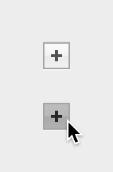
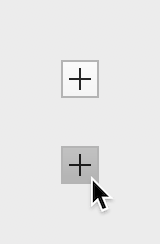
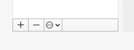
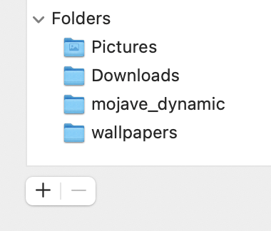
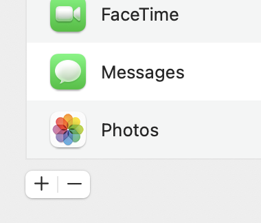
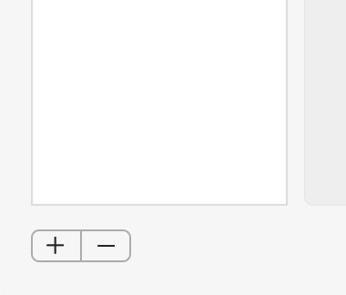
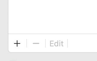
The third button style is the Gradient Button (not much of a gradient left there either, but I guess you can see it if you squint a bit…). This is a style meant primarily for small, square or almost square action buttons with icons like a plus/minus sign or a cogwheel, which are positioned along the bottom edge of a table view. You can see them everywhere in the standard Apple apps, especially in various System Preferences panels - they’re used for adding and removing elements from the list above and performing some other actions on them:
Xcode:
These buttons are styled for use with a source list or other view, and should have a image, but not a title.
A gradient button performs an instantaneous action related to a view, such as a source list.
Gradient buttons contain images; they don’t contain text.
Gradient buttons can have push-button, toggle, and pop-up menu behavior. For example, Mail uses gradient buttons below the sidebar to offer New Mailbox, Show/Hide Mail Activity, and Action menu functionality (…)
When possible, use system-provided images, such as the Action and the Add images, because their meaning is familiar to users.
Use gradient buttons in a view, not a window frame. Gradient buttons aren’t intended for use in toolbars or status bars. If you need a button in a toolbar, use a toolbar item.
They usually reside in close proximity to (either within or beneath) their associated view.
Alternative UI options
To make things a bit more confusing, there is another control that can be used to implement a UI like this: the Segmented Control. The row of “buttons” is then positioned slightly away from the associated view, but otherwise it looks very similar. The segmented control needs to be configured in the “Momentary” mode instead of the default “Select One”, so that the segments act as push buttons, not toggle buttons.
The HIG (all versions) specifically advise against doing this:
Don’t use a segmented control for add and remove actions. If you need a way for people to add and remove items in a table or other view, use gradient buttons. (2021)
But if you look through Apple’s system apps, especially various System Preferences panels, you will find plenty of places that do exactly that 🙃
I’m honestly not sure if there is any logic in that, because sometimes you can even see both styles in the same dialog:
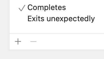
There’s also a third style, used e.g. in Xcode Preferences and in some newer System Preferences dialogs, which is a row of small icon buttons like gradient buttons, but unbordered (since there’s no bezel, any bezel setting can be used, and some of these buttons are e.g. unbordered recessed or bevel buttons):
So I guess feel free to use whichever style makes more sense to you in a given context :)
4) Checkbox
- group: Selection Controls
- button type =
.switch/NSButtonTypeSwitch(NSSwitchButton) - bezel style = “Check” in IB (no counterpart in code, but
bezelStyleis ignored in practice) - fixed size
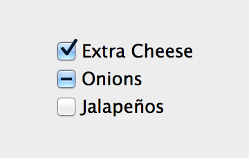
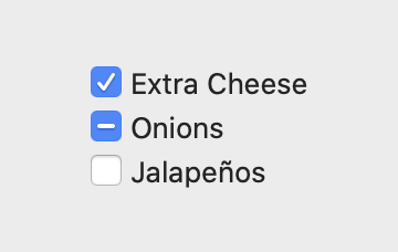
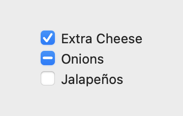
There isn’t much to say about the checkbox style - I think everyone knows what a checkbox is. It works more or less like checkboxes on any other system and platform.
One thing that may not be obvious, since it’s rarely seen in practice, is that checkboxes can have a third “mixed” state apart from on and off, if they’re so configured. The mixed state means something like both on and off or something in between - usually it’s used when some operation is performed on a number of selected items, and the mixed selection means that some of the items have a given property set and some don’t.
Do not confuse the checkbox, which uses the “Switch” button type, with the recently introduced NSSwitch control, which looks like the iOS UISwitch - read more in the NSSwitch section.
Xcode:
Switch a state between on and off.
Check boxes show the user the boolean state of a given value. Clicking the check box toggles the state and sends an action message to an associated controller.
Checkboxes are ideal for controlling a Boolean state within your application. The mixed state of a checkbox, enabled through the allowsMixedState property, is useful for summarizing multiple Boolean states of varying values.
Use a checkbox when you want to allow users to choose between two opposite states, actions, or values.
Use radio buttons, instead of checkboxes, to provide a set of choices from which users can choose only one.
Use a checkbox in a view, not a window frame. Checkboxes aren’t intended for use in window frame elements like toolbars and status bars.
A checkbox is almost always followed by a title unless it appears in a checklist.
Provide a title that implies two opposite states. Make sure it’s clear what happens when the checkbox is selected or deselected. In general, use sentence case without punctuation. If you can’t find an unambiguous title, consider using a pair of radio buttons instead, so you can clarify the states with two different labels.
Consider using a label to introduce a group of checkboxes if their relationship isn’t evident. Describe the set of options and align the label’s baseline with the first checkbox in the group.
In general, arrange multiple checkboxes vertically. When checkboxes are listed vertically, it’s easier to distinguish their states.
Use alignment and indentation to group related checkboxes. In general, checkboxes should be left-aligned. Use indentation when you need to denote hierarchy or dependency, such as when the state of a parent checkbox governs the state of child checkboxes. The Clock pane in Date & Time preferences uses this style to show that some settings are dependent on others.
Enable and disable checkboxes and related controls accordingly. Checkboxes and related controls should be disabled if they’re not applicable in the current state. In the Junk preference pane in Mail, the options for customizing junk mail behavior are inactive unless the user selects “Enable junk mail filtering.”
5) Radio Button
- group: Selection Controls
- button type =
.radio/NSButtonTypeRadio(NSRadioButton) - bezel style = “Radio” in IB (no counterpart in code, but
bezelStyleis ignored in practice) - fixed size
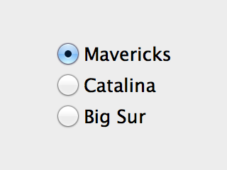
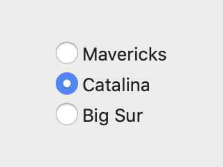
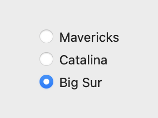
Like the Checkbox, the radio button doesn’t require much explaining - like on the web and everywhere else, it’s a selection button that works in a group of a few buttons of the same kind arranged together, and the user can only select one option at a time; when another option is selected, the previously selected button becomes unselected.
In some old sources you may come across the name NSMatrix or “Radio Group” - this was an old control that worked as a container for radio buttons that managed their layout and exclusive selection. Since OS X 10.8 and Xcode 7 the recommended way to use radio buttons is to create them individually, and the NSMatrix control is deprecated. The buttons “figure out” what group they belong to by the action they’re connected to.
A button that displays a single selected value from group of possible choices.
A radio button is similar to a NSButton.ButtonType.switch button, but it constrains the selection to a single button within a group. Radio buttons are ideal for choosing one value from a small number of options.
Xcode:
Radio buttons present a choose one from many interface. When clicked, a radio button becomes selected, deselects other radio buttons from the same group, and sends an action message to an associated controller. Radio buttons with the same action and superview automatically act as a group.
A group of radio buttons displays a set of mutually exclusive, but related, choices.
Use checkboxes, instead of radio buttons, to display a set of choices from which the user can choose more than one at the same time. Also, if you need to display a single setting, state, or choice that the user can either accept or reject, don’t use a single radio button; instead you can use a checkbox.
Consider using a pop-up menu if you need to display more than five items. It’s best when a group of radio buttons contains at least two items and a maximum of about five.
Use radio buttons in a view, not a window frame. Radio buttons aren’t intended for use within portions of window frames, such as in toolbars and status bars.
Give radio buttons meaningful titles. (…) Generally, use sentence style capitalization without ending punctuation.
Consider using a label to introduce a group of radio buttons. Describe the set of options and align the label’s baseline with the baseline of the first radio button’s title.
Prefer a standard button instead of a radio button to initiate an action. Radio buttons present options to the user. A radio button that initiates an action is confusing and nonintuitive.
Consider a checkbox when the user needs to choose between two states. The on and off states of a checkbox are generally clear to most users and a checkbox requires less space than a set of radio buttons. (…) In a rare case where a checkbox isn’t clear enough, a set of radio buttons with descriptive titles may be warranted.
6) Round Rect Button (formerly “Rounded Rect Button”)
- group: Scope Buttons
- bezelStyle =
.roundRect/NSBezelStyleRoundRect(NSRoundRectBezelStyle) - button type =
.momentaryPushIn - fixed height
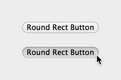
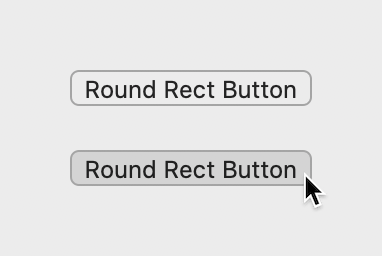
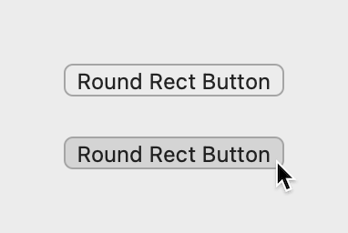
This button’s main purpose is in filtering UIs, where the user can build additional conditions to filter search results by specifying the attributes they’re interested in. The best known example is probably the one in Finder:
The round rect buttons are the ones on the right - the Save/+/- buttons that let you add or remove additional conditions. They’re usually used together with Recessed Buttons (described below), which form the scope bar in the top-left. In the HIG (old and new versions) they’re grouped together as “Scope Buttons”.
Another example can be found in the Preview app when searching in a PDF document (the “Done” button):
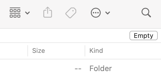
Or in the Trash window in Finder (not technically a scope bar, but still in the header area, so close enough…):
Note: this description from Xcode is actually incorrect - I think it was copied from the Recessed Button, because it’s exactly the same:
⚠️ Round rect buttons represent boolean state and are styled for use with scope bars and related filter rows. When clicked, they toggle on and off, and send an action message to an associated controller.
Unlike a recessed button, a round rect button does not have a boolean state and does not work as an on/off toggle - it’s a normal action button, just used in a very specific context. Check out the +/- buttons in the filter bar in Finder - they don’t stay pressed after you click them.
A bezel style appropriate for use as an action or auxiliary button in scope bars and title bar accessories.
Typically, round rectangle and recessed scope buttons contain text, but they can instead contain images.
Use a round rectangle scope button to allow users to save a set of search criteria and to change or set scoping criteria.
If you want to display an image in a scope button, be sure to consider the system-provided images before you spend time designing your own.
Scope buttons are designed to be used in scope bars and related filter rows only. They are not intended to be used in the toolbar or bottom-bar areas or outside of a scope bar in the window body.
A rounded bezel is reserved for scope buttons that initiate an action or specify search criteria.
Only display a scope button in a scope bar. Scope buttons aren’t intended for use outside of scope bars.
But again, if you look long enough, you can find examples in Apple’s own apps that are in direct contradiction to what it says in the HIG:
Those two buttons at the top and bottom - yeah, they’re round rect buttons (yes, I’ve checked :). So this kind of dark background HUD panel is probably another context in which these buttons might make sense, there may be other such places too. But you should probably not use them within the main window body.
7) Recessed Button
- group: Scope Buttons
- bezelStyle =
.recessed/NSBezelStyleRecessed(NSRecessedBezelStyle) - button type =
.pushOnPushOff - fixed height
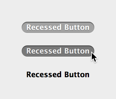
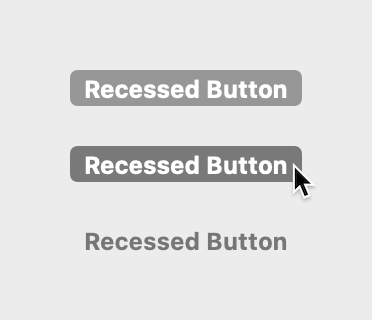
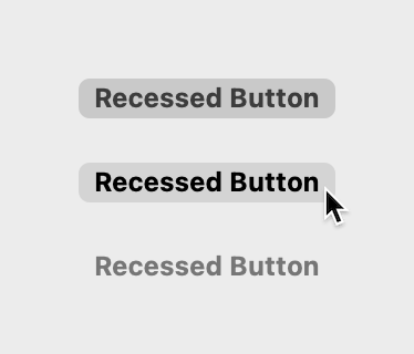
This is the second of the “Scope Buttons”, used in horizontal bars positioned usually at the top of a view, which allow filtering and searching of some kind of data objects like files or messages. It’s often used together with Round Rect Buttons, although it can be used by itself, if choosing the folder/category is the only available action. This is the case here in Mail, where you can only choose which mailbox folder you want to display or search in:
Another example is the Dictionary app:
Xcode:
Recessed buttons represent boolean state and are styled for use with scope bars and related filter rows. When clicked, they toggle on and off, and send an action message to an associated controller.
Typically, round rectangle and recessed scope buttons contain text, but they can instead contain images.
Use a recessed scope button to display types or groups of objects or locations that users select to narrow the focus of a search or other operation.
If you want to display an image in a scope button, be sure to consider the system-provided images before you spend time designing your own.
Scope buttons are designed to be used in scope bars and related filter rows only. They are not intended to be used in the toolbar or bottom-bar areas or outside of a scope bar in the window body.
A scope button appears in a scope bar above a view. Clicking a scope button restricts the scope of content, such as search results, within the view.
A recessed bezel is reserved for scope buttons that toggle on and off to narrow focus.
Only display a scope button in a scope bar. Scope buttons aren’t intended for use outside of scope bars.
8) Inline Button
- bezelStyle =
.inline/NSBezelStyleInline(NSInlineBezelStyle) - button type =
.momentaryPushIn - fixed height (*)
(*) technically you can set a custom height in code, but since IB doesn’t allow that, it’s probably not a good idea…
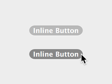
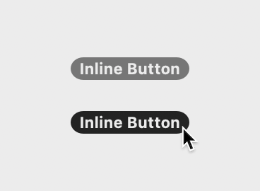
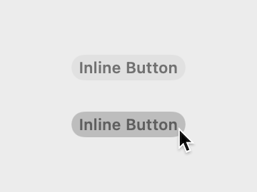
This is a relatively newer button style, added in OS X 10.7. That was still over 10 years ago, but despite that, neither the older or the new HIG seem to mention it at all.
The best explanation of its use, though without any visual examples like those in the HIG, comes from Xcode and the AppKit documentation:
Xcode:
Inline buttons are styled for use as a count or label in a source list and send an action message to a controller when clicked.
Common uses of this button style include:
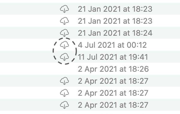
- An inline button in a table view, such as a stop progress button in a download panel
- An “unread” indicator in an outline view
Use text for an unread indicator and a template image for other buttons.
Note the words “label” and “indicator”: as I understand, this button does not actually have to act as a button, i.e. it doesn’t have to be clickable. It can be simply used as a kind of label in a specific context that’s styled in a specific way.
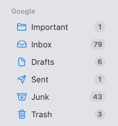
In the Mail app, inline buttons are used as message count badges in mailbox rows in the sidebar:
9) Square Button / Image Button (also called “Icon Button”)
- bezelStyle =
.shadowlessSquare/NSBezelStyleShadowlessSquare(NSShadowlessSquareBezelStyle) - button type =
.momentaryPushIn, possibly.toggleor.momentaryChange - variable height
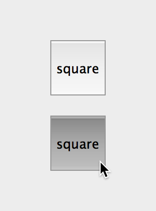
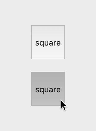
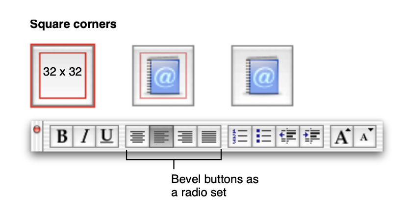
The square button was originally a large button with a clear dark border and sharp square corners that usually displayed a large icon inside, which looked like this:
![]()
Here’s how a very old version of the HIG shows its intended use:
In modern macOS this kind of button slowly fell out of use; in Xcode 7 the button in this form was removed from the Object Library, and already back in 2009 (!) this kind of button was listed as not recommended in the HIG (it used to be described as a variant of the Bevel Button):
Bevel buttons can have rounded or square corners. The square buttons work well for tiling together in groups (to be used as radio buttons, for example). (2006)
You may notice, however, that bevel buttons are not very frequently used in applications running in Mac OS X v10.4 and later. This is due in part to user interface style changes and in part to alternative controls that became available. (2009)
Bevel buttons are not recommended for use in apps that run in OS X v10.7 and later. You should consider alternatives, such as gradient buttons and segmented controls (…) (2012)
However, the bezel style itself wasn’t deprecated - the button was instead repurposed as an unbordered image button, basically a plain image/icon that you can click to perform some kind of action.
In Xcode 7 and above, the button is listed in the Object Library as “Image Button”:
In the Attribute Inspector however it’s still listed as “Square”, so don’t look for an Image Button there. And technically you can still pick that style and enable the border and get the version shown earlier, though you probably shouldn’t - if you really want a large bordered image button, a Bevel or perhaps Gradient style would make more sense.
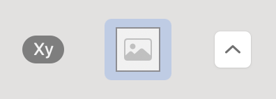
Here are some of the places where image buttons are used in system apps:
Since there is no border (bezel) and only the contents are shown, you can in fact use almost any bezel style with the border off and it will look the same. Looking through Apple’s apps I’ve found unbordered gradient, bevel, square, recessed, textured square buttons, and some even with a non-standard style ID - it generally seems pretty random. So technically there isn’t really any reason why the “Square” bezel style shouldn’t be marked as “discouraged” and replaced with another style for the “Image Button” template - but there’s also no reason for you to specifically change it.
Xcode:
A custom button represented by an image that sends an action to an associated controller when clicked.
An icon button (or image button) is a freestanding icon that behaves like a push button in a window’s content area.
An image button appears in a view and displays an image or icon. It initiates an immediate, app-specific action. An image button has no border and can be configured to behave as a push button, toggle, or pop-up button.
Use an image button in a view, not a window frame. Image buttons aren’t intended for use within toolbars and status bars. If you need an image button in a toolbar, use a toolbar item. (*)
(*) Note: older HIGs mention image buttons also being used in toolbars, but this kind of toolbars with large unbordered colorful icons fell out of use in recent years:
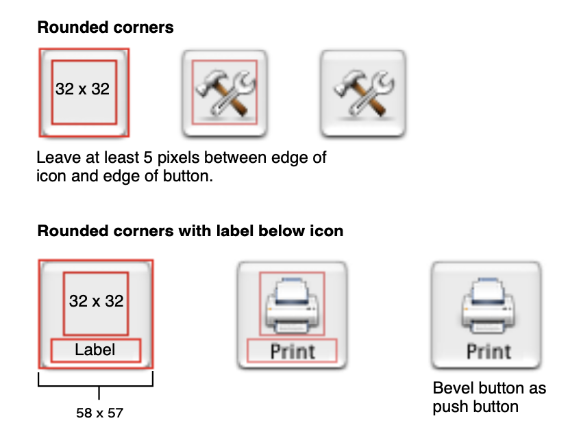
Include about 10 pixels of padding between your image edges and the button edges. Even though the edges of an image button aren’t visible, they still define the clickable area for the button. Padding ensures that a user’s click registers even if it misses the image slightly.
Allow adequate spacing between image buttons and other controls. Provide enough of a buffer that the user won’t inadvertently click the button’s hidden frame when attempting to click another control.
Position a label, if there is one, below the image button.
10) Disclosure Triangle
- group: Disclosure Controls
- bezelStyle =
.disclosure/NSBezelStyleDisclosure(NSDisclosureBezelStyle) - button type = “other” (?)
- fixed size
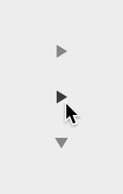
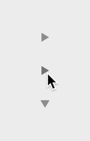
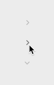
The Disclosure Triangle is used to show/hide some additional information or a section that users don’t need to see by default. For example, if you have a list of properties describing something like a file or a photo, you can group them into collapsible sections and only show the most important ones by default. The triangle should indicate that something below is hidden, and when it’s clicked, the triangle rotates and reveals that something.
Xcode:
Disclosure triangles [show or hide] more detail, or subordinate items in a hierarchical list. They toggle appearance between open and closed when clicked, and send an action message to an associated controller.
Use a disclosure triangle when you want to provide a simple default view of something but need to allow users to view more details or perform additional actions at specific times. In general, you can use a disclosure triangle in the following two ways:
- To reveal more information in dialogs that have a minimal state and an expanded state. For example, you might want to use a disclosure triangle to hide explanatory information about a choice that most users aren’t interested in seeing.
- To reveal subordinate items in a hierarchical list. For example, the Mail Photo Browser panel uses a disclosure triangle to reveal specific iPhoto categories.
Supply a label for a disclosure triangle in a dialog. The label should indicate what is disclosed or hidden and it should change, depending on the position of the disclosure triangle. For example, when the disclosure triangle is closed the label might be “Show advanced settings;” when the disclosure triangle is open the label can change to “Hide advanced settings.”
A disclosure triangle reveals and hides information and functionality associated with a view or in a list of disclosable items. Keynote uses a disclosure triangle to reveal advanced options when exporting a presentation. The Finder uses disclosure triangles to progressively reveal hierarchy when navigating a folder structure in list view.
Note: in some cases you should use the Disclosure Button - the difference is explained in more detail in the next section:
Don’t use a disclosure triangle to display additional choices associated with a specific control. If you need to do this, use a disclosure button instead (…).
- group: Disclosure Controls
- bezelStyle =
.roundedDisclosure/NSBezelStyleRoundedDisclosure(NSRoundedDisclosureBezelStyle) - button type =
.onOff - fixed size
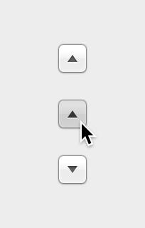
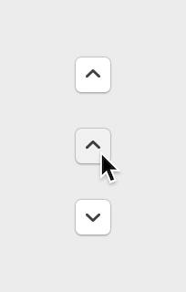
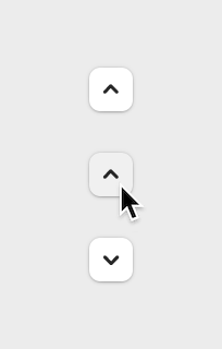
Like the Disclosure Triangle, the Disclosure Button is used to show/hide a section of a view that provides some additional options. The difference between the two is in what exactly is being hidden in the collapsible section.
In case of this more button-like variant, we always have some kind of primary control next to it that allows the user to choose something - e.g. a text field, a popup button or a combo box. The section that is being revealed contains some additional information or options that help the user make this choice they’re making in the primary control. So there needs to be a control for something that the user is picking or editing that’s next to the arrow button, always visible, and the content in the collapsible section is all related to that main control.
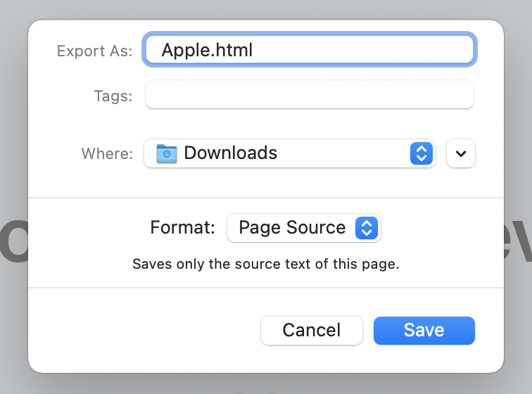
One example you will most commonly see is in save or export dialogs - they usually have a text field for the file name and a picker for the target location:
Here, you can either choose one of the default locations from the picker, or you can click the disclosure button to expand the dialog, and the revealed directory list lets you browse through the filesystem to find the location you need. The selection you make in the list automatically updates the location in the picker control above, which in this case is the “primary control” mentioned earlier.
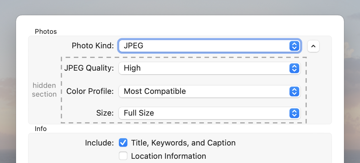
This button style has a definitely more narrow use that the triangle variant. You will mostly see it in contexts like save and export dialogs, where it’s either used to reveal a file/directory picker or to let the user specify additional options for the export. An example of that second case is the export dialog in Photos:
Here, the disclosure button shows or hides the options for JPEG quality, color profile and size. The specific list of options depends on what format you pick in the first picker. So in this case the controls in the revealed section don’t modify the selection in the first control (Photo Kind), but rather clarify it: in the first control you specify that you want a JPEG, and the additional controls let you say exactly what kind of JPEG you want.
Xcode:
Disclosure buttons show or hide options in a window, like Save and Print panels. They toggle appearance between open and closed when clicked, and send an action message to a controller.
A disclosure button expands a dialog or panel to display a wider range of choices related to a specific selection control.
Use a disclosure button when you need to provide additional options that are closely related to a specific list of choices.
Place a disclosure button close to the control to which it’s related. Users need to understand how the expanded choices are related to their current task. For example, the Preview Export As dialog puts a disclosure button close to the Export As text field, so that users understand that the expanded view will help them choose a location for their document.
Don’t use a disclosure button to display additional information or functionality or subordinate items in a list. If you need to display additional information or functionality related to the contents of a window or a section of a window, or if you need a way to reveal subordinate items in a hierarchical list, use a disclosure triangle instead.
Use no more than one disclosure button in a single view. Multiple disclosure buttons add complexity and can be confusing.
12) Help Button
- bezelStyle =
.helpButton/NSBezelStyleHelpButton(NSHelpButtonBezelStyle) - button type =
.momentaryPushIn - fixed size
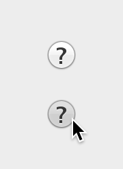
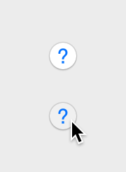
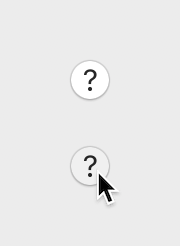
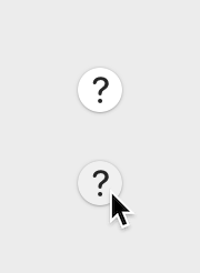
This button is supposed to open a help dialog, or otherwise explain the user what is going on in the given window. You can often find them in panels of preferences windows, usually in the bottom-right corner, sometimes bottom-left.
In theory, as I understand, it’s supposed to always open the standard Cocoa “Help Viewer” system, but honestly, that thing always looked kind of outdated to me… so I think you’d get away with using some kind of custom help window, possibly even linking to a website that opens in Safari (but don’t quote me on that).
Xcode:
Present the application’s help content in Help Viewer when clicked.
The Help button opens a window that displays app-specific help.
When users click a Help button, the system-provided Help Viewer app opens to a page in the current app’s help book. An app can determine whether the help book should open to a top-level page or to a page that is appropriate for the context of the button.
Don’t create a custom button to perform the function of the standard Help button.
In dialogs (including preferences windows) and drawers, the Help button can be located in either the lower-left or lower-right corner. In a dialog that includes OK and Cancel buttons (or other buttons used to dismiss the dialog), the Help button should be in the lower-left corner, vertically aligned with the buttons. In a dialog that does not include OK and Cancel buttons, such as a preferences window, the Help button should be in the lower-right corner.
Use the system-provided help button to display help documentation. People are familiar with the appearance of the standard help button and know that clicking it opens help content.
Whenever possible, open a help topic related to the current context. For example, the Rules pane of Mail preferences includes a help button. When clicked, it opens directly to a Rules preferences help topic. If it doesn’t make sense to show a specific topic, show the top-level of your app’s help documentation.
Provide no more than one help button per window. Multiple help buttons in the same context make it hard for the user to predict the result of clicking one.
Use a help button in a view, not a window frame. Help buttons aren’t intended for use in toolbars or status bars.
Don’t use a label to introduce a help button. The purpose of a help button is clear without the need for additional descriptive text.
13) Bevel Button
- bezelStyle =
.regularSquare/NSBezelStyleRegularSquare(NSRegularSquareBezelStyle) - button type =
.momentaryPushIn - variable height
This one is kind of interesting… Back when I originally wrote this post in 2014, the bevel button has already been kind of semi-abandoned for a while. While it was still listed in the Object Library, its design looked outdated, and the HIG specifically mentioned it as not recommended:
Note: Bevel buttons are not recommended for use in apps that run in OS X v10.7 and later. You should consider alternatives, such as gradient buttons and segmented controls
The button as created from the template in the library looked like this:
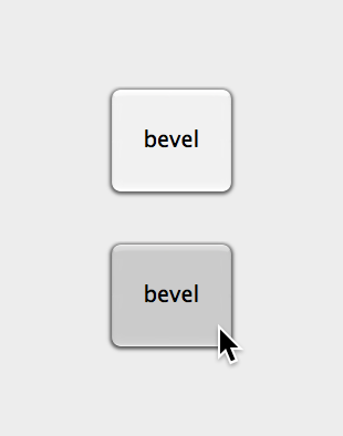
And here’s how an old HIG describes its intended use:
In Xcode 7 this button style was removed from the Object Library, and in the style selector in Attribute Inspector it was moved to a “Discouraged Styles” section. And it stayed like this until… it was kind of brought back from the dead this June with macOS Monterey 🤔
The “What’s new in AppKit” WWDC talk describes it this way:
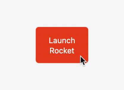
Finally, we’ve updated the Flexible Push style of button – previously known as Regular Square – to serve as a variable-height push button. It now supports all of the same configurations as an ordinary push button, which means that it can serve as the default button, and you can tint it. The corner radius and content padding now match those of a standard push button at each control size, so they’ll fit in great with your other controls, but their vertically resizable design means that they can accommodate larger icons or text with line breaks.
While the vast majority of push buttons should continue to use the standard fixed-height style, this newly expanded style offers some flexibility for those special cases when you need to accommodate taller content.
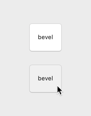
If you look at the button style selector in view attributes, the “Bevel” style is now back in the main section, removed from “Discouraged Styles”. Contrary to what was said in the talk though, it doesn’t seem to be referred to as “Flexible Push” anywhere.
It also hasn’t been added back to the Object Library, so the only way to create it in Interface Builder is to drag another kind of button from the library, e.g. a Push Button, and then change its style to Bevel. It doesn’t really seem to have changed visually either, because a button created this way looks the same in Big Sur and Monterey, as far as I can tell (although the sizing seem to have changed, i.e. it may show up slightly bigger).
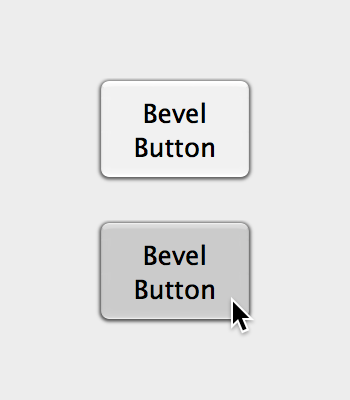
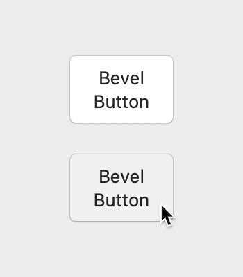
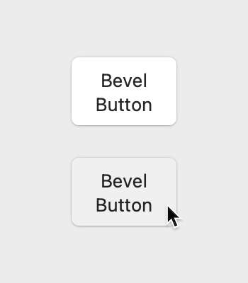
And both the documentation and the HIG still refer to it as the old, deprecated button from the early versions of OS X that should be avoided:
A rectangular button with a two-point border, designed for icons.
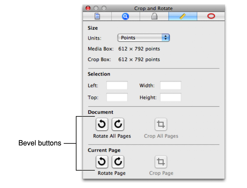
Bevel buttons — due to their ability to have square or rounded corners, and to display text, an icon, or another image — once served many roles on macOS. Used in a window’s main content area, bevel buttons filled a need for things like push buttons, groups of radio buttons or checkboxes, or, when badged with a downward arrow, pop-up buttons.
Avoid using bevel buttons. Bevel buttons are no longer used in modern Mac apps. Instead, use push buttons, checkboxes, pop-up buttons, radio buttons, or segmented controls.
So things seem to be a little bit out of sync right now… But it seems from what was said in the talk and from the changes in Xcode that it’s OK to use this button style again, it’s just not totally clear what the intended use cases and guidelines are.
My guess is that it should mostly be used in the same way as the large Push Button added in Big Sur - as some kind of central “call to action” button, in walkthrough/welcome windows etc. But don’t overuse it, and probably don’t put more than one of those in a window, or two side by side at most.
Oh, and as mentioned, you can make them colorful if that makes sense (just like Push Buttons) 🚀
14) Switch Control
NSSwitchclass- fixed size
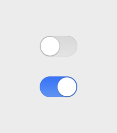
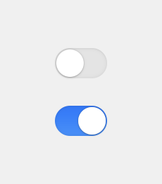
I’m kind of cheating here, because this isn’t actually a button style or even subclass of NSButton - but it could just as well be, because it works just like other buttons (especially the Checkbox). I honestly don’t know why they didn’t make it so.
I’m sure you recognize this shape from iOS - that’s how the UISwitch, one of the most common iOS controls, has looked since the earliest versions. This control was added to AppKit in macOS Catalina and it works visually and functionally more or less the same as the iOS counterpart.
Don’t be tempted to use it exactly in the same way as on iOS though, i.e. as a fancy looking checkbox. The Mac version of the switch has a specific use case, and if you have e.g. a whole list of options in Preferences and you make a vertical row of NSSwitches, it will look weird here (they’re kind of too big for that). We have a classic Checkbox here on the Mac, and it should be used in such cases just like before.
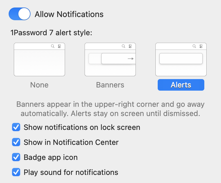
The role of the NSSwitch is as a kind of “master switch” that enables some whole section of functionality. Something like in the notifications panel in System Preferences, where the switch enables or disables notifications in general, and below you can use plain checkboxes to tweak specific notification options:
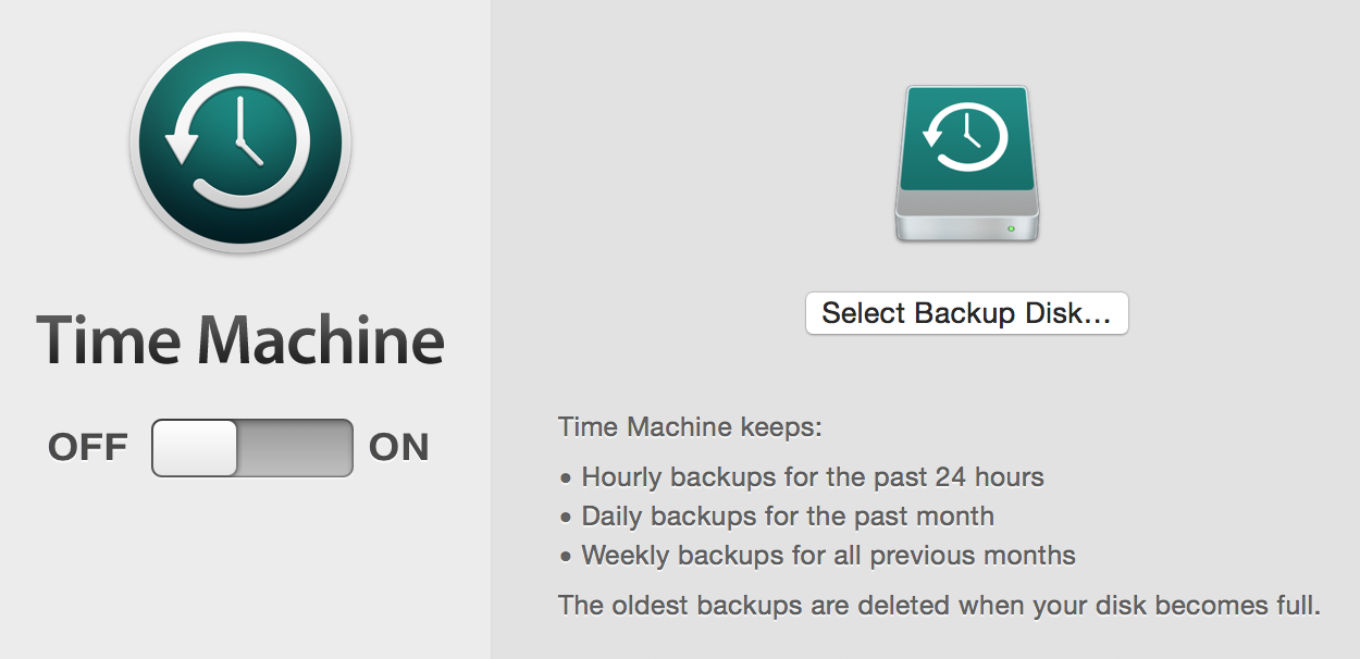
Or, remember that big-ass custom switch thing in Time Machine settings from a few macOS versions back? The custom control was removed in macOS Sierra, but I think an NSSwitch would fit well here:
So if you have something like that - a switch somewhere at the top that basically says “turn this whole thing on or off” - that’s a good place for an NSSwitch. And there should probably only be one of them at most in a single view.
Use a switch to toggle significant preferences, or preferences that provide access to other controls. Avoid creating lists or tables of switches; instead, for general-purpose toggles, use an instance of NSButton to display a checkbox.
Use a switch in a view, not a window frame. Switches aren’t intended for use in window frame elements like toolbars and status bars.
Avoid using a switch to control a single detail or a minor setting. A switch has more visual weight than a checkbox, so it looks better when it controls more functionality than a checkbox typically does.
In general, don’t replace a checkbox with a switch. If you’re already using a checkbox in your UI, it’s probably best to keep using it.
WWDC:
We think NSSwitches are better used when you have a really heavy toggle, something that’s toggling a lot of functionality on and off. And in this example I have here, we have a master toggle on the left which is going to enable all of the individual sharing services on the right. (“What’s New in AppKit for macOS”, WWDC 2019)
Deprecated button styles
15) Round Button
- bezelStyle =
.circular/NSBezelStyleCircular(NSCircularBezelStyle) - button type =
.momentaryPushIn - fixed size
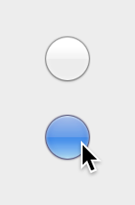
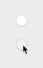
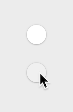
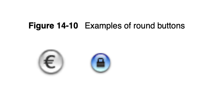
This button has been removed from the Object Library in Xcode 7 and in the style selector in Attribute Inspector it’s listed under “Discouraged Styles”. Round buttons haven’t been used much in the system or third party apps for a long time now - as I understand, they’ve probably been used in early versions of OS X in similar contexts as e.g. Gradient Buttons or the Textured Rounded Buttons in the toolbar:
A round button with room for a small icon or a single character. This style has both regular and small variants, but the large variant is available only in gray at this time.
A round button contains a small centered icon, similar to a help or radio button.
Avoid using round buttons. Round buttons are discouraged from use in modern apps. Instead, use push buttons, help buttons, or radio buttons.
A round button initiates an immediate action.
Round buttons are not recommended for use in apps that run in OS X v10.7 and later.
Use them when you need a simple iconic push button to initiate an immediate action. They are commonly used as navigation controls.
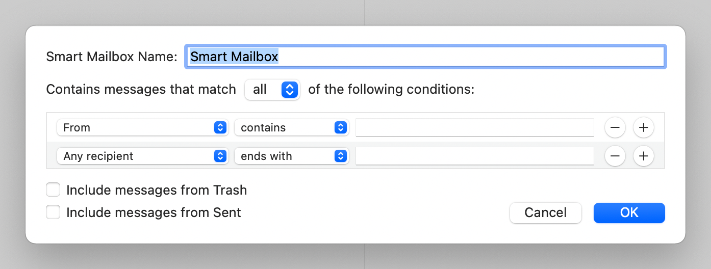
Surprisingly, I’ve found a couple of places where these are used in Apple’s system apps - even on Monterey! You can see them in the condition rows in “New Smart Mailbox” dialog in Mail (yes, these are .circular bezel buttons):
There’s also a very similar one in Photos. It seems these buttons have been there since at least Mavericks, probably earlier (the Mail ones at least, Photos only replaced iPhoto in Yosemite):
But they haven’t been replaced yet, and it seems Apple even slightly tweaked the design of the button in Big Sur. So if you have a similar use case - something like the Round Rect Buttons in a search bar, but within the window body and not in a toolbar area - then it might make sense to use this style.
16) Textured Button (Textured Square)
- bezelStyle =
.texturedSquare/NSBezelStyleTexturedSquare(NSTexturedSquareBezelStyle) - button type =
.momentaryPushIn - variable height
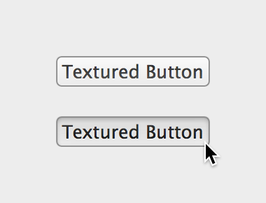

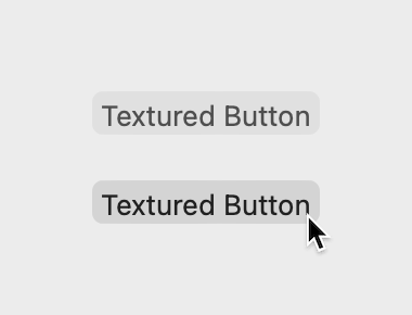
This button has been removed from the Object Library in Xcode 7 and in the style selector in Attribute Inspector it’s listed under “Discouraged Styles”. The HIG doesn’t mention it, and the only useful piece of information comes from the documentation:
A bezel style appropriate for use with textured (metal) windows.
Since textured metal windows haven’t been used much in macOS lately, you can imagine there haven’t also been many good places to use these buttons either :)
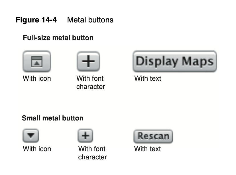
I did find more information in a very old version of the HIG (2006, OS X 10.4). Back then, this button style was called “Metal Buttons”:
Metal buttons are for use in brushed metal windows. (In Interface Builder and in the Cocoa API, metal buttons are referred to as “textured”.)
Don’t use metal buttons in dialogs. Dialogs should never use the brushed metal look.
So I imagine it served a similar purpose as its twin brother Textured Rounded Button, it was just meant for a different kind of window. The square version then went out of use when the brushed metal backgrounds disappeared from OS X.
Bonus level: Segmented controls
While inspecting some of the built-in apps, I’ve noticed that some of the buttons I’ve looked at aren’t actually buttons - they’re in fact segmented controls (NSSegmentedControl) used in a non-standard way.
A segmented control is a set of toggle buttons forming one body in a horizontal row, which let you choose one of the options, like the list display mode in Finder. There is almost always more than one segment, because it doesn’t make much sense to choose from a single option.
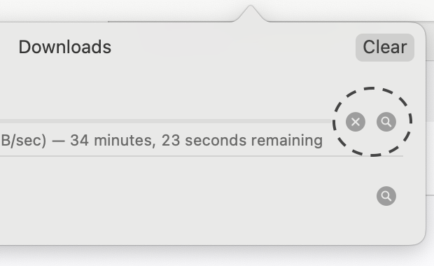
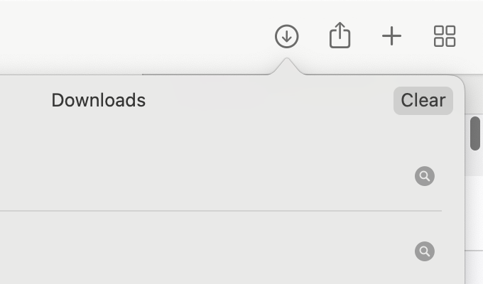
However, you can technically make a segmented control with a single segment, and configure it with trackingMode set to .momentary / NSSegmentSwitchTrackingMomentary, which means it automatically reverts back to normal state after being pressed, and then it becomes… basically a normal button. For example, the “Clear” button here in Safari’s Downloads popup is really a single-segment segmented control:
The HIG doesn’t mention that you can use segmented controls as buttons this way - but neither does it say that you shouldn’t do that… That said, I honestly don’t see any reason why you would. If you have an idea why Apple might be using these controls this way, let me know :)
Here’s how different types of segmented controls look in this pseudo-button mode:
Rounded (NSSegmentStyleRounded)
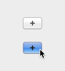
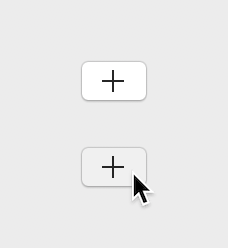
On Yosemite and later it looks like a Bevel button, on Mavericks it looks like a Push button. The “Separated” style (NSSegmentStyleSeparated, 10.10+) looks the same, the difference is that if you have more than one segment, they appear as separate buttons.
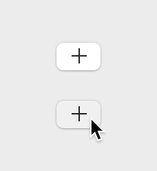
Capsule (NSSegmentStyleCapsule),
Textured Rounded (NSSegmentStyleTexturedRounded),
Textured Square (NSSegmentStyleTexturedSquare)
These three look the same, and very similar to the two textured (toolbar) buttons. The documentation explicitly says that these styles look the same since 10.7 and that you should use the “Textured Square” one.
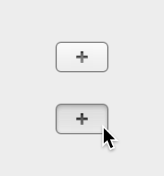
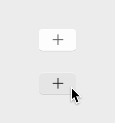
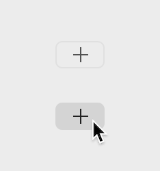
Round Rect (NSSegmentStyleRoundRect)
As expected, it looks like the Round Rect NSButton:
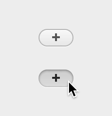

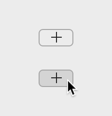
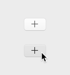
Small Square (NSSegmentStyleSmallSquare)
And the last one looks similar to a Gradient button:
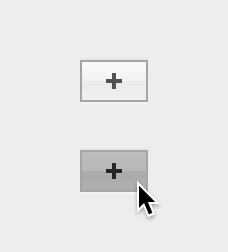
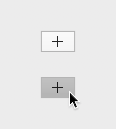
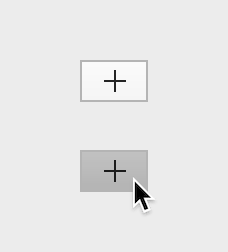
Note: all segmented control types have a fixed height.
Button types
Just for completeness, here’s also a list of button types (the behavior modes, NSButton.ButtonType) and what I could figure out about them - since the descriptions in the documentation aren’t exactly making things clear:
.momentaryPushIn- the most standard kind of button that has a pressed state and then it goes back to normal state automatically - used for most button styles.momentaryLight- this seems to work exactly the same as “Momentary Push In”, it probably exists only for historical reasons.momentaryChange- a button that works like a push button, but in the pushed state it displays the alternate title/image; this probably only makes sense for unbordered image icons (clickable images) for which you want to provide a pressed state.pushOnPushOff- once a button is clicked, it stays pushed in, highlighted or rotated until it’s clicked again; use only for recessed buttons, disclosure buttons and triangles, or unbordered image buttons.onOff- it seems to work the same as.pushOnPushOff.toggle- a button that works like a push button, but also switches between normal and alternate title/image after each press; this probably only makes sense for unbordered image icons (clickable images) that toggle between two states, or perhaps if you had something like an “enable” or “start” button that turns into a “disable” or “stop” button once it’s pressed (?).switch- for the Checkbox button (bezel style is ignored).radio- for the Radio Button (bezel style is ignored).accelerator,.multiLevelAccelerator- these two can have a specific behavior on Force Touch capable trackpads (see blog post)
Sources
- Apple Human Interface Guidelines (2006, pdf)
- Apple Human Interface Guidelines (2008, pdf)
- OS X Human Interface Guidelines (2013): Controls, Windows (full pdf)
- OS X Human Interface Guidelines (2015): Buttons, Selection Controls, Infrequently Used, Toolbars
- macOS Human Interface Guidelines (2021): Buttons, Dialogs, Toolbars, Segmented Controls
- NSButton docs
- NSButtonCell docs / old class reference
- NSSegmentedControl docs / old class reference
- NSSwitch docs
- AppKit Release Notes for macOS Big Sur 11
- AppKit Release Notes for macOS Monterey 12
- WWDC 19: “What’s New in AppKit for macOS” / my notes
- WWDC 20: “Adopt the new look of macOS” / my notes
- WWDC 21: “What’s new in AppKit” / my notes
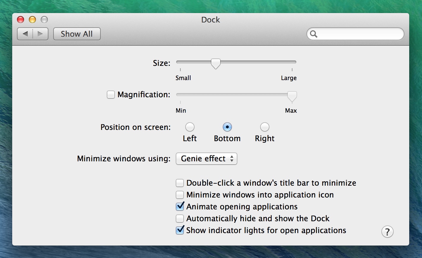










26 comments:
Mark Aufflick
FWIW nothing wtf about the word abut - it just means something right up against something else. http://www.oxforddictionaries.com/definition/english/abut
Kuba
Ah, thanks! :) I could swear I'd looked it up, but maybe I didn't...
aure
Good job man! The NSButton is still a nightmare for me, even after more that 10 years developing with Cocoa.
Tony Arnold
You've skipped over the curliest of the bunch: the checkbox! And ditto @aure — I still get tripped up subclassing these guys.
Stefan Hong
Thank you so much! I finally know the intended use of these button types.
Quinn Taylor
Hopefully you noticed the improvement in Xcode 7. I had filed a bug about a month before you posted this, and integrated button content and useful descriptions in the object library. Thanks for the detailed write up!
Kuba
I haven't looked there recently to be honest... You're right, they're cleaned up the list a bit and added descriptions, nice! I'll make a note to add them here later.
Ray
it's good for me, Thx!!!! :]
Sam Stevens
Thank you - very helpful summary - I'll keep coming back to this.
Keegan Rush
Great post, thank you! I've used this to recreate the action (gear) button in Finder and other default apps: http://www.thecodedself.com/macOS-action-button-swift/
Bartosz Kunat
Congrats on being featured in iOS Dev Weekly!
Jie Yang
thanks
Fernando
Great article!
It would be great if this article could be updated to 2020. Looks pretty up to date though... Thanks!
Kuba
@Fernando: I will! I've been thinking about this for some time, but now I wanted to wait until final Big Sur version is released, so that I can show (and see myself) how things look there. I don't have it on my Macs yet, but when I update them I'll try to find time to update this. Although to be honest newer versions of Xcode are doing a much better job at explaining what is what, and some older buttons have been removed too.
Madeline
This is one of the best articles I've managed to find!
I'm a new Mac OS developer working in Xamarin.Mac and this is so so so so so helpful!
Kuba
@Madeline: I'm working on an update for Big Sur and latest Xcode, check again in a month or two :)
Fernando
Hello! I'm back! :) Any news about the update? Thank you!
Kuba
@Fernando: Haha, good to know someone is watching me :D Sorry, no progress yet - same story, Monterey betas eventually came out and I've decided to wait with this until the final release so that I can re-check everything there… So hopefully I should be able to do this sometime in November.
Kuba
Ok, I'm working on a new version now, for real.
Kuba
Done :)
Fernando
Amazing update! Thank you! 🙌
alphaArgon
This article was added into my reading list and I sometimes review it. Thanks for updating!
Wilhelm
Thank you very much for this article.
After spending 2 hours++ trying to figure out how to get a standard button to have that preselected look like in alerts, already loosing hair, getting bloody eyes, and not anything working… I finally found the required information in your article (adding that keyEquivalent to \r…). You saved my sanity (unlike Apple's documentation)!
(BTW, that Captcha question is too hard for newbies. Not even DuckDuckGo can help… :( )
Kuba
@Wilhelm: Thanks, I'm glad I could help!
Sorry about the captcha - I thought this would be easy enough/googlable if needed… there used to be a question about "advertisingIdentifier" which I think was harder to answer ;) Earlier I used to have something simple here, but I was getting a lot of spam with people linking to some non-IT-related sites (clearly not bots unless they make bots that smart now - I think people were just googling the answer).
As for documentation - interestingly, they do mention this in NSButton documentation, except… in a wrong place :D Specifically, on the "recessed" button style page there is a paragraph that was clearly supposed to be on the "rounded" style page instead: https://developer.apple.com/documentation/appkit/nsbutton/bezelstyle/recessed
Mx-Iris
Great article, solved a lot of my doubts, I wrote a small library to help use NSButton, he defines each style as a subclass of NSButton and restricts it to modifying the style and providing only meaningful buttonType
https://github.com/Mx-Iris/StyleSplittedButton
Yukio Murakami
Awesome. Very helpful. Thank you.