Tips for creating mobile sites
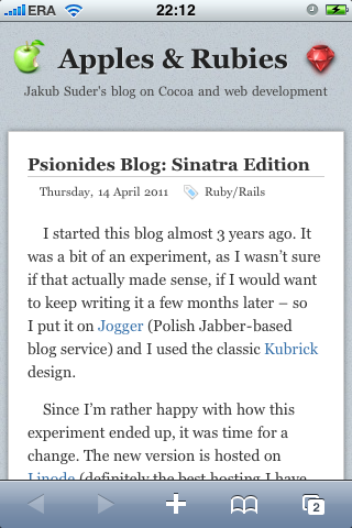
I’ve recently updated my new blog’s layout to support mobile phones, iPhone in particular (since that’s what I’m using ;). Here’s how it looks now:
I decided to use the same HTML for both versions, and use CSS media queries to define how the mobile version differs from the main one – I thought this was the cleanest and simplest solution in this case. For more complex sites, it probably makes more sense to have the two versions completely separated.
Surprisingly, it was quite easy to do once I figured out what exactly I needed to do. Turns out, the hardest part is apparently knowing what to put in your header and what media queries to use. Here are some tips and suggestions if you want to make a mobile version of your site too:
Media queries
You can use CSS media queries to define parts of the stylesheet that are only used in some specific conditions. You can check things like media type (screen, paper), orientation, screen size, number of colors, and so on. In this case, you’ll mostly care about screen size.
You can define the media conditions either in HTML:
<link rel="stylesheet" media="screen and max-width: 320px" href="mobi.css">
or in CSS itself:@media (screen and max-width: 320px) { ... }The query is basically a set of conditions joined together with an
and. The most popular form isscreen and some-param: value(you can also find a variant withonly screeninstead ofscreen– this is just a hack to make older browsers ignore given style section).There are two kinds of sizes that you can check with media queries:
- window/viewport size (
min-width,max-width) – the size of the browser window - device screen size (
min-device-width,max-device-width) – the size of the whole screen
For desktop browsers, this behaves as you’d expect – the first one uses the width/height of the browser window, and the second one uses the dimensions of the screen. For mobile browsers – see below…
- window/viewport size (
Here’s a pretty good set of media queries that cover all kinds of mobile and desktop browsers with different sizes and orientations. I’ve only used one here –
@media only screen and (max-width: 480px)to define the smartphone-specific styles that override the default desktop styles.
Viewports
PPK wrote a really good article about viewports on desktop and mobile devices (part one, part two). If you read that, you’ll already know most of what you need to know. It’s the most comprehensive explanation of how this stuff works that I could find. (You can also read this and this if you really want to know everything.)
By default, mobile browsers render sites using window width of about 700-900px (iPhone has 980px). Why? Because if they used their real window size, most sites (those that weren’t specifically prepared with mobile browsers in mind) would like like crap. So instead they imitate a reasonably sized desktop browser window, show the site zoomed out and let you zoom in to the section you want.
So if you tried to use
min-widthmedia query to show a mobile version of the css for devices that have a screen width smaller than e.g. 480px, it *wouldn’t* work. An iPhone would just ignore this block, because it pretends it has a 980px wide screen.You could use the
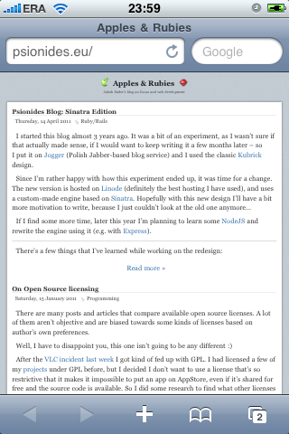
min-device-widthinstead, but – surprise – it wouldn’t work either. The reason is that the phone would use all the styles that you’ve prepared for the mobile site, but would still display the page in a window that imitates a 3 times larger desktop browser window. So it would look as if you opened the mobile version of the site in a desktop browser:The solution is to add this magic line to your HTML’s head:
<meta name="viewport" content="width=device-width">
The meta viewport tag tells a mobile browser what should be the size of a desktop browser’s window that it tries to imitate. You can pass a specific number, but this isn’t a very good idea (because it might not look good on every mobile phone), or you can use
device-width, which theoretically means the width of the screen in pixels. Theoretically, because apparently a lot of browsers cheat and use a different width in this case, but they usually set it to something that makes sense for them. On iPhone, this means 320px in portrait mode and 480px in landscape mode.Once you set this, it’s actually better to use
min-widththanmin-device-widthin the query, becausemin-device-widthmeans “actual width of the screen in pixels”, andmin-widthmeans “the width that the browser thinks is optimal for viewing on the device”. Also, some Android phones with high resolution report a large device-width value, and you might not catch them with amin-device-width: 480pxquery – and you do want to show them a mobile version, because the screen is still small.iOS devices with Retina display (iPhone 4) calculate everything as if they had normal screen resolution, so you don’t have to worry about them – they will behave exactly like older iPhones (unless you explicitly tell them not to).
These settings will also affect rendering on tablets like the iPad – so if you happen to have one around, make sure the site looks good on it too. In iPad’s case, the default viewport width is the same as on the iPhone (980px), and the meta viewport tag will change it to 768px (in portrait mode) or 1024px (in landscape mode).
Other stuff
If your site loads fast on your desktop, it doesn’t mean it will work just as fast on an old iPhone. If it takes a lot of time to load, try disabling some things – especially JavaScripts – and see if it helps. In my case, I had a CoffeeScript file included with
type="text/coffeescript"and a LESS stylesheet included withrel="stylesheet/less", and both were being processed at runtime in JavaScript. This worked super fast on the desktop, but it made a big difference on my iPhone – so now I preprocess the two files during the deploy instead and include the result JS and CSS in the HTML.I’ve done it this way from the beginning, so I can’t say if it’s a big difference, but apparently it’s easier to make the mobile version look as it should if you have a flexible layout, i.e. you use percent and em units instead of px. It’s harder to write, but it’s easier to scale to different sizes. Read this article by Kasia Drzyzga to see why em’s are better than px’s. (Also, have you always thought, like me, that “1 px” simply means “1 device pixel”? Well, it doesn’t, according to W3C.)
You might notice that if you have some areas on the page that need scrolling (with
overflow: scroll), iOS devices won’t show any scrollbar on them; in my case, this happened to some code sections with long lines that don’t fit on the screen. I found a library called iScroll which is intended to solve this problem, but it didn’t work well with my syntax highlighter, so I didn’t use it in the end. Fortunately, this will be fixed in iOS 5 which will be released soon.If your site is popular among Apple geeks, you might want to add an Apple touch icon apart from a normal 16x16 favicon. This is used when people add your site to their iPhone home screen as an app (although, honestly, do people actually do that? I never do…), but not only there – e.g. I’ve noticed that the Reeder RSS app uses them to display large icons for RSS feeds.


1 comment:
Jimmy Johns
I always recommend a simple color scheme when creating a site for <a href="http://www.mobilewebsite.com">Make a Mobile Website</a> your text as visible as possible as mobile screens are small so a contrasting color between the background and font is advised.